Heritage crafts and a National Honour

Buckingham Palace gatesA great day for heritage crafts – the first national honour was awarded today, and what a day that was!


photo copyWe had been advised to get there early, and so we were, and queuing with Brian Rea, from Northern Ireland Policing, and his family, at one of the wonderful Buckingham Palace gates.

Fortunately it was a fantastic day. Last night there were gale force winds and horizontal heavy rain. If this is the weather tomorrow, I thought, my hat will be flying off my head and be completely ruined!


BUCKINGHAM PALACE LOOSOnce we had had our tickets and passports checked, we were led through the central archway of Buckingham Palace and into the building itself. Then we were directed to the cloakroom and loos – the latter quite extraordinary. Vast wooden seats covered a rather ancient loo, with a wooden ‘stirrup’ pull up handle instead of a chain or lever.


Access_BP_grandstairs_lgThen up an amazing gilded staircase, where guests/family went one way and recipients the other. We were led into the picture gallery, and once our names were checked, a hook was pinned to our jackets. This meant that when the medal was awarded, it was simply looped on to the hook.


Picture GalleryThe picture gallery was stunning – if only we could have just looked at the wonderful art – but there were so many interesting people to meet and find out why they were being awarded honours. They ranged from Pamela Goldberg who got hers for the Breast Cancer Campaign, Wing Commander Teresa Griffiths, who is doing sterling work at Birmingham Hospital with those who have been injured in conflicts, Christine Edwards for Higher Education, and our celebrity Adele (Adkins), the singer.

First Football Match In Buckingham Palace Gardens To Celebrate 150 Years Of The Football AssociationThe awarding procedure was then explained to us – not too complicated – and we were then told to wait until our names were called. We were taken out in batches, through some wonderful rooms, and then led across the back of the huge ball room to a parallel corridor and were checked yet again at the entrance to the ballroom. One by one our names and awards were announced. Forwards, stop, curtsey/bow, forwards to The Prince of Wales, medal awarded, chat and then go. (picture on right is of the Duke of Cambridge presenting awards earlier this year). It was a thrilling moment, not least because, coincidentally, In Paradisum, from Fauré’s Requiem, one of my favourite pieces of music, was played by the orchestra just as I went forwards for my award.

The Prince of Wales, President of the Heritage Crafts Association, was charming, as indeed he was to everyone I spoke to afterwards. He was interested in what we were doing and very supportive. Once out of the ballroom, I did give a little jump of celebration, but then remembered that there were video cameras everywhere (you could buy a film of your own presentation) and hoped they didn’t catch that rather non-MBE behaviour! The hanging pin was removed for us, and the medal was put into a smart box, then we were shown to the back of the ballroom to watch the remaining people being awarded.

When everyone had received their awards, The Prince of Wales left after the National Anthem, escorted by ghurkhas, and the Yeoman of the Guard marched out.

Patricia Lovett and her MBEI met up with my family in the Ballroom, and took my medal out of its box straightaway and pinned it on. As I said to the people as we walked out at Buckingham Palace – if you’ve got it, flaunt it! Then it was out into the courtyard for our photos.

This is the first time heritage crafts have been nationally recognised like this, and the first time for calligraphy for about forty years. The Heritage Crafts Association is working hard to nominate deserving traditional craftpeople for honours and we hope to see many more makers in future New Year and Queen’s Birthday lists.

And the singer Adele? Well apart from standing next to her and her smiling back in the picture gallery, and spotting her a few rows in front in the ballroom, we didn’t see her again. Speaking to the photographers they said that celebrities and VIPs are usually fast tracked through afterwards.

What a fantastic experience!

A modern flagellum

IMG_0522Beating the sin out of your body with a mediaeval flagellum may have worked in those times, but to me, this is a shocking use of beautiful writing and wonderful animal skin. I saw a flagellum first in the old British Library, when it was still housed within the British Museum in Great Russell Street. There was a well-used wooden handle, and Biblical texts in a form of Gothic Black Letter written on strips of animal skin, which were attached to the handle. The skin was rather discoloured, which it would be if it had been used to beat the body.

enlargement of modern flagellumI thought that, following my theme of loving a lot of lettering that is 3D, I’d try my hand at making a modern flagellum. But what to write? Although I love the words of the St James Bible, I thought that to use biblical texts would simply be a copy. I then realised that there were words and phrases that seemed to be beating the living daylights out of the English language – pre-owned, meaning second-hand, faux, meaning fake, compact (with houses and flats) meaning tiny, economical with the truth, meaning lying. I also have a bit of a thing about verbs being used as nouns, and I’m sorry, but it’s the grammar police here, different from (not different to), fewer for numbers (rather than less than), and so on.

We had a great time one evening with our friends suggesting words and phrases, and then I set to. It may be flagellum, but I wanted to make it beautiful. So I chose some really creamy vellum, used Chinese red and black stick ink, and separated the individual words and phrases along each strip with a gold leaf dot on raised gesso. I marked out with pencil and a straight edge the strips on the vellum – the plan was to make long strips and fold them in half, and then attach them together – and set to. Once the gilding and writing were done I cut up the strips using a sharp knife and straight edge (not too clever with the raised and gilded dots, but there we are!), folded the strips in half and then sewed them all together with bookbinder’s thread.

I am not skilled in wood turning, but I know a man who is, our piano tuner! So we discussed the dimensions and he made the handle. I tried ramming the strips into the cup-shape in the handle but they didn’t stay there very effectively, so I then flooded the inside cavity with acid-free PVA, and it held.

Unlike the mediaeval flagellum which had been used and so the vellum strips were quite flexible, this vellum is stiff, and so, when displayed, each strip has to be separately attached to the backing (with white bluetac). I just wonder what people will think of this in years to come!

‘Gutsy lettering’ and all that jazz – Michael Harvey

Michael Harvey typefacesSome of the names of the fonts available on our computers can be quite intriguing, and the stories behind them even more so. When Michael Harvey designed his first he called it Zephyr after the car he was driving, and his later fonts were named after his passion for jazz – Ellington, Mezz and Strayhorn. They are strong, clear and simple designs which have stood the test of time.

Michael Harvey book jacketDesigning book jackets was another of the strings to Michael’s bow. Initially influenced very much by the letter-forms he had been taught by Joseph Cribb, who was Eric Gill’s first apprentice, Michael then went on to work with the wood engraver Reynolds Stone, who encouraged him to free himself from what could have become a straight jacket. Despite the constraint of being able to use only one or two colours at the time, Michael made sure that his book jacket designs fairly leapt off the shelves, as with his own book here.


Sainsbury wing letteringPerhaps the best place to see his work easily is outside the Sainsbury Wing of the National Gallery. The architect, Robert Venturi, said that he wanted ‘really gutsy English lettering’ and Michael was able to oblige with letters having strong serifs and a good contrast in the widths of the strokes. He approved of being involved in the whole design process rather than what is sometimes the case – architects simply picking a design out of a font catalogue almost as an afterthought. The commission really was huge, though, and Michael required the assistance of letter cutters and designers themselves, Brenda Berman and Annet Sterling of Incisive Letterwork, to help him carry it out.

Page from Michael Harvey's bookMichael also taught for many years at the University of Reading, running the course Letter-forms, and many are those who have benefited from his skills and knowledge. I remember talking with him about teaching and him saying that it was as much about learning as it was teaching, with which I wholeheartedly agreed. His books on lettering are worth every penny, with strong layouts, copiously illustrated with his own designs and artworks, and often with his drawings as well. Michael believed very strongly in the importance of drawing.

He and I also felt that copying was useful, but his words are far better than any I could give: ‘A model is not an end but a beginning. Copying a good model is a good start … No matter how much one tries to reproduce another person’s style we add something of ourselves.’

Michael sadly died last month after a long illness.

  • Harvey, Michael. Letters into words. London: Clowes, 1973.
  • Harvey, Michael. Lettering design: form and skill in the design and use of letters. London: Bodley Head, 1975.
  • Harvey, Michael. Creative lettering, drawing and design. London: Bodley Head, 1985.
  • Harvey, Michael. Carving letters in stone and wood. London: Bodley Head, 1987.
  • Harvey, Michael. Calligraphy in the graphic arts. London: Bodley Head, 1988.
  • Harvey, Michael. Reynolds Stone: engraved lettering in wood. Netheron: Fleece Press, 1992.
  • Harvey, Michael. Creative lettering today. London: A. & C. Black, 1996.
  • Harvey, Michael. Adventures With Letters. Bridport: 47 Editions, 2012

Kites flying high!

Finished Kite artworkI was asked to write out this poem for a special birthday present, and was delighted when the budget stretched to calfskin manuscript vellum, and real gold leaf on gesso base. As soon as I read the words, I had an idea of the shape and feel of the design. The poem talks at the end about the kite taking off, itself alone, and so I saw the kite flying free through the piece as the wind took it. To do this, and to create that feeling of the flight through the air, the piece just had to be long and narrow, there was no question of any other shape.


Kite 1I experimented with various sizes of lettering – the lines are quite long and there are six verses, so it couldn’t be too large. On the other hand, pieces that are hung on the wall, as this was intended to do, need to have larger lettering than that in books, for example, which are held in the hand, as people read further away from a wall-hung piece. I wrote the verses out fairly quickly on to Layout paper (for types of calligraphy paper, see Calligraphy Clips – Paper), and then cut these up into strips and placed them either side of a quickly drawn kite. The piece didn’t hang together, though, and rather than unite the verses, the tail of the kite seemed to separate them.


Kite 2So I changed the design a bit and pulled the verses together. I did have an idea of the size of pen to use for the lettering, and maintained that thought of the verses being slightly offset, and so wrote out the first more formal rough on to proper paper. Layout paper is fine for first trials, but it doesn’t always give the real feel of how long the lines will be, what the final spaacing will be, and so on, so after experimenting I do then prefer to use a good quality piece of paper. As someone once said, paper is no use if it’s stored under the bed or in a drawer; it needs to be used!


Kite 4So I was pretty sure about the dimensions from this writing out, what shape the kite should be, and how the tail would fall in the piece. I used two large, wide L-shaped pieces of card, placed carefully to make a rectangle, to determine the margins, and then cut the vellum such that it could be stretched round a piece of wood. For more information about vellum, why it needs to be stretched, and how to do the stretching see my Illumination DVD. It stretched beautifully flat and I then set to marking out the skin using a compasses and a 4H pencil (again see Calligraphy Clips for Measuring Lines). I mixed up Paris Blue and Madder Red Calligraphy gouache (again Calligraphy Clips – Ink and paint) and fed this into the nib as I wrote. When there is illumination well away from lettering, it is usual to do the writing first, as in this case. The centre line was marked on the skin and, taking a deep breath, I drew on the tail of the kite freehand.


Kite piece, gesso laidThe illumination and decoration was next. I mixed up some new gesso and laid it with a quill. I turned the piece upside down for ease of working and so that laying the gesso would be away from the area of writing, although my paper guard did slip a little as you can see here. The gesso is still wet and glistens in the light. It is also possible to make out the markings of the hair follicles. And there is a better idea in this enlargement of the variegated colours of the red and blue gouache.


kite piece, briar hedgeAgain masking off the lettering, I then went to the lower part of the panel to concentrate on the briar hedge. This had been designed especially for this piece, and consisted of pink roses with gold centres and rose leaves with prickles on the leaves and the intertwining stems. Almost pure real gold leaf (23·5 carat) was placed over the dried, scraped and polished gesso. Raising the gold from the surface like this makes it shine and catch the light.

Once the gilding was done, the flowers and leaves were painted, as well as the kite and blue kite bows. The title and dedication was finally added, and then, the next day, the pencil lines removed with a soft eraser.


Here lies the beautifully lettered gravestone …

Langar 3It is rare to get a whole batch of beautiful gravestones, and even rarer to be able to spot the hand of real craftspeople at work. This is clearly the case in the graveyard of St Andrew’s Church in Langar, Nottinghamshire. The church is a Grade I listed building, and is quite wonderful inside, and large, too, for a small country parish. But nowhere on all the records of the church does it mention these wonderful stones, such as the one on the right. Carved in slate, the lettering is still as crisp as they were when first made. This one to William James is dated 1809, and although it has little text, the decorative surrounding is quite wonderful. A grieving woman tugs on a rope or swash from an urn, and this is balanced on the right hand side by the same swash being caught up on the branch of a tree.

Gravestone from Langar Church

This early gravestone dated 1720, some 80 years before the one above, is not quite so fine. Here a rather Chinese-looking sad cherub spreads its wings with wonderfully carved feathers to protect Anne James, who died when she was only 42. The curly letters in the words of ‘Here’ and ‘James’ contrast with the fairly restrained lettering of the rest of the gravestone, but see how the letter carver has had a bit of fun by extending the serifs into spirals on some of the ascenders, such as the l of lies, and the B and d of Body in the first line.


Gravestone at Langar ChurchThis one from 1730 is very interesting, and again not of the same quality as some of the later others. I did tweet about this soon after we had visited the church (follow me on Twitter) as I find it so interesting. This, too, has a delightfully sad angel at the top, with eyes this time that are remarkably similar to those in the Lindisfarne Gospels. There is a great deal to learn from this stone about forward planning and the need to sketch something out to resolve any design issues before you start. So in the larger capitals at the top, there are conventional abbreviations and contractions with the letter e tucked into the v of the y to make ye, the letters h and e conjoined in he, and a slightly smaller letters at the end of the second and third lines. But what happens towards the bottom? Choosing that size of lettering has meant that the letter cutter has not had room to complete the lines, and so the remaining one or two words in each line have been squashed above or below. Charming though it is, it really doesn’t work!

Gravestone at Langar ChurchBut this one certainly does! A wonderfully vibrant and lively border of swags, foliage and flowers really draw the eye in rather than distract from the lettering. The exuberantly flourished H of Here at the top contrasts with the second line, and the third again with the fourth. The advantage of planning is also shown at the base where the four lines of lettering sit neatly within the left and right borders, although the last two lines have slightly smaller words, but this doesn’t detract from the overall feel. And we have a name! W Barnes was the sculptor. This is rare indeed to have this information.


Langar 5And the high standard continues. It seems that W Barnes had a workshop where he was able to pass on his skills. The name Wood has been carved near the base on the right of this later stone of 1810. The unusual curved lettering, sitting neatly into the flourishes or just underneath contrasts with the conventional straight lines of the rest of the citation. It is likely that the gravestone was carved in one hit, even though Richard died just a few days short of a year after his wife, but it is interesting to see the two ways in which his named has been carved, once in Copperplate and the second time in Small capitals.


Graveyards can be a rich source of inspiration for letterers when they include stones as fine as these.

Gerald Cinamon – Man of Letters

Cover of Gerald Cinamon's bookAlmost without realising it our book buying is influenced many times by the design. Without knowing the contents, we select or reject a book often simply by the cover.

Gerald Cinamon, Jerry, is a past master at this. A recent publication, coinciding with an exhibition of his work at the Institute of Contemporary Arts this year, Gerald Cinamon: Collected Works Since 1958, and the accompanying video: Close Not Touching, shows some of the breadth of his work, and it is simply stunning! Sadly the exhibition has now closed, but his book is still available. The cover of the book, right, is in his favourite bold red, used in a number of other of his designs, too.

Cover design for Penguin Books 1967Jerry, born in the US, started his career well before there were computers, when type and image could be shifted around simply by a click of a mouse. His were the days of Cow Gum and Letraset letters. The title of the video Close Not Touching was taken from the use of Letraset, where letters were pressed from a transparent sheet on to paper, and were – close, but not touching. How very much easier it is for designers now. This design for Architecture and Art, made for Penguin books in 1967, shows just what an eye for really strong design, and a sense of humour, can achieve.


Design for wine list for a restaurant


This is a real favourite – a design for a family restaurant in Devon. The use of the wine glass distorting the letters, although they remain completely legible, suggests not only the movement of the tide coming in and out of the shore, but also the possible effects on someone’s vision of too much strong drink!


bbc poster image

A simply stunning design is this for the BBC, used both for posters and recital programmes. It is so simple but so effective in the way that the bowl of the letter b has been reversed to make the c, and any heaviness in letter-form has been avoided by truncating the downstroke. The letters are all very readable and clear, even though they are reduced in form so much. Jerry writes that he really enjoyed seeing his posters displayed at the Royal Festival Hall when he went there for a concert.


Cover for Penguin's 50th anniversarySimple and ingenious – this cover is for the Fifty Penguin Years exhibition catalogue in 1985. Here is that wonderfully vibrant red again, but the 25th penguin is in silver, and the 50th in gold. Penguin book covers were renowned for their limited use of colour, usually just one colour and black, so special permission had to be granted to do a silver and a gold run in addition!

This book is a real visual delight, each page, with its informative captions, shows another stunning design. There is a foreword by Ken Garland, a biography of Jerry and an interview with him and David Pearson (who is also in the video).

The book is available from Jerry’s website and costs £20 plus postage. I cannot recommend it more highly for anyone interested in lettering, design, and a really great man.

Luck be a Lady …

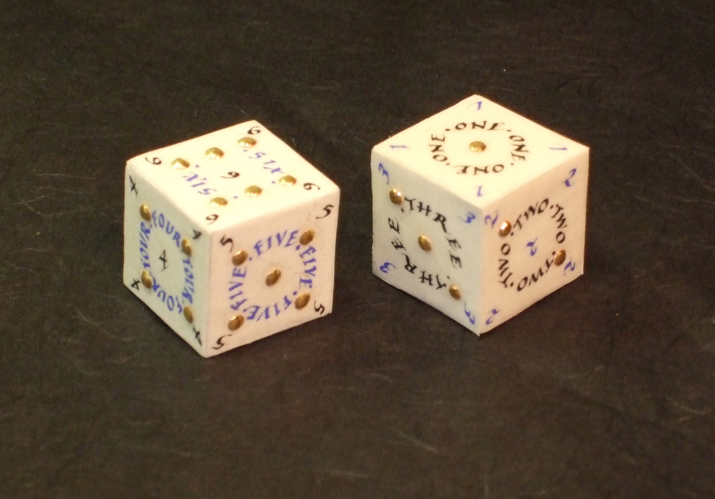
Wooden cubeIn my view, calligraphy doesn’t always have to be two-dimensional. I really like pieces that aren’t hung on a wall, and making calligraphy books is a favourite. I had a different idea from a book, though, and that was to make some calligraphy dice, not just any old dice, but ones made with slunk vellum (very fine skin), with real gold leaf covered dots, and with the numbers written with a quill. First, I needed some wooden cubes which could be covered, and once I had these, the experiments started.


Wooden cubes covered with paperThe problem with using slunk vellum, though, is that it is by nature very thin, and so the darker wood could be seen easily beneath the skin – not a good look. I experimented with covering the wood with paper. The paper itself needed to be reasonably robust otherwise it too would show the wood through. However, none of the covering styles I experimented with were suitable as the skin still showed through what was beneath – the folds in the covering paper. In the end I simply used archival quality PVA and pasted this on one side of the wood. I then placed this on a square of paper slightly larger than one side of the wooden cube, and pressed and held down. When dry, I used a knife to trim off the paper close to the edges of the cube, so there were no folds at all that could show through.

Strips of slunk vellum with pencil linesNow to setting out the dice. I experimented with various layouts, and needed to ensure that whatever style I chose, I could fit in numbers such as 6 and 1, which have three letters, as well as the number 3 with five letters (normally no problem, but I was working on an area of just over 2.5 cms (one inch), and the lettering was to be written as circles within that, so an even smaller space!). When I was happy with my design, I cut two strips of slunk vellum, treated it carefully (see my DVD for more details of treating skin for writing and gilding and lots more [download the order form]), and used a sharp 4h pencil, compasses, stencils for the circles and a straight edge to set out each face of the dice. Rather than working with small squares of fiddly and curling up vellum, I kept them as a strip for ease.

L b L 4I made a new batch of gesso (my DVD again), and laid it with a quill, making sure that each dot was round and stood proud of the skin surface. I use a scientist’s crucible for both gesso and pigments and ink, rather than a usual flat paint palette, as the former has a smaller surface area for the moisture to evaporate. Traditionally (!), we use the end of a paintbrush to stir the gesso, as the ingredients for gesso need to be constantly mixed. Using a quill to lay gesso usually means that there are fewer air bubbles, and this was the case in this instance.

Partly gilded dotsWhen the gesso was completely dry, I polished the dots with a burnisher (you might be able to see the shine on the dots of the top vellum strip). Then to lay the gold leaf – this was 23.5 ct, almost pure, gold leaf. I got up early one morning, because laying gesso needs a certain amount of humidity, and set to. Gilding the dots was a little fiddly, but no more so than in some other jobs I had done. The curved-bladed knife is to scrape away excess gold when the gilding is complete.

Writing completed on the vellum stripsAnd on to the writing. I used a quill, recut so it was sharp (yup, that DVD again!), and wrote the letters and numbers in Chinese liquid ink and in ultramarine Schmincke Calligraphy gouache (the best to use for calligraphy). I had planned for the two dice to look different, one with blue numbers and black lettering and the other with black numbers and blue lettering.

Finished illuminated dice


When the writing had dried completely (always leave at least half a day for this on best pieces), I erased all the guidelines, and then carefully trimmed each square using a straight edge and metal rule. Finally, and really carefully, I pasted each side of the dice, and firmly placed the appropriate square of illuminated vellum securely. Usually I would use a bookbinder’s bone folder to press the surface down, but this wasn’t possible with the gilded dots. I allowed the finished dice to dry and here they are.

And why ‘Luck be a Lady’? Well, those of you who are as firm musicals fans as me will know that this was sung in Guys and Dolls by Sky Masterson. The first line in his song ends with ‘tonight’, but I wanted luck to be a lady for more than just ‘tonight’!

New Illumination book on the way

After many delays I’m now getting very excited at the publication of my new book on Illumination. I’ve updated a lot of the techniques from my previous British Library book ‘Companion to Calligraphy, Illumination and Heraldry’ (can’t believe how long ago that was published!), and it links very well with my DVD on Illumination. I think that we’re on the home straight now, and could even get copies in time for Christmas! Fingers crossed.

This is the cover (left side is the back, then the spine, and then the right is the front cover):

Cover of Illumination

The little angel on the back is a copy from the Sforza Hours. It’s one of my favourite manuscripts with paintings both by Birago, done when the book was in Italy commissioned originally by Bona Sforza, Duchess of Milan, and then by Horenbout, in the Netherlands, when the stolen images were replaced by this great Dutch artist (the story of the book is really fascinating.)

Angels by BiragoMy favourites are those by Birago as he paints saints and angels with the most fabulous cheek bones and really curly hair. They almost look as if they have put their fingers in electric sockets such are the curls, and despite being angels they don’t seem to have known about frizz-eaze!

My angel is a copy of one painted by Birago and is of a chorister, but I popped a quill into his left hand to make him into a scribe (or an illuminator) ready to write or lay gesso into a book.