Tag Archives: medieval manuscripts

The Glitterati of 2023

Layout 1What a wonderful group of eight budding illuminators-to-be there was for this year’s intensive Tools, Techniques and Materials of Mediæval Manuscripts three-day course in May. It is always interesting to see how eight different people, complete strangers, from different parts of the UK and the world will react when spending three days together. I have been so lucky in that everyone who comes on my courses has been really nice – and so it proved to be this time!


IMG_2930It takes quite a long time to get the rooms ready. The furniture has to be arranged, and then all the tools and equipment set out for each individual – well over 30 individual pieces of equipment. No-one has to bring anything with them – it’s all provided. I do this for three main reasons. It is very expensive buying vellum, books of gold leaf, sets of paints, and fine kolinsky sable brushes. If someone is doing this only once, it is a lot of cost, which could be seriously off-putting! Then, for those coming long distances and even from overseas, buying all the correct stuff is not easy and carrying it long distances on public transport is also a challenge. Lastly, and this is from experience of many, many years, it is so important to have the right tools and materials – too low a gold level in leaf gold means that it will not stick to itself, a old burnisher that someone has found in a drawer may be scratched and ruin the gold, and new scissors bought cheaply will make the gold leaf tear. It really is a case of, quite rightly ,a workman blaming his tools when things don’t go well!

But the results were amazing as you can see. Gesso well laid, gold attached and burnished to a bright shine, and miniatures painted well.

IMG_2945Here are the results and comments from those on the course, although comments are not necessarily next to the image completed (by the way, the images may be a bit skewwhiff because I wanted to make sure the brilliance of the gold was captured).

Amazed at what I’d learnt on the first day. I thought we had a lot to do, and we did, but Patricia had timings meticulously planned, and we finished. it was extremely good value for such an in depth course (and most memorable).


IMG_2934Your help and advice at all stages have been very welcome; thank you for your encouraging words throughout the course. So glad to have attended. I have learned a great deal and particularly enjoyed using gesso. Absolutely fantastic. Thank you.


IMG_2935Superb! I’ve learned so much and will definitely experiment with techniques in the future, Unique and top quality training with plenty of inspiration for future explorations. Very clear, easy to follow and clearly based on practical experience. Brilliantly pitched.


IMG_2937I just want to say what a wonderful experience this has been – absolutely perfect for me! Thank you so much for your wonderful warmth and hospitality (well beyond what the course would require to be a success).


IMG_2936Perfectly paced and really fun, learned so much, quill making amazing. Patricia you are wonderfully encouraging and positive, Loved the gesso and gilding. Tremendous! Wish I could have stayed for a week.


IMG_2942I was so looking forward to it, but the course was so much more than I could have expected, The learning was wonderful, and I cannot thank you enough for all the effort you put in to make it an amazing experience. Excellent! Repeats, great demonstrations, you are a wonderful teacher! All my thanks.


IMG_2939This is famously the best course in the world, which is why we’re all here. No-one was disappointed.


IIMG_2940 loved the fact that you walked us through the details of all the supplies we used, where they came from and how they are made. It was an amazing experience, I have learned so much more than I had hoped to. Patricia, you are a very generous teacher and person. I am so glad I signed up for this workshop.


Courses are held in Kent, UK, about 35 minutes by train from London. They are run usually the third weekend (plus the Friday) in May, and details are sent out in my free online monthly newsletter. The courses fill up very quickly, so if you are interested, do book your place as soon as it’s advertised!

How Mediæval Manuscripts were Made

fcdcf8be-d41f-4954-b06e-603091f607c1It really was a great joy and privilege to be part of the great Polonsky Project, which was a joint venture between the British Library and the Bibliotèque nationale in Paris to digitise manuscripts which from before the year 1100. They were keen to show how those manuscripts were made, and so it was on two very hot days in the summer of 2017 that Dr Alison Ray, filmer Jan and I spent many hours recording those processes. The films are now on the British Library’s and the Bibliotèque nationale’s websites (the latter being dubbed into French) and sections of the films were also used in the fantastic 2017–2018 Anglo-Saxon Kingdoms exhibition at the British Library.

Screenshot 2018-12-17 at 18.53.31The first film features the pen used for the writing, which, of course, was usually a quill cut from the feather of a large bird. I always use penknives which have curved blades as the curve rolls over the slight curve in the barrel of a feather to cut the nib tip, whereas a straight blade tends to squash the feather. Indeed, penknives today (the clue is in the name!) still always have a curved blade. Here’s the link. There’s more on quill knives and how to cut a quill on my website on this link.

Screenshot 2018-12-17 at 19.05.35Ink was usually made from oak galls, although in fact peach, cherry and apricot stones can also be used but give a less dense colour. It’s the tannic acid from the galls reacting to copperas (iron sulphate) that creates a dark liquid, and which needs an adhesive, in this case gum Arabic, to ensure that it adheres to the writing surface. To see the process, click here.

Screenshot 2018-12-17 at 19.07.32The writing surface was vellum or parchment – calfskin, sheepskin, goatskin or ever deer on occasion. In this clip I explain about the differences between the hair and flesh sides of vellum and also the qualities of other types of skin. More here.


Screenshot 2018-12-17 at 19.10.21Having cut pieces of skin to size for writing, the page needed to be set out, and often dividers – similar to sets of compasses, but with a point at the end of each leg – were used as it was easier to mark the exact positions of the guidelines in this way. On occasion, the lines would be set out using a ruler and lead point (or similar) and then the positions marked using the tip of a knife (perhaps a penknife). Here the ‘point’ would actually be a triangle shape and this can be seen in some manuscripts. There’s more on setting out a manuscript page here.

Screenshot 2018-12-17 at 19.17.54Pigments used in illuminations came from animal, vegetable and mineral sources. Perhaps the most famous is ultramarine, as Cennini Cennino called it ‘perfect, beyond all other colours’. A very similar blue, but much cheaper was citramarine. Woad and indigo are from vegetable sources along with madder. And Tyrian purple and carmine came from animals. There’s more on this link, including dragon’s blood!

Screenshot 2018-12-17 at 19.22.01 1These pigments have no natural adhesive (apart from saffron interestingly!) and so this needs to be added. Traditional either glair, the egg white or the egg yolk was added. This film clip explains the process, including the equivalent of a hole in one! It can be tricky removing the egg yolk from the egg sac, but when this was being filmed, it worked with the very first egg! Here it is with the knife being withdrawn and the yolk falling out at the bottom. See the whole thing and more here.

Screenshot 2018-12-17 at 19.26.13And having got everything ready, it was then only the setting out the illumination, laying the gesso, applying gold and then painting bringing everything to life and with wonderful colour. Watch the process here.

It is hoped that these short films will add to the knowledge and understanding of these historical craft processes and ensure that more people understand and appreciate the skills that went in to creating the wonderful manuscripts now in great collections such as those at the British Library and the Bibliotèque nationale.

A stunning Renaissance manuscript

BL, Add ms 19553

BL, Add ms 19553

The British Library has a stunning array of manuscripts and one that has been recently digitised caught my eye because of its lively and idiosyncratic lettering; the shelf reference is BL, Add ms 19553. The page shown has typical Renaissance decoration – the manuscript is dated to c.1505 – with a rather restrained red, blue and green decoration on shell gold (powdered gold in gum Arabic base).


'que'It is the lively lettering, though, not the decoration, that caught my eye, particularly the exuberently free curved stroke on the letter q in the middle of the second line. This is an abbreviation and indicates that this word should be tibisque. There is wonderful control of the pen as the pen moves from the right to the left, and, with again great control, moves to the left with a slight hesitation at the finish of the stroke adding a hint of a thickening at the very end. Note also the letter g with the exaggerated lower bowl, and no little ‘ear’ to the right of the upper bowl. This scribe is really enjoying making these strokes!

xAnother beautiful stroke is the one from top right to bottom left in this letter x; it is rather more successful that the slightly more wobbly stroke from top left to bottom right. Notice also the very flat pen nib angle to the strokes. Usually the nib angle for this writing style, Humanistic Minuscule, is about 30°. The flatter nib angle gives a more chunky feel to the lettering.

a:eWhen the letters a and e are combined as a ligature it can be a rather clumsy form. Here, though, the scribe has sloped the usual upright of the letter a and the e nestles in neatly, sharing the same stroke. Extending the ‘crossbar’ of the e and just pushing it up slightly at the end, which thickens the stroke, gives a very elegant letter-form overall. Note, too, the second thoughts the scribe has had with the long s and t in posteritate . The long s started just above the line for x-height, and the letter t was written normally. Then the decision was made to extend both strokes and join them together. It’s great when watery ink like this is used as these sorts of things can be detected.

& and extended fThe ampersand (et = and) is very graceful here, with the smaller bowl written as a complete letter o, and the lower stroke travelling to the right has a real swoosh to it. Note, too, the additional extension to the letter f written after the letter had been completed.


yAnd lastly another wonderful stroke on this letter y, where the slight thickening at the end of the stroke bottom left not only collides with the letters o and n on the lines below, but the pen has also caught a little on the surface so it looks a bit messy.

And if you want to see more of this intriguing manuscript and spot fabulous letters yourself, then click here.


Recreating the ‘Beatus’ page from the Eadui Psalter

© 2018, Patricia Lovett MBE

© 2018, Patricia Lovett MBE

As part of the Polonsky project for the British Library and the Bibliotèque Nationale I was asked to show how mediæval manuscripts were made to create a series of short informative films. To show the process of completing a miniature we selected the ‘Beatus’ page from the Eadui Psalter, (although, to be honest, I immediately regretted it because it was so complicated!). We agreed that for filming, because of time and logistics, I would concentrate only on the central letter B, but aim to complete it after the filming.


© 2018, Patricia Lovett MBE

© 2018, Patricia Lovett MBE

The first stage was to trace the outline from a print out of the original. It was such a complicated image that the tracing alone took 5 hours. The tracing needed then to be transferred to vellum. I used my own Armenian bole paper as ‘carbon’ paper; doing this took another 5 hours.Then the outline was reinforced in red, which is the traditional colour; this process took 6·5 hours.


© 2018, Patricia Lovett MBE

© 2018, Patricia Lovett MBE

The next step was to lay the gesso with a quill. Gesso is the plaster-based cushion that raises the leaf gold from the surface, and the slight rounding of the cushion, once the gold leaf is attached, really catches the light so it looks as if light is coming from the book itself – truly illuminated. I had made a batch of good gesso and was filmed laying this on the letter B. The interlace at the head and foot of the minim was very complicated and it took a while to work out the pattern and lay the gesso according to the original. I had one day in between the schedule before the next filming session to lay, scrape and prepare the gesso. However, there was so much to be gilded that I ran out of gesso halfway round the border. I made another batch but didn’t have time to test it, and found out as I was laying it that it was rather bubbly. Laying, preparing and scraping the gesso took over 12 hours.


© 2018, Patricia Lovett MBE

© 2018, Patricia Lovett MBE

And then for the gold. The stickiness in the gesso is reactivate by moisture in the breath and the leaf gold (23·5 carat) attached immediately. Once secure, the gold is polished to a high shine with a stone burnisher (just visible on the left). Building up layers of gold improves the depth of burnish.


© 2018, Patricia Lovett MBE

© 2018, Patricia Lovett MBE

The gold leaf can attach to the surface of the vellum as well, especially after a hard burnish. It was particularly difficult to remove the excess in the gold interlace area.


© 2018, Patricia Lovett MBE

© 2018, Patricia Lovett MBE

Well-burnished gold really does catch the light.


© 2018, Patricia Lovett MBE

© 2018, Patricia Lovett MBE

Applying the gold, burnishing it and cleaning it up took 14 hours, but the end result was worth it.


© 2018, Patricia Lovett MBE

© 2018, Patricia Lovett MBE

It was a difficult to decide what to do about the colours. Although contained within a book, pigments still deteriorate over time; some of the colours had changed even in adjacent areas. So should this copy of the manuscript page be exactly the same as the original that has deteriorated, or should I try to recreate the page as it was? I decided to plump for trying to paint it as it was. Matching the colours was a bit of a challenge!


© 2018, Patricia Lovett MBE

© 2018, Patricia Lovett MBE

Painting mediæval manuscripts is a little like painting by numbers sometimes. Each colour is done completely and separately. Here the blue has been done.


© 2018, Patricia Lovett MBE

© 2018, Patricia Lovett MBE

And now the magenta red, no doubt it’s madder.


© 2018, Patricia Lovett MBE

© 2018, Patricia Lovett MBE

The basic colours have now been completed. At this point, I often feel that any artistic skills I may well have had have disappeared because it all looks so flat.


© 2018, Patricia Lovett MBE

© 2018, Patricia Lovett MBE

However, adding tones and shades starts to lift the image.


© 2018, Patricia Lovett MBE

© 2018, Patricia Lovett MBE

The white highlights improve the image even more and it starts to take shape.


© 2018, Patricia Lovett MBE

© 2018, Patricia Lovett MBE

The black outline makes all the difference, separating the gold from colour and colour from colour, also emphasising what look like folds on draped cloth. Notice the difference between the letter B which has been outlined in black and the rest of the border where there is no black.


© 2018, Patricia Lovett MBE

© 2018, Patricia Lovett MBE

And the final result again.

If you would like to recreate your own mediæval image, then my book and DVD on Illumination: Gold and Colour have clear instructions on making and using gesso, cutting quills, treating vellum for painting (and writing), and the process of creating a mediæval miniature shown step-by-step. See here.

‘Magic in Medieval Manuscripts’ by Sophie Page

IMG_1284This delightful little pocket sized book by Sophie Page, published by the British Library, is lavishly illustrated by many mediæval manuscripts and explains the conundrum in the Middle Ages of angels and devils, magicians, magic spells and charms. The conundrum was that from the mid-thirteenth century there was a backlash against magic yet the church still wanted their followers to believe in the good and evil of angels and demons, but not of magicians and sorcerers.


IMG_1289Despite the book’s small size there is a huge amount of information, presented in a very readable way. The five chapters of The Medieval Magician, Natural Magic, The Power of the Image, The Magical Universe, and Necromancy and Sorcery cover the topic comprehensively. Magicians and saints possessed special powers but the latter were not always the victors. Here Saints Simon and Jude, who were murdered by the crowd after they drew forth demons from statues of pagan gods but refused to sacrifice to the sun, meet up with three magicians shown wearing exotic hats.


IMG_1290Alexander the Great’s father, the exiled Egyptian king Nectanebus, was a magician, and he used to sink ships by creating images of them and pushing them under the surface of water in a basin, as shown here. And he appeared to influence the English court in 1376, when Edward III’s mistress, Alice Perrers was said to have acquired her powers over the king due to a Dominican friar who used spells from ‘the Egyptian necromancer’ Nectanebus.


IMG_1291Animals and plants were also believed to have magical powers, or at least powers that couldn’t be easily explained. A mandrake plant killed the person who pulled it up, but a dog pulling out the plant would take the curse. The mandrake was valued because it was believed to cure epilepsy, snake bites, gout, baldness and afflictions of the eyes and ears. The blood, feathers and heart of the exotic hoopoe, shown here, was used in necromantic rituals, and the heart, marinated in honey and put under the tongue would then ensure that that person could understand the language of birds.


IMG_1292Sorcery was often personified by an old woman. Here she has a severed hand and uses her stick to poke at a pilgrim. In her baskets she has ‘Many knyves and hoodys ek,/ Dyvers wrytes and ymages, / Oynementys and herbages’. The cut off hand indicates that she can tell fortunes from palms.


This is an interesting and informative book and is ideal for those who loved images from mediæval manuscripts, learning more about what they represent and finding out about the fascinating spells, potions, magic and beliefs of the period. This is highly recommended.


More Glittering Gilders

IMG_2768 2Another group of budding illuminators gathered at my studio to learn how to cut quills, make and lay gesso, treat vellum for painting, and the craft processes of the mediæval illuminator. I am always delighted when a random group of people get on so well – perhaps it’s that all those who want to learn these skills are so nice!


IMG_2790Everything was ready for their arrival as I supply all the tools and materials, so students need to bring nothing but a pen and notebook (no expensive outlay if participants decide that it’s not for them, but how could they not?). As well as teaching the skills and techniques, I always try to instil elements of best practice and ways of working in my classes so tools and materials are placed carefully around the work station, and also care of tools and preparation and use of materials are explained as the class progresses.

Here is a beautiful white horse from a student who declared that she was ‘definitely not an artist’! Yet look at those fantastic fine white lines and the decorated border!

IMG_2799This student decided to tackle a large and complicated image. The burnish on the gold and smoothness of gesso is great, but she wasn’t able to finish in the time the three-day course allowed. This does give some indication of how long a miniature like this would take to complete, as there were no stops for chats!


IMG_6611And here is the image complete. What a great achievement! Certainly something to frame and put on the wall! And look how that gold shine.


IMG_2787Here a rather blue ram (as in the original) which has the most impressive woolly coat! The expression on the face is particularly good as well as the fine lines depicting the wool and the white hairlines.


IMG_2781These little ducks or geese (we weren’t quite sure in the original!) are surrounded by a very well laid, smooth gesso which has been beautifully gilded – I haven’t quite captured the shine in this photograph.


IMG_2783And this is a very proud peacock with its colourful tail which is well matched by gold leaf on gesso everywhere in the background! The advantage of copying and making the miniature your own is that you can take liberties like this!


IMG_2793Miniatures from bestiaries are not always quite what students want, so this white hart was from a couple of paintings, the hunters with spears were omitted, an extra tree inserted, and the hart made white not brown. The brilliant shine on the gold is evident in this image.


IMG_2797The chameleon is certainly multi-coloured, and has a cute little owl sitting on a tree noticing everything. The gesso is well laid here and has a good depth of burnish with very fine painting.


IMG_2778And these three little hares are chasing one another’s tails, with very fine lines, particularly the white ones in the patterned border.


The next course will be in 2019, and subscribers to my free online monthly newsletter will received the dates first and have priority booking.


The Vespasian Psalter

Screen Shot 2017-02-15 at 16.56.19The Vespasian Psalter is an Anglo-Saxon book written, it is thought, in the second quarter of the eighth century. The style suggests the south-east of England, possibly St Augustine’s or Christ Church, both in Canterbury, or Minster-in-Thanet.
The large full-page illustration on the right shows an intriguing mix of Insular interlace, La Tène spirals, and Roman motifs. David is painted as the psalmist with scribes recording his words on a scroll (which could represent the Old testament) and a codex (the New Testament). Musicians play musical instruments and a couple of young men look almost as if they are break dancing!


Screen Shot 2017-02-15 at 16.53.12The prefatory material contains pages written in small elegant Rustic letter-forms.


Screen Shot 2017-02-15 at 16.54.53The main text is written in delightful Flat Pen Uncials, held with the pen almost horizontal. The fine serifs at the top and bottom of many of the letters give the impression of the script being written between tramlines.


Screen Shot 2017-02-15 at 16.55.37The huge advantage of viewing this manuscript on the British Library’s website (view here) is that the pages can be enlarged so that the formation of each letter can be seen. The large triangular ends to the downstrokes on the letters N and T are clearly shown here, and it is possible to enlarge the pages even more. And the change in nib angle from the flat pen used for the fine hairline serifs and the diagonal stroke to about 45° for the bowl of the letter A is also obvious. The very fine curved stroke leading off to the left from the bowl of the letter A is made by the left-hand corner of the pen. How this is done is shown in writing the letter t in this Calligraphy Clip for Gothic Black Letter here, about 2.30 minutes in. The dancing Insular Minuscule Gloss (word-by-word translation) was written about a hundred years after the main text and is the earliest extant translation of biblical text into English.

Screen Shot 2017-02-15 at 16.54.11But it is the decorated letters which are so inventive. Here is a little gold bird in the letter D with rather unusually-shaped lumpy companions either side. The gold is flat, but it does look like leaf gold rather than shell gold here.


Screen Shot 2017-02-15 at 16.58.07And on this page, there is a line of decorated letters with a huge initial S. This letter is an intriguing mix again of patterns and decorations from different cultures.


Screen Shot 2017-02-15 at 16.58.36And when enlarged, the sad little bird, who looks most perplexed, can be seen clearly. Note, too the many red dots indicating the line markings and surrounding the letters; these are typically insular. There is more about this page in my book ‘The Art and History of Calligraphy’, published May 2017 by the British Library.


Screen Shot 2017-02-15 at 16.56.38The book has another first and that is that it contains the earliest known historiated initials, and the one shown here is of David and Jonathan. An historiated initial is one that tells a story as opposed to a decorated initial.


Screen Shot 2017-02-15 at 16.53.36The book was owned by Sir Robert Cotton, and his was one of the three major collections which made the British Library. Here is his signature in the book.


Orpiment – it glisters but isn’t gold

220px-KellsFol032vChristEnthronedOrpiment, the word derived from the Latin Auripigmentum, and also known as king’s yellow, has been known since Roman times, and was a treasured pigment used in mediæval manuscripts. Its particular value was because it was yellow and could not only replace gold when it was unavailable or too expensive, but because orpiment was similar to gold and that was the colour that was considered to be near-divine and, like God, indestructible.


260px-LindisfarneFol27rIncipitMattCennino Cennini in in his Libro dell’ Arte of the 15th century, describes orpiment as ‘a handsome yellow more closely resembling gold than any other colour’. It was used in books like the Book of Kells (see above) which has no gold. The Lindisfarne Gospels does have a few areas of gold, but orpiment was the colour used for yellow as in this incipit to Matthew (right).


orpiment19052a
Other yellows available at the time were not nearly as lasting as orpiment; saffron, urine and fish bile – all forms of yellow – were all far more fugitive. Orpiment could not be ground too finely, though, or it lost its egg yolk golden colour, but the advantage of this was that by being still a little crystalline, it actually glistened and reflected the light.


imgresIt is, though, one of those colours where it is very wise not to lick brushes. Orpiment is arsenic trisulphide, and Cennini said ‘beware of soiling your mouth with it, lest you suffer personal injury’! Wise words.

It wasn’t a colour that mixed well, though. Sulphur in the pigment reacted with copper in verdigris, and the lead in ceruse, or white lead. In the 17th century, Cornelius Jansen wrote: ‘Orpiment will ly faire on any culler, except verdigres, but no culler can ly faire on him, he kills them all’.

Mediæval Monsters

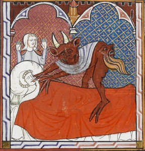
Devil snatching soulThe British Library have done it again! This delightful little book on Medieval Monsters by Damien Kempf and Maria L Gilbert is the perfect introduction to all those fascinating creatures which delighted the mediæval mind as much as many of us today. Sometimes the monsters are familiar – the one on the right is the devil waiting for death when the soul leaves the body. In mediæval times this was believed to be through the mouth, hence the devil’s hands ready to make a timely catch!


Devil taking soulAnd here the devil has been successful. The soul is often depicted as a newborn baby, so this poor chap, having left this mortal coil, is off to spend eternity in hellfire as the devil drags his soul there.


Devil stealing inkpotThe devil was often at work in other ways too. Here is St John the Evangelist, with a couple of completed books behind him, writing the Book of Revelation on the island of Patmos – a place known for its dangerous criminals, scary bears and lions. None more so dangerous and scary than the devil who is here stealing the saint’s inkpot to prevent him writing the word of God.

grotesque


But it is the invented animals and grotesques which are often so intriguing. What about Panotii (which means ‘all ears’ in Greek) who had such big ears that are so large they act as scarves or blankets? Others have slightly smaller ears, but pointed, wizened grey faces and hands that are claws, with bodies wrapped in a long cloak. Now some of you may have thought that the creatures in Star Wars were completely invented, but no, here is Yoda on the right, the legendary Jedi Master, instructor of Luke Skywalker (NB I am getting this info from the internet!).

YodaAnd if you don’t believe me, there is the ‘real’ Yoda on the right.


BlemmyaeWhat mediæval imagination would have thought of Blemmyae? They were harmless, without heads with their faces on their chests.

This little book covers a number of fantastical monsters as well as dragons, unicorns, mermaids, werewolves and very many more. Many of the images are full page which means that you really can see the details and the print quality and design make it a delightful book to read.

If you want to see more mediæval creatures, here’s the top ten monsters of the middle ages here