April is the month for engagements in the Trés Riches Heures of the Duc de Berry, and shown here is a very elegant group dressed in rich fabrics with the happy couple giving and taking the engagement ring. The striking blue of the cloak of the man on the left, the woman sitting, that of the sky, and the semicircles above completely balances in the painting.
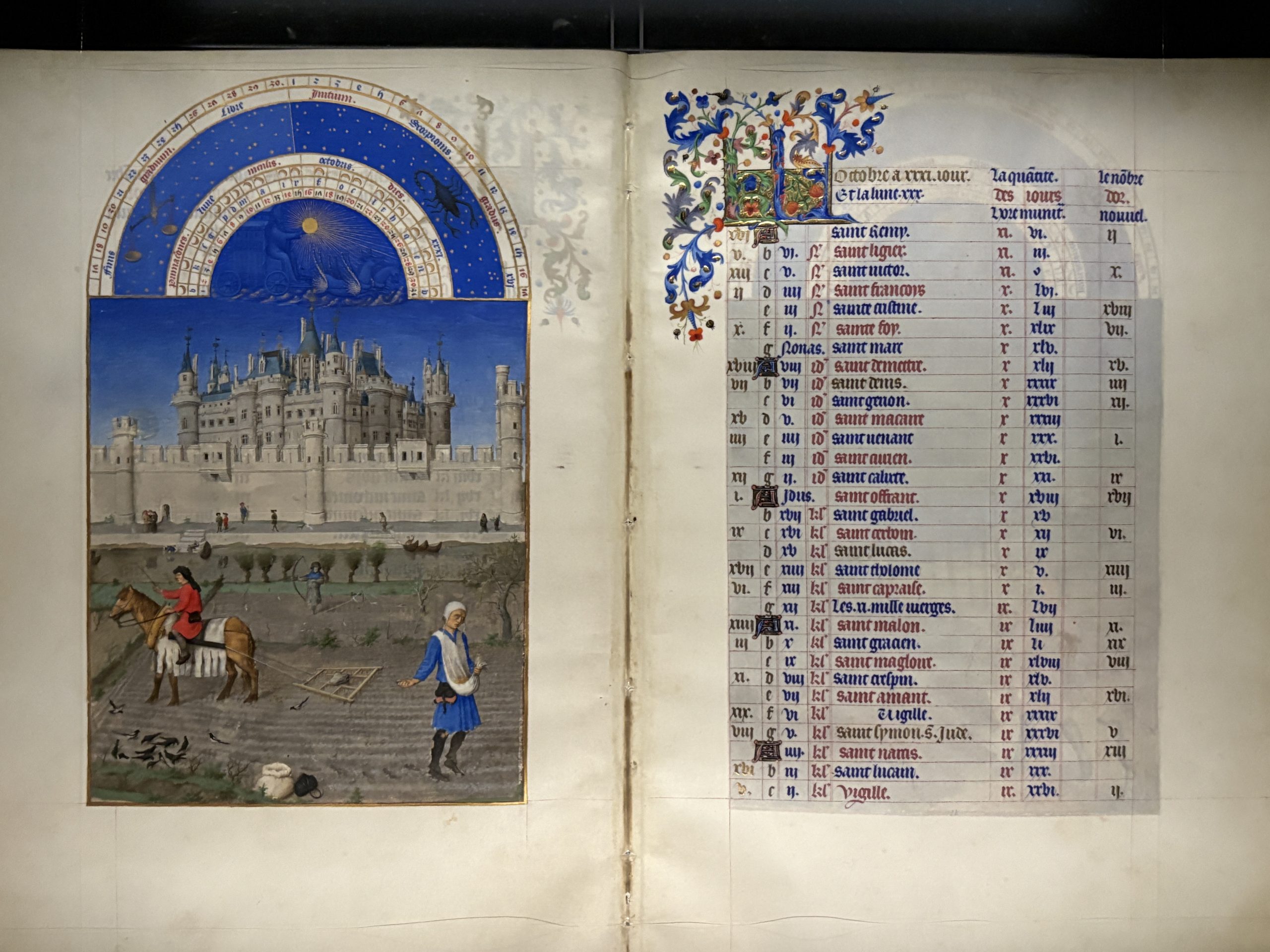
 At the top of the image, as with all of these Labours of the Month in the Très Riches Heures, is a semicircle with repeated fine shell gold lines encasing two wide blue borders. The sun in its winged chariot and pulled by horses – picked out by shades of blue and highlights of gold – are in the inner one, and in the outer one are the astrological signs for the month – Aries the Ram and Taurus the Bull.
 On many such pages the Van Lymborch Brothers include one of the Duc de Berry’s castles and houses, and that is the case here. This time it’s the Château de Dourdan with it’s fine red tiled roof, high walls, and many conical towers.
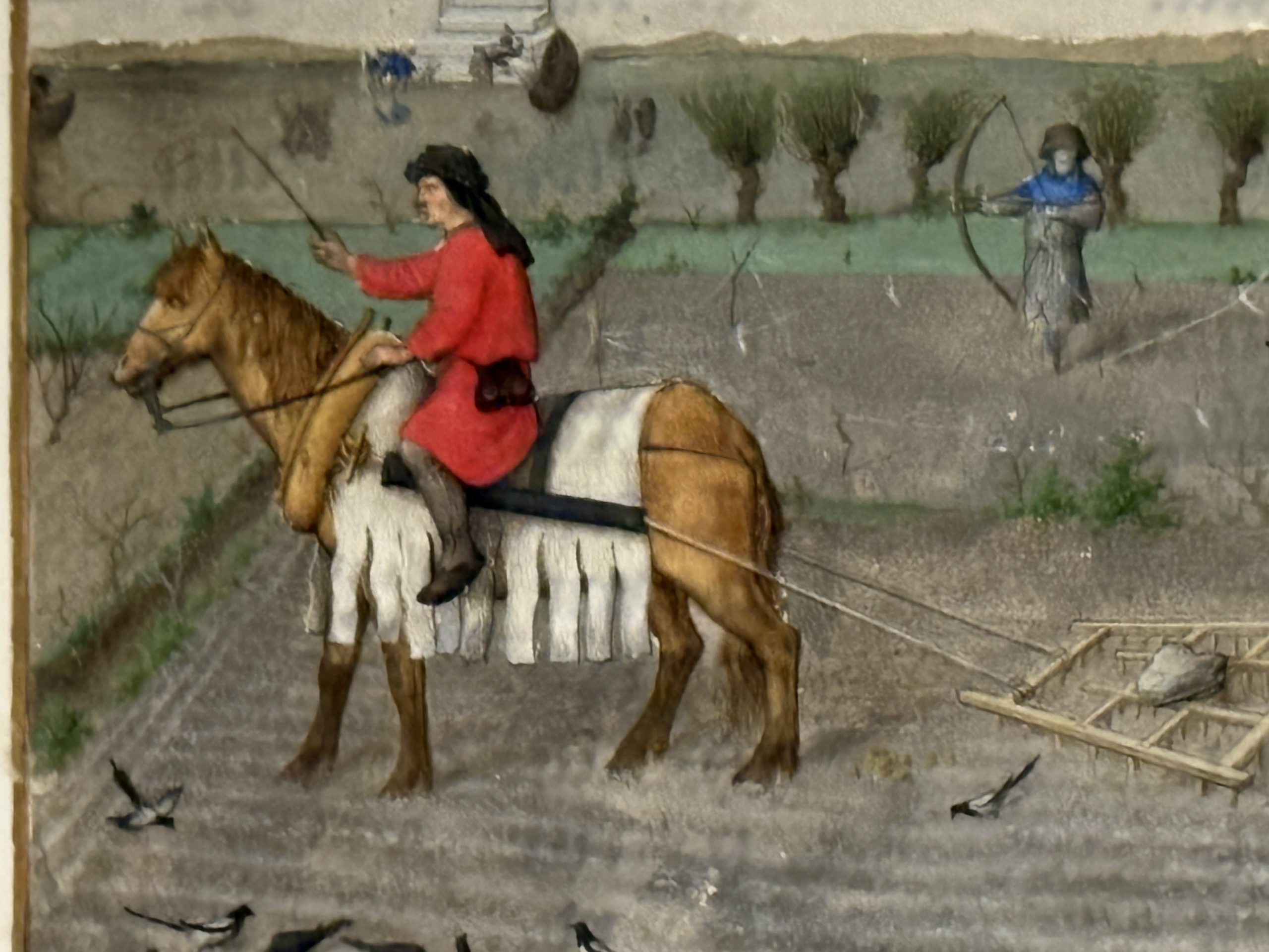
 Below the castle are the tiniest of boats, two of them, each containing a man rowing. Between them the floats for a net attached to each of the boats are shown by tiny dots, and to the left is what looks like a weir.
 Carefully and exquisitely painted is the edge of a stone building with four diamond leaded light windows, and a walled garden with well-kept beds and fruit trees in blossom – appropriate for the month. Some plants are being trained up the back wall – espaliers – and there is a trellis separating parts of the garden.
 But the main focus is the engagement with the four main figures in the foreground. Their clothes are rich and colourful, the ultramarine blue of the man on the right offering the engagement ring is particularly striking, especially in contrast to his gloriously plumed red hat! His bride-to-be looks suitably modest as she accepts the ring; she’s wearing a paler blue gown decorated with a regular deeper blue pattern, which so cleverly changes according to the folds lower down as she hitches up the skirt. Behind them are probably her parents, her mother in a rather sombre black dress but with bright red sleeves for contrast, looks as if she is encouraging her daughter to accept, and her father on the left, in a subdued grey gown with gold trim, is supporting his wife. His gown may be sombre but note that extravagant black hat and those red stockings!!
Two women one in a pretty pink dress clinched at the waist with a gold belt, her flaxen hair loose and falling in waves to her waist, wears a circlet of gold roses, on her head, and her companion, with a rather strangely shaped ultramarine blue hat decorated with pearls and a gold medallion, has a deep blue dress and a black and white over-tunic. It looks as if they may be picking flowers perhaps to create bouquets on such an auspicious day.
Yet again the Van Lymborch brothers have created a wonderfully joyful page, full of details and painted exquisitely.
For more Labours of the Month click on these links: July, August, September, October, November, January, February and https://www.patricialovett.com/march-in-the-tres-riches-heures-of-the-duc-de-berry/