I was absolutely stunned and truly delighted that my latest book for the British Library (published in March 2025) won in the ‘Scholarly, Academic and Reference’ category of the British Book Awards sponsored by the British Printing Industries Federation.
I was thrilled when I heard that the British Library had nominated my book for this Award, even more so when it was shortlisted.
However, I did practise my loser’s smile, not looking too disappointed, but the other book was a worthy winner (as in the BAFTAs)!
 When it came to this category, there were three other books that looked like very worthy winners, and having looked at them, I was pretty sure who would win – not mine.
When the book wasn’t even Highly Commended (Runner Up), I took a bit of a back seat – it had been a good evening, and at least the book was shortlisted.
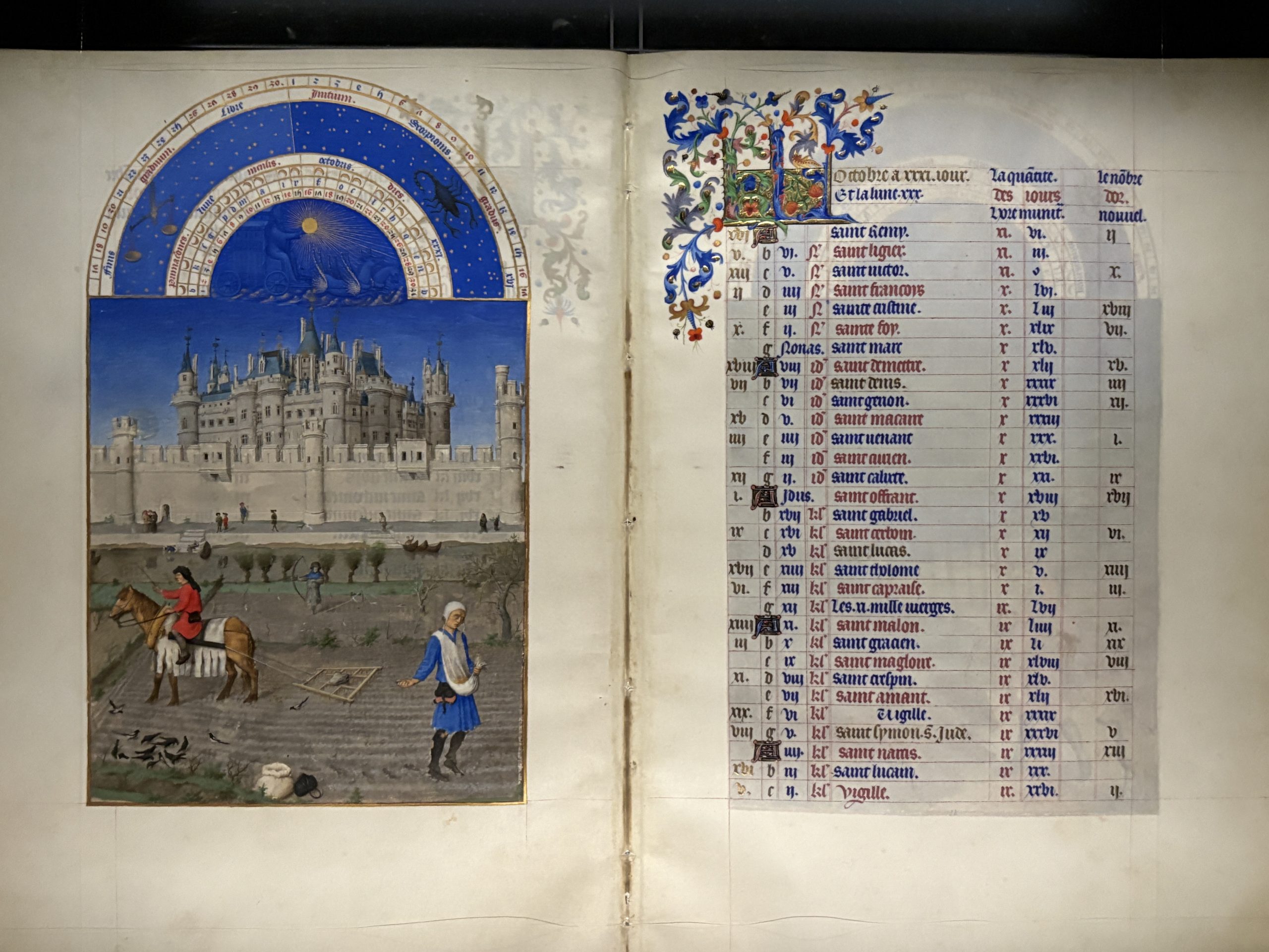
 Then came the ‘And the Winner is …’ moment. I absolutely couldn’t believe it when ‘The Art of the Scribe’ was announced with this citation on the left (also in the ‘Book of Winners and Nominees’ given to everyone afterwards)! It was just tremendous!
 The Award was presented by Heather O’Connell, Publishing Consultant, Coach and Trainer at Bluebird Consulting. When I thanked her afterwards she actually said something on the lines of when we saw your book we hardly thought it worth looking at the others, it stood out so much! Also on the platform was heather herself and Lucy Mangan, artist and author (right)
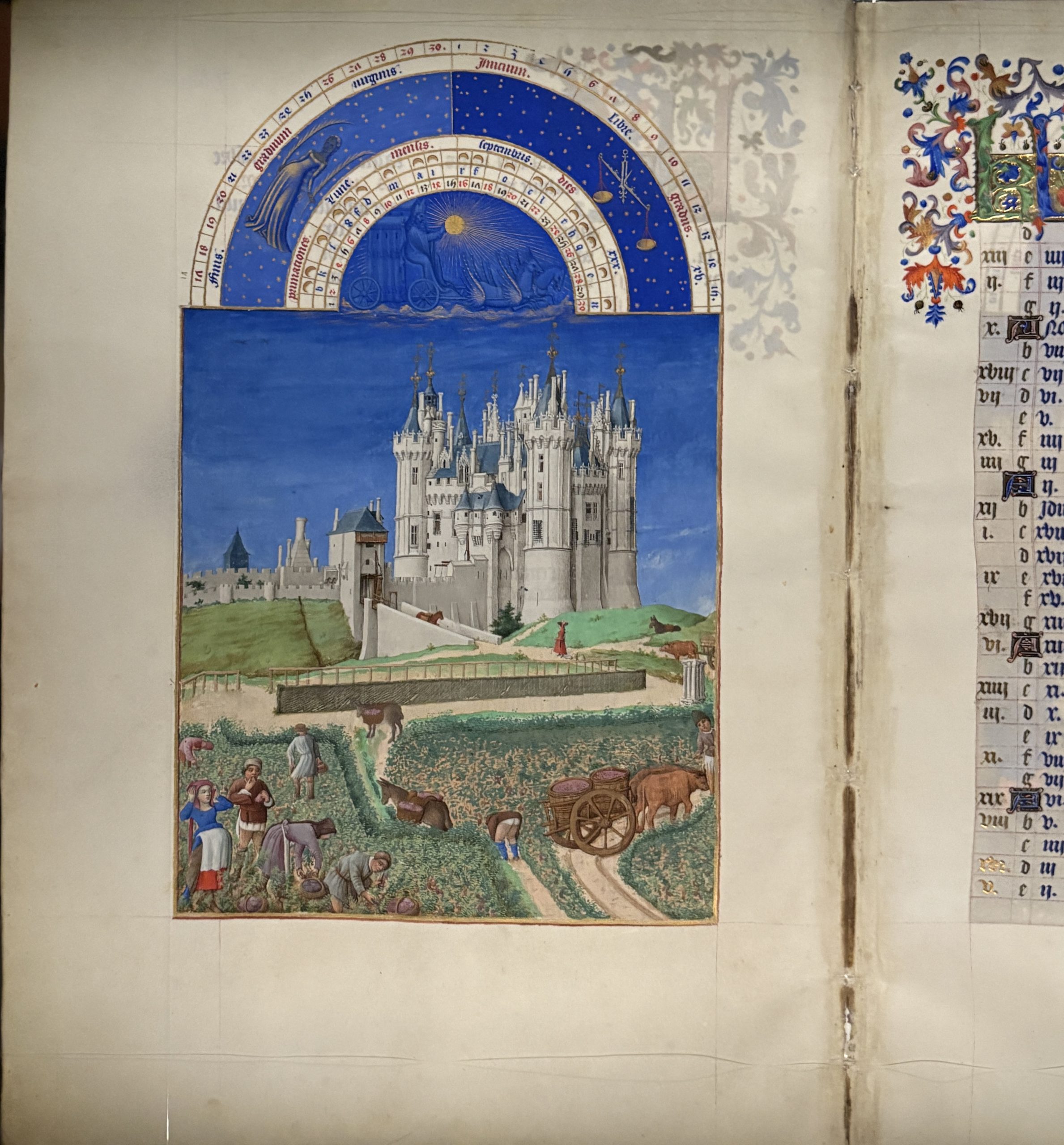
 And the double spread in the ‘Book of Winners and Nominees’ which was distributed after the presentations was a thrill too.