Everything was prepared and ready at eight separate work stations for the 2026 3-day intensive course on the mediaeval tools, materials and techniques of gilding and painting a mediaeval miniature. Everything is provided and nothing needs to be brought apart from an extra seat cushion if thought necessary (there’s already one on the chair!)!
 It is always interesting to see how each group consisting of people from different areas of the country and world, at different stages of their lives, with different jobs, different personalities gel together so quickly, and so it proved to be this year. It was such a lovely group of people to spend three days with.
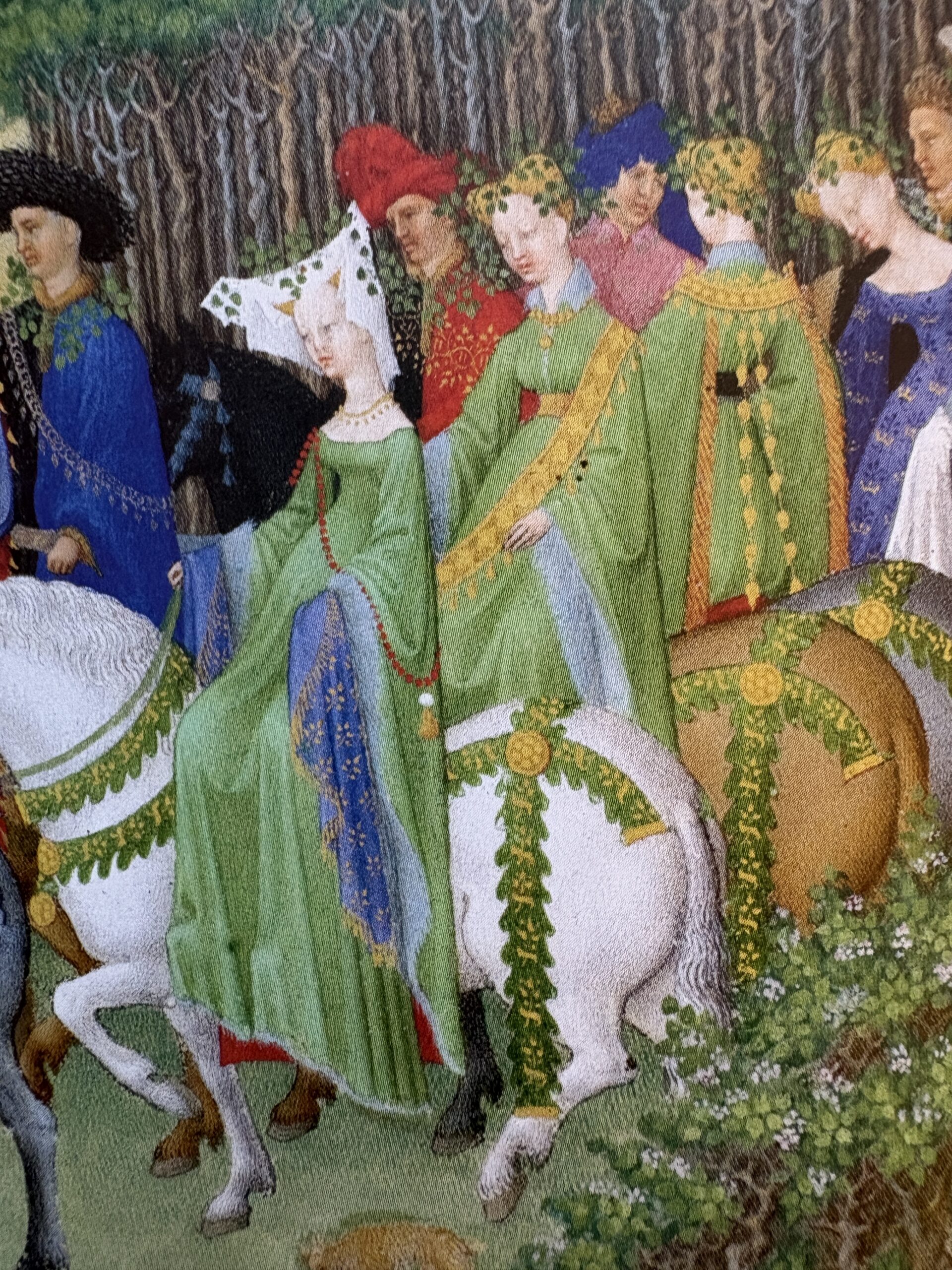
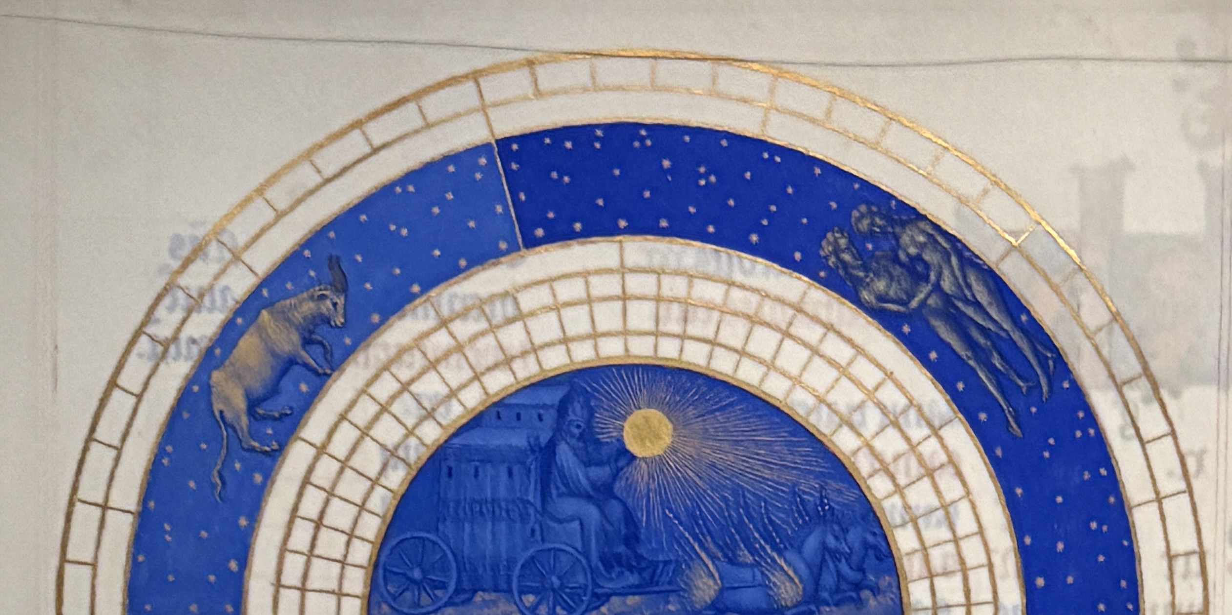
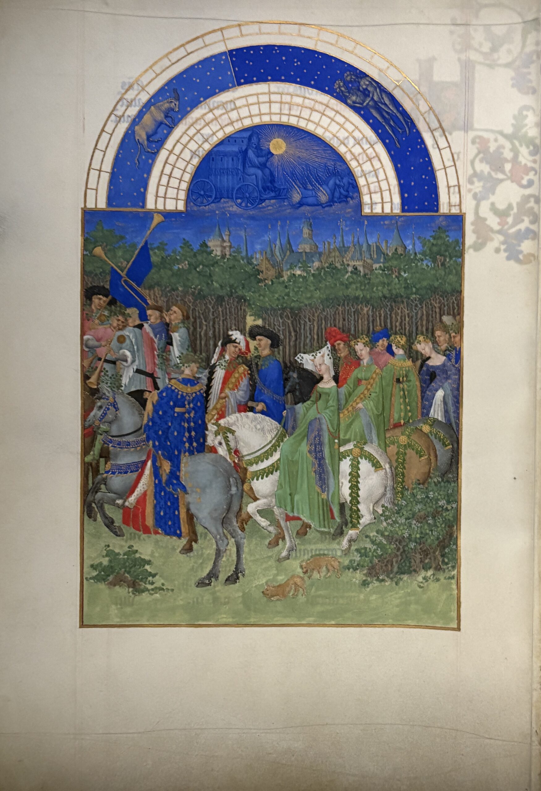
The course covers copying an animal from a mediaeval bestiary – copying takes away all the anxiety and worries about drawing skills (or lack of) – and the stages in creating it. After gesso has been made a quill is cut from a feather to lay the compound which raises the gold leaf from the substrate on a ‘cushion’ ensuring that the shiny leaf catches the light even more. The barrel of a swan’s feather is tough stuff, and cutting a quill isn’t quite as simple as it can look, but everyone finished with a really good quill.
 After the image has been transferred to vellum, the gesso is laid. It is important that the gesso is exactly the correct consistency so that it not only creates that ‘cushion’ but that the surface is relatively smooth.
 Similar to quill cutting, this also isn’t as simple as it looks and it’s important to have the image being copied close by so that the gesso is laid only where there is to be gold.
 Gold leaf – 23·5 carat – is applied to the gesso and that cushion really enables the gold to shine in the light especially when it has the final heavy burnish.
 Then the animals are painted with very fine Kolinsky sable brushes using mediaeval techniques.
 The paint used is gouache as this is the closest to egg tempera as used in historical manuscripts. It is very much a process and at some stage everyone feels as if any painting skills they had have deserted them …
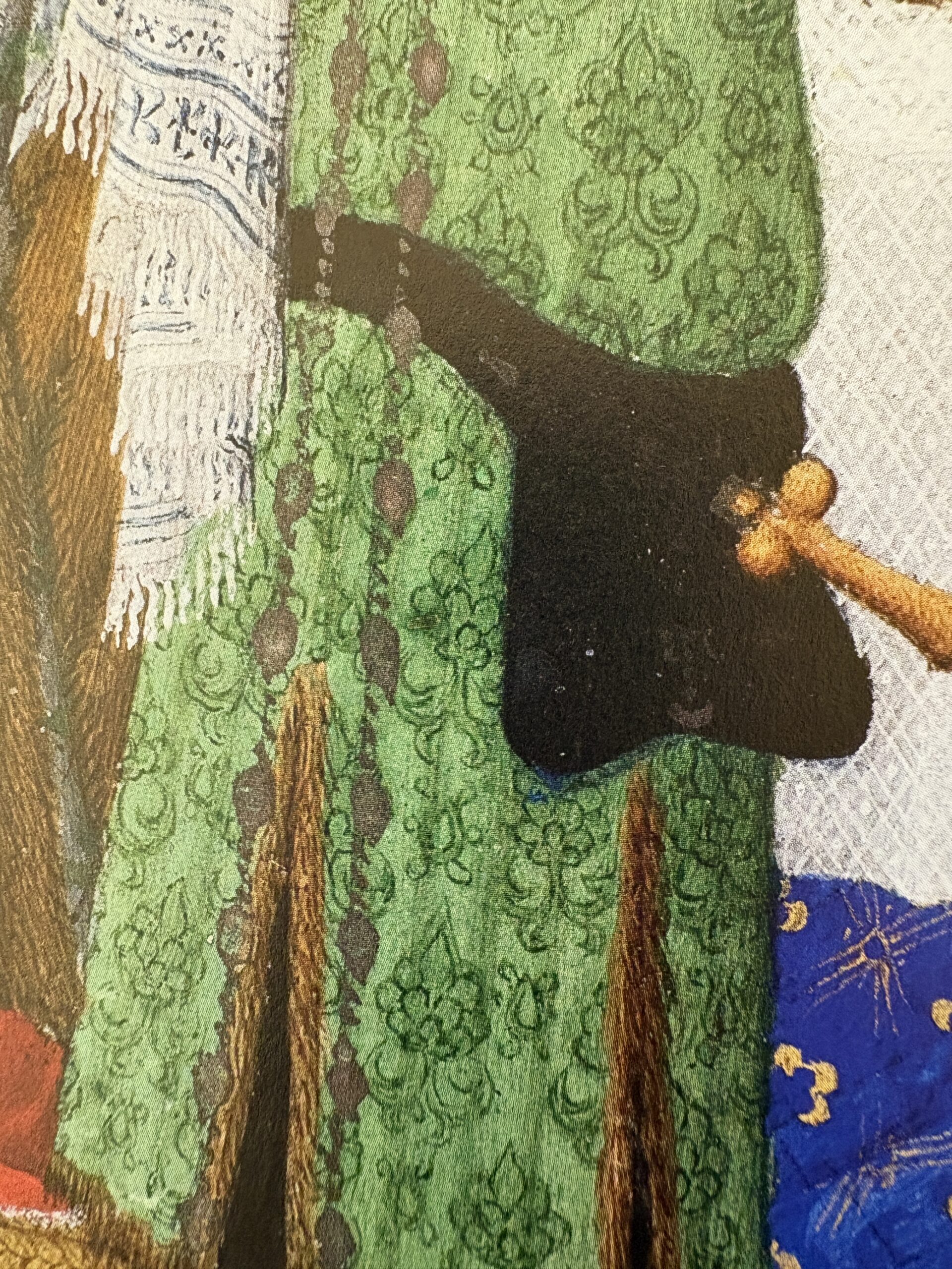
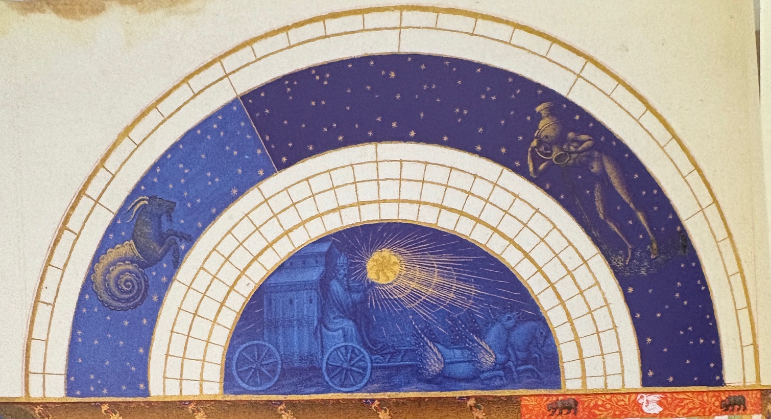
 But when it all comes together, the results look spectacular! The detail of the animals, the shiny gold and the colours.
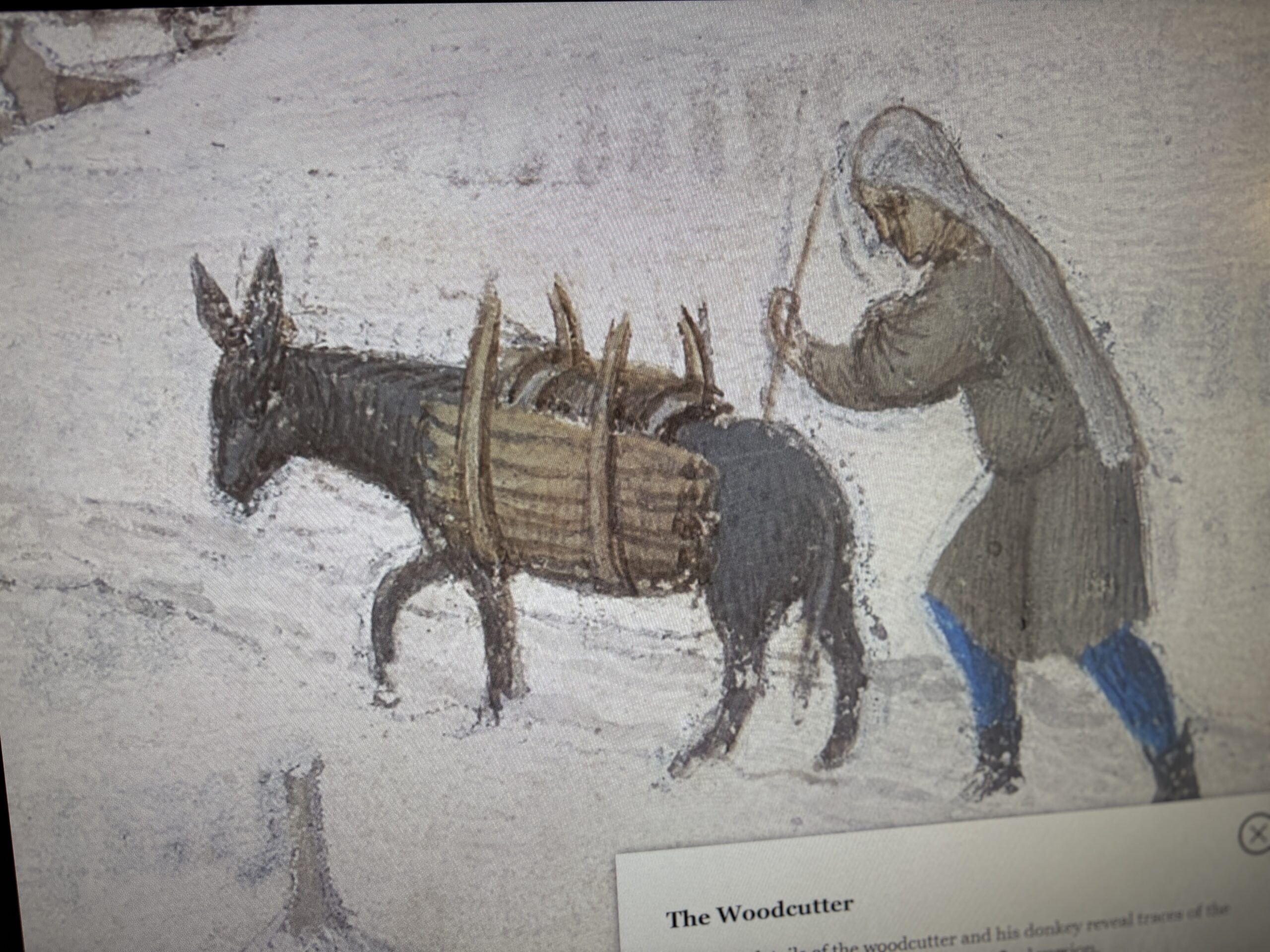
Almost everyone in the group had never done anything like this before. Here (and above) are the results and also comments from those taking part, the comments don’t necessarily relate to the person who created the image.
 Exceptional! I have taught adult ed myself for 20+ years. You are the best teacher I know. An utter privilege.
 Excellent course – very good value for the money.
Overwhelmed with joy!
 All procedures were carefully explained and overall everything was professionally handled and each student had personal encouragement and attention. It was a very enjoyable learning process. Thank you.
 Thank you for sharing so much information. I really enjoyed the course and I learned a lot. I am looking forward to the next one.
 I have not had such fun for a very long time on a course. Not only have I learned how to make an illuminated miniature and all the skills along the way, but I have also learned about myself! Thank you again – thinking about this course will always bring a smile to my face.
 World class! Best course I’ve done.
(This miniature is unfinished.)

I like your instruction style of a demo and then step-by-step guide/walk through. It’s clear and helps with the learning process. This course is really enjoyable, the days are nicely laid out, a lot of information without being overwhelming. I’d recommend this course to anyone.
Courses are run over Friday/Saturday/Sunday in mid-May in Sevenoaks, Kent, UK (trains from Charing Cross in London take about 35 minutes; there is a Premier Inn hotel about 300 yards from Sevenoaks station and lifts to the course can be arranged). Booking opens when I send out my free online newsletter in mid-October. Places go very quickly, so if this appeals then it’s worth being ready to secure your place.