Tag Archives: Rome

Trajan’s Column II

IMG_0281Trajan’s Column in Rome, completed in 113 AD, commemorates the victory of the Emperor Trajan over the Dacians. It is stunning when viewed in real life as it towers over the ruins of Trajan’s Forum and Market, being 98 feet (30 metres) high. The main part of the column consists of a frieze in bas relief which shows in great detail the preparations, movement of troops and battles that took place before the final victory, with Trajan, not surprisingly, being the tallest of all the figures in the column. There are 20 drums in all around which the figures wind, each drum weighing about 32 tons. It truly is a magnificent example of Roman engineering.


IMG_0262It is the base of the column, though, which is most interesting to calligraphers and letterers because it shows exquisitely carved Roman Capitals, regarded by many as the purest examples. It has been only recently (post written May 2024) that it has been possible to get anywhere near this part of the column to view the lettering.


IMG_4762An exhibition in spring 2024 at the Coliseum detailed how the column was constructed. Huge blocks of Carrara marble were moved from the quarries in Lunigiana sliding on wooden poles and being pulled by a team of oxen.


IMG_4764The stone drums were shaped into circles and the inner staircase cut as well. What is amazing is the accuracy of each block which had to fit on the next. The masons also had to allow for the fact that to make the columns look straight, there needed to be a swelling just below half way. This is explained in a blogpost on this website here. The huge round blocks were then loaded on to ships using a system of pulleys and a lot of labour as shown here.


IMG_4767 2Once at the forum, they needed to be put into position. The stone blocks were far too heavy to use a simple system of pulleys, and so a tower was built as here.

Either side of the column were two libraries, one for Greek texts and one for Roman, with bookshelves to store the scrolls. It was possible from balconies on these buildings to view the carvings spiralling round the column close up.


IMG_4771At the base of the column during construction was a huge wooden treadwheel. A similar one is shown carved into the family tomb of the Haterii. During the reign of Domitian (81–96 AD) Haterius was working on the construction of buildings and would have used a treadmill as the one carved on his tomb. The treadwheel had 5 men inside and ropes held by more men outside acted as brakes. There were two parallel wide poles creating the crane’s mast between which was the wheel’s axle; this all made up a strong block and tackle system.


IMG_4768 2This is shown more clearly here. The sheer mass of the wood being used for construction is amazing, and also the strength of the men using this machinery.


IMG_4737The spiral stone staircase carved inside the blocks led to the top of the column where there was a viewing platform. It must have been quite a sight, climbing the stairs and reaching the top for a view over Trajan’s Forum and the main Forum itself!


IMG_4812But, of course, it is the carvings on the outside of the column that are the true stars! Twisting round the column, with no allowance given from one stone drum to the next, a narrow carved line stands proud and separates the scenes one from another.


IMG_4823Here preparations are being made for the battles, with Neptune looking on benignly, no doubt giving his blessing to the campaign. The detail on the clothing, the wooden ships, the horses, a wooden bridge and building walls is really wonderful.


IMG_4821And even the base has the same care and attention to detail, with enviable precision of carving. Note the carefully carved garland of individuals leaves, and the metal ‘scales’ on the cuirass in the middle.

It truly is one of the wonders of the ancient world, and still astounds today.


Trajan’s Column

IMG_0299We have been fortunate enough to visit Rome in Italy a few times and on each occasion I make a pilgrimage to Trajan’s Forum intending to see if I can view the lettering at the base of the column. But every single time the Forum has been closed for renovations and as the lettering is on the side of the column facing into the Forum, the lettering has been impossible to see!


IMG_0313I want to see the lettering up close because it’s regarded as one of the very best examples of Square Roman Capitals. The column was erected to celebrate Trajan’s victories in the Dacian (present-day Romania) wars between 101 and 106 AD and was completed in 113 AD. It is thought that the architect was Apollodorus of Damascus. The victories of Trajan were significant. It’s estimated that he brought back half a million pounds-worth of gold and a million pounds of silver.


IMG_0308The column is simply magnificent – it’s 98 feet (30 metres) tall, but when the pedestal is taken into account it’s even taller at 115 feet (35 metres), and consist of 20 drums of Carrara marble placed one above the other. Winding round the column is a 620 feet (190 metre) frieze with carvings of the wars between the Romans and Dacians. There are 155 scenes with 2,662 individual figures and they have even been used as an historical source for the clothes worn at the time.


IMG_0306

The inside of the column is hollow and there is a spiral staircase winding to the top; there are narrow rectangular windows placed around the column to give light to this staircase which can just about be detected (there’s one just to the right of the arch almost in the centre of the top visible spiral, and then another beneath it three spirals down. In 1787 the German poet Goethe climbed to the 185 steps to the top to ‘enjoy that incomparable view’. Placed on the platform there  was a bronze statue of Trajan but this was removed by Pope Sixtus V in 1588 and replaced by a statue of St Peter.


IMG_0258So there we were last month on our first morning, looking at Trajan’s Column and I happened to spot that the gate to Trajan’s Forum, which had always been firmly padlocked before, was open and it was possible to go down steps to the Forum. There was a kiosk selling tickets – it was open! We immediately bought tickets and I turned hoping to be able to stand in front of the column to view the lettering only to find this section was roped off and thus inaccessible! Without any Italian I tried to explain that I have visited Rome and each time been disappointed by Trajan’s Forum being closed as I really wanted to see the lettering at the base of the column. They very kindly lifted the rope and I was able to realise a long held dream of standing in front of the column and gazing at the lettering. The sun on the letters brought them in to sharp relief and it was such a privilege and thrill to view this panel of exquisitely cut letters that had eluded me for so long.

IMG_0262They really are magnificent! And the sun light added to the exhilaration. The letters also looked so fresh despite the fact that they are two thousand years old. At this point I do have to acknowledge that whoever it was who made the decision to cut into the inscription to allow for the roof of a porch to be built deserves every punishment they should get!

IMG_0265Standing at the base of the column and looking up the letters look very regular and even, but the top row of letters is considerably larger than the lowest row to allow for perspective – the Romans knew about this even then!


IMG_0270Each letter is so precisely cut and is a fitting tribute to the victor of the wars. And yes, if we go back to Rome, I shall indeed on the first day make my way back to Trajan’s Forum to view the lettering, though I may not be able to persuade the ticket seller to let me cross the barrier again!


Roman Capitals

ada9a09acea936d776a6f55c82778c43_LLettering at the base of Trajan’s Column at one end of Trajan’s Forum in Rome is regarded by many as one of the best example of Roman Capitals. These majestical letters, with beautiful proportions, are one of the purest guides for any who want to study the proportions of Roman Capitals. On a recent trip to Rome, I was determined to take the best photograph I could of this block of lettering. For many years this Forum was closed for restoration (it is the other side of the road to the main Forum), but I had read that Trajan’s Forum was now open and so I could stand in front of the column and get a good shot.


Lettering at the base of Trajan's ColumnGood fortune was clearly not smiling on me, as when we were there it was closed yet again, with no date for re-opening, and this was the best photograph of the lettering I was able to get – not what I had planned at all, and only from a side angle. The letters are not narrow as they look here, but grand and rounded. Notice also the way in which a later roof for a porch of an access door has been cut into the last line of the lettering. Interestingly, which you may just be able to make out here, the height of the letters on the top line is greater than the next, and so on until the bottom line. This is because the letters were designed to be viewed from the ground, and by having larger letters at the top, they would look all the same.

Triumphal Arch of SeptimiusThere are examples of stunning Roman Capitals all over Rome (including all the modern street names). This is the triumphal Arch of Septimius, just across the road from Trajan’s Forum in the main Forum. It is best viewed, as here, by not going into the Forum itself, but climbing up the path behind the Vittorio Emmanuel monument. The letters were originally bronze and you can make out in close-up the small round darker areas which indicate the attaching pins.

Lettering on one of the tombs in the Via Appia, RomeUndaunted by inaccessibility to Trajan’s Column, I knew that there were really good examples of Roman lettering attached to the tombs along the Via Appia, some way out of the city centre and a long walk, but certainly worth a visit. This is just one example. The letters are beautifully cut in marble, and generally their proportions are good – although the letter N is rather too wide in most examples. However, spacing is not always as good as the letter-forms, lines 9 and 11 being examples of letters pushed too tightly together. David Kindersley, the great letter-cutter, used to say that a bad space is worse than a bad letter. See my Calligraphy Clips on spacing.

Pantheon, RomeThe Pantheon, the temple to all gods, has some majestical Roman lettering along the top of it. From this you can see how wonderfully clear the letter-forms are. We were standing quite a long way away yet it is clear that Agrippa was involved and it was made (FECIT)!


Rome street signEven road signs around building sites look good in Rome when Roman Capitals are used, but if we’re also looking at spacing, slightly blur your eyes. The ROM is fine, but perhaps the letter ‘A’ is slightly too far to the right. It is the ‘PIT’, though, in the middle of ‘Capitale’ which really stands out. The letters ‘I’ and ‘T’ need to be further to the right, and join up more with ‘ALE’. But this is being really picky when such a good use is made of this wonderful lettering style.


Diagram of Roman CapitalsSo what are the proportions for Roman Capitals shown in all these examples? Allowing for the fact that letters need to breath, and don’t always conform, generally speaking the letters in Roman Capitals are regarded as being based on a circle that can be encased within a square, as shown here. Obviously the letter O is that circle, and Q too with its tail (notice it poking out to the right). The letters C, D, and G are also formed from parts of that circle. You can trace them with your finger over the red lines.


Asymmetrical letters, then, are narrower, and the width of half of a square, as shown on the left of the diagram. These are B, E, F, J, K, L, P, R and S.

The odds are the letters I and W. Obviously the letter I is a vertical line. The Romans, very sensibly, had nothing to do with the letter W and it is an awkward letter. Nowadays it is regarded as two very slightly narrower Vs.

HCA Awards logoTo see how Roman Capitals can be made to sing, look at this wonderful example of lettering from Tom Perkins for the Heritage Crafts Awards. THIS is how Roman Capitals should look when they are made into a distinctive personal style.

But lettering should not have a rigid a straight jacket, but room to allow it to breath, so the letter R has a tail that sensibly extends beyond that half a square and the top bowl is larger than that of the letter P, the top and bottom bowls of the letters S and B are not equal in size, and so on. Studying the proportions of Roman Capitals is a good first step, but keeping rigidly to them is not the best second step!

Books you might find useful:

Patricia Lovett, The British Library Companion to Calligraphy, Illumination and Heraldry

Patricia Lovett, The Historical Source Book for Scribes

Lida Lopes Cardozo Kindersley, The Annotated Capital

Lida Lopes Cardozo Kindersley, Letters Slate Cut

Tom Perkins, The Art of Letter Carving in Stone

Edward M Catich, The Origin of the Serif

L C Evetts, Roman Lettering

Cosmati pavements

Cosmati pavement, Westminster Abbey

The Cosmati pavement at Westminster Abbey, laid down in 1268 on the orders of Henry III, was covered by a carpet for over 100 years. It has recently been restored and the wonderful colours and riot of swirls and whirls has now been revealed. The pavement is particularly special because it is one of the very few in the UK and the only one in such a complete state. (There is an excellent website with much more about the Westminster Cosmati pavement, how it was restored, the lettering, and the history on this link.)

cosmati_inner1The pavement is 7·5 m square and in the Sacrarium or Sanctuary, butting up against the three steps going up to the High Altar. This position must have indicated its importance and significance when the floor was laid. It’s on this pavement that the throne will be placed and the next king will be crowned. Interestingly, during restoration it was found that many of the stones were antique and were salvaged from Roman buildings, presumably in Italy. It is also different from other Cosmati pavements because the background is dark Purbeck marble, rather then white Italian marble as with all other Cosmatesque pavements

Santa Maria Maggiore
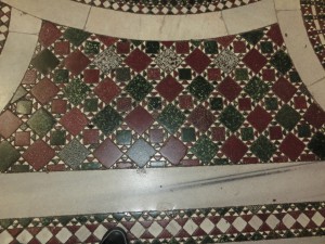
It was, in fact, in the church of Santa Maria Maggiore (a splendid building and certainly worth a visit if you are in Rome) that I first noticed the floor, and was intrigued by the patterns and the design, and wanted to find out more. An enlargement of the floor in this church in Rome is on the right.


Monreale Cathedral

Seven members and four generations of the creative Cosmati family based in Rome worked from before 1190 to 1303 and made decorative floors, pulpits, thrones, choir screens and tombs for churches. Colourful and sometimes patterned pieces of stone were cut into geometric shapes of triangles, circles, squares and rectangles and laid in a matrix of white marble. (Right: Monreale Cathedral)


Santa Maria in Trastevere, RomeThe first work of the Cosmati family was by Lorenzo Cosmati in a church in Fabieri in 1190, and the last recorded work was by Deodato who died in 1303.Their name gave rise to the style of pavements which are now in a number of churches, such as the Church of Santa Maria Travestere on the right which is an impressive display of wonderful patterns and colour.


Two Temple PlaceAnd you don’t have to travel to Italy  to see another great Cosmati pavement. There is one at Two Temple Place, which was built for William Waldorf Astor in 1895. Now the house is a gallery and open only during exhibitions. There is a lot of glorious craft in the house, so it is worth visiting if you can. (Right: taken from Two Temple Place written by Barbara Bryant, used by kind permission)

San Cataldo church PalermoIt does seem quite amazing that this one family, the Cosmatis, working for just over 100 years in the Middle Ages, gave rise to something that is still in evidence today and wanted by some of the richest people in the world in the 19th century for their town house. These pavements are walked over by thousands of people yet also delighting those who care to pause and look down. (Right: San Cataldo Church, Palermo.)

Codex Amiatinus – a very English book with an Italian name


St Paul's, Jarrow
Abbott Ceofrid (pronounced Chalfrith) must have been a remarkable man. At the beginning of the eighth century, he was in charge of the twin foundations of St Peter’s at Monkwearmouth (now Sunderland) and also St Paul’s, Jarrow (right), both on or very close to the coast on the far north-east of England. The church buildings have evidence of Anglo-Saxon work, and although both have been much altered, it is still possible to get something of the feeling of what it must have been like at the time of Ceolfrid and Bede; Bede lived at Jarrow.

cod amIn 692, Ceolfrid commissioned three great pandects (all the books of the bible in one volume) to be created, one for Monkwearmouth, one for Jarrow and one to take with him when he went to see Pope Gregory II in Rome; this last book became the Codex Amiatinus. The date is fairly certain because it was in that year that the twin foundations were given a grant of extra land, needed to raise the cattle required for these books. (Map of Jerusalem on the right from the Codex Amiatinus)

Each of the three books had 1029 leaves from calfskin, which was of exceptionally fine quality. The books were large, one calfskin would have had the edges trimmed and then folded in two to make four pages. It’s been estimated that 2,000 cattle were needed for the project, and it should be pointed out that these would be calves, not fully grown mature cattle because their skin is too thick and unwieldy. The books weighed over 5 stone each (75 lbs, 35 kg), and would have required two strong people to move them once bound.

page from Cod AmiatinusThe writing in the Codex Amiatinus is a particularly fine uncial script (opening of St Mark on the right), and for many years was thought to be produced by scribes in or from Rome because of its quality. It must have taken years to produce three great books; seven scribes have been identified and there is evidence that the Venerable Bede was involved in the project. It was only at the beginning of the last century, and then only because of its similarity to other manuscripts known to have been produced at Monkwearmouth/Jarrow, that scholars agreed that the books would have been written by English scribes in England. There is no punctuation, but sections start with a large initial, and it is written as per cola et commata, which means that it is set out as clauses in a sentence, and indented as such. It is remarkably easy to navigate despite there being few illustrations or big headings.

Ezra page, Cod AmiatinusThe text is an almost pure form of the Latin Vulgate translation of St Jerome (the language used at the time, nothing to do with it being ‘vulgar’), and is thought to be have based on a book called the Codex Grandior, an Italian 6th century book, and again a pandect, but now lost. Benedict Biscop, who has recently been adopted as the patron saint of Sunderland, was the founder of the monasteries, as well as being Ceolfrid’s predecessor. He and Ceolfrid visited Rome in 678 and brought back books, including the Codex Grandior, bought from the library of the Vivarium, a monastery set up by Cassiodorus, on the site of modern Santa Maria de Vetere near Squillace, in Italy. (Right: The Ezra page from the Codex Amiatinus)

Two of the pandects stayed in England at Jarrow and Monkwearmouth, but, when he was 74 years of age, on 16th June in 716, Ceolfrid set out for Rome with the third book. It must have been a tearful departure as the monks knew they would not see their dear abbot again. Sadly, Ceolfrid didn’t get to Rome but died at Langres, Burgundy, in France on September 24th the same year.

Codex_Amiatinus_(dedication_page)By the 9th century, the pandect was at the monastery of Monte Amiata, near Siena, which gave the book its current name. It remained there until 1792 when the monastery closed and it was taken to the Laurentian Library in Florence, where it is to this day. In 1888 a scholar called Giovanni Battista de Rossi noted the similarity in text to the bibles mentioned by Bede, and also noted that the dedication of Petrus Langobardorum (Peter of Lombardy, see right, line 5) had been added over Ceolfridus Anglorum (Ceolfrid of England) which had been partially removed. This was one of the great Ceolfrid pandects.


Greenwell leafWhat happened to the two books that stayed? We have evidence that one was presented to King Offa when it was thought that it was a book from Rome, but that hasn’t survived, and nor has the other. However, individual leaves have. The most famous is the Greenwell leaf (right) discovered by the Reverend Greenwell in an old register that he said he bought in Newcastle. Other leaves have turned up including one from a book found at Kingston Lacy; mainly these are used as binding waste, which is why they are often discoloured and with pieces cut off.

So the Codex Amiatinus, one of the most famous books in the world because of its purity of text and script, is actually an English book produced by English scribes from Northumbria. Perhaps its name should be changed to Codex Northumbrianus (or whatever the Latin translation would be!).

Was Moses Born with Horns?

Michelangelo's Moses, with tablets and hornsThis very famous Michelangelo statue from the Church of San Pietro in Vincoli, Rome, shows Moses with the most exuberant and lush beard, which he seems almost to caress with his left hand, which is at the same time holding the stone tablets of law. However he also has two horns sprouting from his head.


God instructing Moses (with horns), Aaron (as a bishop with mitre and crozier) and an attendantImages of Moses with horns were used in manuscripts, too. This delightful miniature in a British Library manuscript of a rather youthful God, possibly a golden angel peeping over his right shoulder and clearly in a blue sky, is explaining the proper forms of sacrifice to a rather young horned Moses (unbearded, unlike the wonderfully soft curly bearded locks of Michelangelo’s Moses), a young Aaron – shown as a Bishop with his crozier and mitre – and an attendant.


Miniature from the Bury Bible showing MosesA favourite manuscript, the twelfth-century (about 1355) Bury Bible, now in the Parker Library at Corpus Christi College in Cambridge, has magnificent miniatures (although some are almost 30 cm, one foot square, so not so mini, though more on this in a later blog) painted by ‘the incomparable Master Hugo’. This is one is two-storey and shows Moses, in the upper part he is instructing the Israelites using the recently received laws, and below that, Moses is pointing out the birds and animals Jews can and cannot eat by law. The Jews are recognised by their Jewish hats – brims with a conical middle part. Moses has bright white, very obvious horns. Note, too, the stunning borders, intricate colourful patterns on a black background which are very characteristic of Master Hugo. Another design device he uses is to paint a plain dark green rectangle behind the main figures, which focuses the viewer on the central action. Master Hugo’s palette and painting style is quite simply stunning (more on this later too).

So why should Moses be shown with horns in this way? Was he born with horns? Other images of Moses, before he went up on Mount Sinai show Moses un-horned, so it was when he went to get the tablets of law from God that the horns appeared.

There are some theories about this. First, when Jerome was translating the Old and New Testaments into Latin Vulgate in the fourth century, it is thought that he may have mistranslated the Hebrew word qaran – meaning to shine – to qeren – meaning horn. As Hebrew was usually written without vowels, this confusion is understandable. Horns can also be quite shiny, so context is quite important. This theory seems perfectly reasonable and is one that many find very plausible.

However, when Jerome translated this text into Latin his words were: splendor eius ut lux erit cornua in manibus eius ibi abscondita est fortitudo eius (Exodus 34), which can be translated as: His brightness shall be as the light: horns are in his hands; There is his strength hid.

Now the horns seem to be not on Moses’ head but in his hands!

Others have thought that again there is no confusion by Jerome. The sun’s rays can be considered as horns in shape, and horns can be polished until they shine and reflect the light.

Statue of Pan, with horns, and DaphnisSome feel that horns are a symbol of ancient mystery. Greek and Roman gods, such as Pan (seen right with Daphnis), Triton, Dionysos, and Bacchus were horned, and so the special god-like attributes of those with horns – those who were divine and honoured – may have been applied by artists to Moses once he had received the tablets of law from God.


sculpture of Moses with horns that look like beams of lightOn a recent trip to Rome, I was delighted to see in the Piazza di Spagna, close to the Spanish Steps, at the base of the Colonna dell’Immacolata, a statue of Moses where the sculptor had decided to cover every eventuality. Here is Moses holding the tablets of law and with horns on his head, but the horns are shown as beams of light as well!