Author Archives: Patricia

More Sheila Waters’ prints

50mbroundel-copy-2PLEASE NOTE: I am no longer selling these prints but have left up this post for interest.

This is Sheila’s wonderful Roundel of the Seasons. This is a tour-de-force of subtle colour change and inspirational strong and delicate calligraphy.


sw-decoratedalphabet-copy-2This intricate alphabet comes in green and pink. Notice how detailed the decoration is.


sw-music-copy-copyThis strong black and white piece with a musical text is very much in harmony.


sw-whatisman-copy-2This dramatic piece really packs a punch – it is a masterclass in contrast.


sw-donotstand-copy-2A delicate piece but powerful piece.


sw-forman-copyAnother wonderful dancing black and white artwork.


sw-sonnet-1-copy-3The last one shows Sheila’s terrific sense of colour, with a dancing delicate script.


‘Meetings with Remarkable Manuscripts’ – Christopher de Hamel

img_1771Any book written by Christopher de Hamel is always worth a second glance, but this new book – Meetings with Remarkable Manuscripts – is one you will find hard to put down again! Christopher has such an easy writing style which, in this book, seems almost as if he is sitting by you as you turn the pages in each of twelve featured major manuscripts, explaining what is on the page, and adding nuggets of information, popping up like jewels of wisdom to make each one even more real. As he explains, manuscripts are a direct link with people in the past – the book is something that they held, owned and looked at. They pose many interesting questions, and Christopher answers a number of them.


ccc286-f129vEach of the twelve manuscripts has its own chapter, and the books range from the sixth-century St Augustine’s Gospel to the sixteenth-century Spinola Hours. A unique feature is a photograph of the book itself, showing the front cover, and scaled to the Codex Amiatinus, the largest codex in the book, and shown as large as Christopher’s book will allow; this allows us to see the relative size of each manuscript. The St Augustine’s Gospel is, of course, well known to the book’s author, as this is a manuscript in the Parker Library at Corpus Christi College in Cambridge, of which Christopher is currently the librarian, although he is due to retire at the end of 2016. The Gospels just c o u l d have been a book brought over by St Augustine himself in 597 or sent by Pope Gregory the Great to help the saint in his mission soon after. You will have to read the book to see whether it was, but also to find out at first hand what it is like to be the person with the responsibility of not only transporting the Gospels when each new Archbishop is enthroned, but being the person carrying the book in the procession.

411101098The Leiden Aratea, can be viewed digitally here, but there is nothing like seeing a manuscript up close and personal. This is what Christopher has done with all twelve manuscripts. The Aratea comes from the name of the astronomer Aratus of Soli, and the book contains thirty-nine full-page illustrations of the constellations. The lettering is in fine Rustics, and the image on the right shows Arcturus major and Arcturus Minor, the bears between a coiling snake, which mark the north pole, and the stars of the constellation are indicated by gold squares. Perhaps we know the constellations better as Ursa Major and Ursa Minor with the north star. The book’s links with its Roman ancestry are pointed out by Christopher and then he explains why it is definitely a Caroline manuscript. All aspects of each book are considered, including the known history of the manuscript, how it came to be where it is now, and also the making of facsimiles.

fkp00024vThe Copenhagen Psalter (book of Psalms) is the sort of illuminated manuscript that anyone who thinks of the same would have in their mind’s eye. It is littered with richly illuminated pictures which tend to have rather bad-tempered figures, as on the right – the Presentation in the Temple (note the two little birds being carried in a basket, and two others being held). The ‘single’ eyebrow, with a slight dip over the nose, is usually the reason for the appearance of crossness. Mary, here, doesn’t look at all happy at what is about to happen. Where the book was written, where it was illustrated, and the fact that it’s not complete, are all included in this chapter.


spinoladeathThe Spinola Hours are now in the Getty Museum in California, certainly a place to visit if you have never been, not least for the setting, but also for the wonderful collection of manuscripts, a number of which are usually on display. The Spinola Hours is larger than most books of hours, and lavishly decorated with the most realistic of paintings which, at the start, depict the seasons in the calendar. The scenes are incredibly complex and once described as ‘the most pictorially ambitious and original sixteenth-century Flemish manuscript.’

However, these are only mere flavours of what this book offers the reader. Each chapter describes the library or museum in which the manuscript is currently held, how it got there as well as the book itself. It is eminently readable and is most highly recommended for both those with an interest in manuscripts as well as those without. This book will change the view of the latter in that there is a great deal to be learned and appreciated from these wonderful relics of times past. Put this book on your Christmas or birthday list and hope that someone reads your list; you won’t regret it!

Gilding and painting a miniature of a female martyr

cimg2855I had been asked to speak at the Houghton Library, and teach and give a demonstration at Harvard as part of the wonderful ‘Beyond Words’ exhibition there. Taking a lot of tools and materials on a plane is not sensible, and so I decided to almost finish a tiny miniature shown in the exhibition, which is a cutting from an Italian mid-fifteenth century Anitphonal (Harvard University, Houghton Library, MS Typ 983), and then add some more gold and paint more as a demonstration. The original female martyr, holding her martyr’s palm, had a bit of a double chin and a rather unfortunate expression, so I decided to do a bit of cosmetic surgery on her, and make a few adjustments (if only it was that easy in real life!).


cimg2833I selected a piece of vellum which had hair follicle markings on it and traced down the outline in red (minium) which is traditional. I then laid gesso ready to receive the real gold leaf.


cimg2834I planned from the start not to gild it all so that I could show how it was done when I went to Harvard.


cimg2835Then it was on to painting the base colours. At this point, as always, any painting skills that you think you might have seem to go out the window (!).


cimg2855However, once the shades and tones, fine lines and details are added, suddenly the whole thing seems to come to life. The face, hair, hands and delicate white tracery on the blue background are very finely painted indeed, the dress and left-hand side of the initial ‘D’ less so. It is quite possible that the ‘master’ did the former, and an apprentice did the slightly less-well executed ‘colouring in’. It was a very interesting exercise and I do hope that Harvard find it a useful addition to their teaching repertoire.

The Brentwood Charters

cimg2583One of the more unusual commissions I had recently was to copy out two thirteenth-century charters on to vellum panels, and write the translations underneath.


cimg2585The charters granted the rights to a weekly market and an annual two-day fair to the district of Brentwood (Bois Arsus, Brendewode, and Burntwood); one was dated 1227 and the other 1252.


cimg2568
This may seem straightforward – until you see the actual charters, as one of them on the right. The earlier one of 1227 had a great many contractions, and I was most grateful to Tessa Webber at Cambridge University for very kindly transcribing it for me, so at least I was able to try to decipher whether a Latin word started with ‘min…’ or ‘uni…’ or ‘niu…’ etc! The later charter of 1252 was slightly clearer, but it still meant that I had to resort to my scant knowledge of mediæval Latin on occasion.

cimg2556The width of the panels was determined by the charters themselves, and I felt that there should be a consistency between the two panels in terms of size, shape and layout, even though this may mean larger gaps between the copied Latin and the English translation (as in the first panel above). I was able to get some wonderfully marked skin from Cowleys and cut pieces to size before stretching them. The excess was ideal to use for determining how much preparation was required for each skin.

cimg2560Then it was time to rule the lines with a 4H pencil and the sliding rule of my sloping board. Distances between the lines were marked with dividers.


cimg2563I started with the translations. The two charters were in totally different hands, albeit being only twenty-five years apart, but I thought it important that the translations should be in the same writing style, trying to marry together the hands on the two charters rather than choosing any particular calligraphic style. Also, the writing needed to be legible for those who wished to know what the Latin in the charter meant.

cimg2562This is a close-up of my first efforts. I thought the final effect too heavy and dominant and so chose a smaller nib which seemed to balance the writing in the charters better.


cimg2480The writing in that period of time was Gothic, but Gothic Black Letter majuscules are so difficult to read, so again I devised a style, this time based on Gothic Black Letter and Gothic Cursive. I used a five-diamond cross to separate the title from the date, as this looked more in keeping than the simple dash. The titles were written in vermilion.

cimg2589The third panel, on paper the same size as the stretched vellum, explained about the charters, what they were written on and the pen and ink used originally. The cost of the charters was met entirely by sponsors who commissioned the panels (The Brentwood Borough Renaissance Group, Brentwood Chamber of Commerce and the Essex Farmers’ Markets Ltd) and Clive Othen, Chair of the Brentwood Chamber of Commerce and the Brentwood Borough Renaissance Group, was the driving force behind this project. Dr Jennifer Ward translated them. Clive and Elaine Richardson from the Borough were some of the best clients I have worked with and I hope the panels prove interesting to those who live in Brentwood and others who visit.


‘Art of the Islands’ by Michelle Brown

img_1727Michelle Brown is a prolific author, yet every additional book comes with new insights explained in her inimitable user-friendly way, and this volume is no exception. It covers the period from c. 450–1050 AD, that is from the departure of the Romans to the incoming of the Normans and their conquest. The book is beautifully produced and the illustrations particularly clear and detailed, and it brings together aspects of manuscripts, stone-work, armour, metalwork, jewellery and architecture as well as archæological finds and hoards.


ship_burial_helmetAfter an Introduction, the book is divided into five sections, starting with the period 300–700. This includes artefacts from the Sutton Hoo burial mound, a belt buckle from Kent, the St Augustine Gospels, and the Franks Casket. The influence of figures such as Benedict Biscop, Bede, King Æthelbert of Kent and his wife Bertha are also considered.


lindisfarne_gospels_folio_139r-1The importance of the identity of the Anglo-Saxons in their art and artefacts at this time is brought out in the next chapter in a consideration, amongst others, of manuscripts from the early eighth century such as the Lindisfarne Gospels and the Codex Amiatinus. The influence of Bede and stylistic aspects led Michelle Brown to date the Lindisfarne Gospels later than the previously accepted date of 698. Her conclusion is that they were completed by Bishop Eadfrith from 710–20, the unfinished nature of a few pages in the book likely to have been due to his death in 722.


staffordshire_hoard_annotatedThe Staffordshire Hoard was found in 2009 near Lichfield, and, at over 3,500 items, is the largest hoard of Anglo-Saxon gold. In the next chapter in the book on Southumbrian art, this hoard is linked to the crypt at Repton and the ‘Tiberius’ group of manuscripts. This group includes the Vespasian Psalter, the Book of Cerne, the Tiberius Bede and the magnificent Stockholm Codex Aureus.


athelstanWhat happened in art after the defeat of the Vikings is covered in the following chapter where Bede’s Life of St Cuthbert is shown here being presented by King Æthelstan to the saint himself. Their rather swarthy appearance is due to the discolouration of white pigment. Art in Wales, Alba (Scotland mainly), Cornwall, Ireland and other places is considered with illustrations of many local stone crosses, and also a delightful set of stone caryatids from Fermanagh in Ireland and the glorious Cross of Cong.


2006bc6621_jpg_lThe fusion of Insular, Carolingian, Ottonian, Byzantine and Scandinavian influences are brought together in the last chapter which deals with art from the mid-tenth century onwards.The Benedictional of St Æthelwold, the Ramsey and Harley Psalters, the Sutton Isle of Ely brooch and a grave slab from St Paul’s Cathedral all show those influences.


For anyone who loves manuscripts this is a wonderful book, produced by the Bodleian Library Publishing, as it places script, illumination, and page design and decoration in the context of what else was happening in other forms of art at various stages in this fascinating period of British history. It is very highly recommended.


Type is Beautiful

IMG_1589This new book by Simon Loxley ‘Type is Beautiful’ brings together fifty different fonts from Gutenberg (used from around 1454) to Zulia (designed in 2013) and many in between. It starts with a chapter explaining about type design, why we need more than one style, how letter designs are translated into type, the development of different designs for headings and titles, and how type is designed and used today. Simon Loxley’s selected fifty types are not ‘the best of’ but ones that have a significance, and, more often than not, a story.


the-first-page-of-eusebius-preparation-for-the-gospelThe type used by Gutenberg for the first printing presses in Europe, in Mainz in Germany, was based on Gothic Black Letter manuscripts. It was a Frenchman, Nicolas Jenson, working in Italy, who produced a Roman type (based on the work of others) that, from the 1470s, lead the way for many years. It was not only the type design that was important, but also the type-setting. Unlike modern newspapers, magazines and books the impression on the page on the right is one of clarity and evenness; even though there are right and left justified margins, no lines are denser as the letters have been packed in, nor any lighter as the letters have been stretched out.


imagesJohn Baskerville was an English type designer, who created the letter-forms in ‘Baskerville’ which first appeared in 1754. It is a design of great elegance and style, with a roundness of form. Baskerville was concerned not only with type but also the ink and paper used in the printing process. His eponymous typeface was described as ‘letting in the light’, and the page on the right shows ‘the art of concealing care and the sense of balance which has taken infinite pains to obtain the right interlinear spacing and letterspacing, the right gradations of size.’


images-1William Morris was a polymath who, it is said by his biographer, typically spent five years on something achieving a very high standard, and then moved on to something new. When setting up the Kelmscott Press Morris knew that he wanted ‘letters pure in form; severe, without needing excrescences; solid, without the thickening and thinning of the line’. An example of the ‘Golden Type’, designed by Morris and Emery Walker, and first seen in 1891, is in the first book printed at the Kelmscott Press – ‘The Glittering Plain’.

images‘Neuland’, first seen in 1923, is a completely different typeface from those that have gone before. Rudolf Koch from Germany was a great calligrapher as well as type designer, and it was said that ‘All his founts are derived from written hands. They spring into life quite freely’. For Neuland, Koch cut the letters directly on to the punches which is remarkable. It is chunky and has great charm.

transport_specimenWe may pass them every day but road and motorway signs use typefaces and they have to be designed. ‘Transport’ is the one used in the UK. It first appeared in 1958 and was designed by Jock Kinneir from Britain and Margaret Calvert from South Africa. The design for such signs needed to be clear and easy-to-read particularly from a distance. When travelling at speed confusion between letter-forms can be dangerous!

uix80p0vdc314c6cd6sxc7d965c6deNatWest Normal RegularOWe are used to brand recognition by company logos, but NatWest bank went one further by commissioning British type-designers Freda Sack and David Quay to create a typeface especially for them. Initially asked to design a one-weight headline for the bank, it was then used for more than that. ‘Natwest’ was said to be one of the first identities that was type-led, and although literature from most banks may not be easily recognisable, because of this typeface, that of NatWest is.

This is a fascinating book giving the background to fifty different type designs from the classic to the fun, and it even includes Comic Sans – the Marmite of typefaces!

*NB The illustrations used here are not necessarily the ones in the book, as these weren’t available at the time of writing this blog.

An unknown book by Graily Hewitt


CIMG2727
Graily Hewitt was a truly great craftsman. Not only did he write the ‘Illuminating’ section in Edward Johnston’s seminal work ‘Writing & Illuminating, and Lettering’ but his work is astonishingly fine, particularly his gilding on gesso. The gesso is usually laid exquisitely, with spine-tingling serifs, and the burnish of the gold leaf enviable. I have been shown and have been given permission to feature this book which has been previously unknown.


CIMG2734The book is a hand-written copy of the poem ‘John Gilpin’ and was written for the granddaughter of Dr R A Holmes (see right). He was a student of Graily Hewitt and they corresponded until the Dr’s death. Because his granddaughter had shown an interest in what the Dr did as a hobby (although a very competent ‘hobbyist’!) he left his desk and all his tools, materials and equipment to her. During the war, vellum, parchment, gold and pigments were scarce, and the granddaughter was asked if Graily Hewitt could have some of the calligraphy materials that had been left to her. She agreed and this book was sent to her as a thank you.


CIMG2735The accompanying letter written by Graily Hewitt is delightful, and starts ‘Dear Little Maid’. It explains that the book is ‘mere writing’ but what ‘your grandfather and I used to love and practice together’. He goes on to say that her grandfather ‘was getting on famously, though his profession kept him too busy to enjoy doing it often’.


CIMG2737Graily Hewitt then says that it is in thanks for her ‘unselfishness in parting with all his beautiful parchment and gold and most of his pens, that I, who loved him very much, might have them to continue in the work we both so much cared for … I can hardly get such things nowadays; and I shall be so glad to have them for their reminder of him and the craft he loved, as well as his continued kindness to me’.


CIMG2728 (1)The illumination is just perfect, even looked at under magnification.


CIMG2729The poem is written on parchment, not vellum, being Graily Hewitt’s preferred writing surface (for the different between the two see here), and so the writing isn’t always as sparklingly fine as it can be on vellum, but it shows the hand of a great master nevertheless.


CIMG2723The book is bound in fine red leather on raised bands, evident on the spine. The title is gold blocked and there is a simple narrow gold border around the front and back covers.


CIMG2725At the back of the book the name of the binder is recorded as ‘W H Smith’. This is now a newsagents, bookseller and stationers in the UK. It may seem strange to think that they once did such a fine binding. Dr Christopher de Hamel of Corpus Christi College, Cambridge has told me that Douglas Cockerell used to do most of the binding for W H Smith, so perhaps this slim volume has a link with another great man.

Cobblers and cordwainers

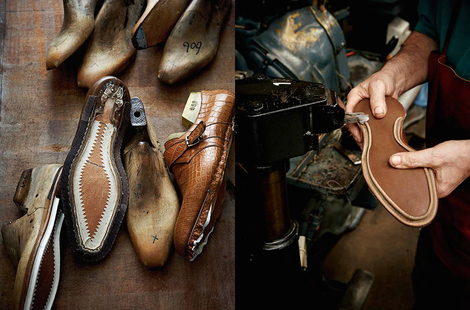
220px-Cordwainer_statue_Watling_StreetThe nursery rhyme says it all ‘Cobbler, cobbler mend my shoe’! It is cordwainers, not cobblers, who make shoes from new leather, and although the name is slightly archaic, it is still used by the Worshipful Company of Cordwainers, who received their first ordinance in 1272. There is even a Cordwainer ward in London which is where most of the cordwainers lived, and where this statue is now situated. The Cordwainers’ College in London existed as a separate entity until the year 2000 when it was incorporated into the London College of Fashion.


Cordwainers-crestThe name comes through Anglo-French ‘cordonnier’ as a corruption of cordouan leather from Córdoba in Spain. This leather was made from Musoli goatskin which was tawed with alum; it was in demand throughout Europe for the best shoes, particularly the red leather. In fact images of the goat are on the shield of the Cordwainers’ Company and as their crest.


Paris_psaulter_gr139_fol7vThe high-grade status of the red leather of skin from Córdoba is emphasised in this Byzantine image of King David. Only someone wealthy and really important such as a king would wear red leather shoes.


220px-Lohgerber_1880Making shoes today follows a similar pattern. Leather is first soaked in water to clean and soften the skins. The hair was then removed and the skin ‘bated’ by pounding dung into the skin or soaking in dung, urine and animal brains. For this reason tanneries were usually on the outskirts of towns as this was a stinky business! Vegetable tanning uses bark, often oak bark, and the hides are used mainly for luggage and furniture, strong shoes and belts.


Clicking-Image-1bThen the hides are taken to the clicker who cuts the uppers for the shoes, This is a skilled job because thin and damaged areas of skin need to be avoided, and the best sections of the skin used for the appropriate parts of the shoe. The craftspeople are called clickers because of the sound of their knives against the metal edged-binding of the patterns for the shoes.
hqdefaultThe uppers are then closed or sewn together, a process which includes decoration, punching holes and fitting eyelets.


imgresThen the soles and heels are cut from leather, the heels being built up from a number of layers.


2.aaCJ1187The next stage is lasting, where the tops of the shoes take shape over a wooden last, and are attached to the inner sole.


_benchmade_04After a number of other processes finally the uppers are attached to the soles and heels, the shoes finished, polished and packed ready to be sold. This is a short film of how shoes are made.

Glittering Gilders

IMG_1469We had an early start at the London University Palæography International Summer School to ensure that the images of mediæval beasts were transferred on to prepared vellum, and the adhesive laid before a break for coffee. It was marvellous that everyone managed this, but hard and concentrated work!


IMG_1472It’s tricky to get a whole miniature gilded and painted in a day, especially as most people have no experience whatsoever in even handling a paintbrush, let alone one with so few hairs, so we chose the miniatures carefully, focusing on animals from bestiaries. This lovely peacock is the copy, not the bestiary original!


IMG_1470Here is a fearsome bonnacon without its usual defence mechanism (look it up!), with two soldiers holding spears and shields.


IMG_1474And here two elegant goats, with the ‘original’ being copied in front. Notice the shine of real gold leaf on the vellum!


FullSizeRenderA red elephant and a blue dragon are fighting here perhaps producing dragon’s blood!


FullSizeRender 2And a knight on a horse is hunting a boar here.


IMG_1475Two strongly coloured pigs!


IMG_1477 2And lastly a white horse fit for a princess!

Comments from students included:

Excellent!

Best class of the week.

A detailed, practical workshop.

I thought the teaching was excellent; all the explanations were very clear and thorough. Patricia was very encouraging throughout the course and I never felt that I wouldn’t achieve something worthwhile. 

I have thoroughly enjoyed this course.

Next year, 2017, I shall be teaching a one-day practical calligraphy course for LIPSS, and the year after that, 2018, there will be a repeat of this course. Meanwhile, in 2017 I am thinking of running the three-day gilding and painting a mediæval miniature course again here in Sevenoaks, probably over the late May Bank Holiday. Look out for details and dates in my newsletters. This was the one last year.

Book of Hours greetings cards

squirrelSo many people have asked about the Wolf Hall Book of Hours that I produced for the BBC series, and whether copies of the pages are available that I’ve had some little cards printed. They feature on the front the cutest red squirrel with long pointed ears that look like a punk haircut, and on the back of the card a little grey rabbit, and are A7 in size (11 by 7 cm; 4 by 2 and 3/4 inches).


IMG_1383They’re ideal for little thank yous, greetings for birthdays and anniversaries, and tiny cards for children. I’m selling them in packs of 5 with white envelopes for £3.50p per pack (70p per card), with postage on top but at cost as they go into an A6 envelope. For the UK it’s £1 per pack p+p, £2 p+p for Europe and £2.50 p+p for elsewhere. (For multiple packs, please contact me.) Everyone, of course, gets their name written calligraphically on the envelope!


Please contact me through my website for details of how to pay, or through my usual email address.