Author Archives: Patricia

David Kindersley Centenary Celebrations

David Kindersley letteringI happened to be waiting in Exhibition Road to go into the Victoria and Albert Museum many years ago, and noticed the letter-cut sign on the wall. The more I looked at it, the more intrigued I was. The lettering looked so perfect and so even; it was cut over two blocks of stone, and yet no letter was actually on the join. In addition, the steady diagonal on the right-hand side almost drew in to the lettering the obvious bomb damage. It seemed a supreme example of craftsmanship. I learned later when talking with David that, when he was approached to cut the inscription noting that the damage to the building was as a result of air raids, he was asked what sort of stone he wanted to cut the lettering on for it to be attached to the building; his reply was that there was perfectly good stone already on the walls!

IMG_0015David’s lettering was exceptional, his eye for design, and particularly spacing quite phenomenal (one of his quotes was on the lines of a bad space is worse than a bad letter). This year, 2015, celebrates his centenary and there are a number of events planned. For details see the Cardozo-Kindersley workshop website here. One major event is the exhibition at the Fitzwilliam Museum; this is on from 21st April to 14th June and coincides with more of David’s work at Kettles Yard, both in Cambridge. If you haven’t been to either then both are worth a visit on their own, but take in David’s exhibitions while you’re there!

wall picHis inventiveness and skill are shown here in a picture from the wall in the Cardozo Kindersley workshop – examples of lettering of various styles and designs, and beneath that a cupboard with the tools of the trade. David learned letter cutting with Eric Gill when the latter was based at Pigotts in High Wycombe in December 1934 starting when David was 19. His father, it was said, liked to do things properly, and so he paid for David to be apprenticed. Whilst with Gill, David worked on many important commissions.


IMG_0004When Gill died in 1940, David was asked to take over the workshop, but once he had sorted out Gill’s affairs, he set up his own workshop at Dales Barn in Barton. David was a leading figure in setting up the Crafts Council and became Chair, stepping down because of concerns of underfunding (’twas ever thus!). David’s lettering for the Ministry of Transport was widely praised, but in the end they chose a lower case monoline style for motorway signs. Yet his clear and readable letters are still seen throughout Cambridge and in other towns and cities which have an eye for good design!

pod57Many commissions flowed from the workshop in Barton and when it was moved into a converted infants’ school in Cambridge itself, not least the magnificent gates for the British Library, designed by David and his third wife, Lida. They are a fitting addition to a remarkable building.


IMG_0394The workshop is currently preparing for the exhibitions and centenary events and here is a selection of David’s work being considered for inclusion. Again it shows just how versatile and talented he was.

There is not only the exhibitions but also an evening at the British Library with Tanya Harrod, Fiona MacCarthy and Lida and Hallam Kindersley on Friday 12th June (tickets here). The London exhibition is at the Patrick Bourne Gallery on 15th June, with pieces of David’s work for sale alongside new pieces by the workshop. Then the Centenary Walk is previewed here, and also a wonderful set of playing cards with David’s work featured on the backs of the cards – a delightful video shown here.

All in all a great way to celebrate the life and work of such a wonderful man, a true Alphabetician!

State Postillion’s Jacket

CIMG2275At the launch of London Craft Week, Keith Levett, Director of Henry Poole & Co, tailors of Savile Row, was making a state postillion’s jacket – it was in pieces when The Prince of Wales and The Duchess of Cornwall looked at it (click on the link and scroll down to see photos of Keith at the London Craft Week launch). When Keith finished it, he very kindly invited me to see his incredible craftwork and take some photographs. The jacket is a real tour-de-force in red and gold, and the style of it has remained unchanged for years.


CIMG2289The wool cloth comes from the Abimelech Hainsworth Mill in Stanningley, Pudsey, West Yorkshire, and is the only ‘vertical’ mill there. This means that the fleeces go in at one door and the finished lengths of cloth out of another. The red wool is a rich, vibrant and dense colour and provides a real contrast with the extensive gold decoration. Here is Keith showing the back of the finished jacket.


CIMG2274The lace, or gold braid, is 2•5% gold and woven into a specific pattern used only by the Royal Mews and Household; it is produced to order, is rich and substantial, and looks simply amazing.


CIMG2271The 80 decorative gold buttons and the 13 buttons that actually secure the jacket are saved from one garment to another. They are covered in gold, first by electro-gilding in 18 carat gold, and then there is a second coating of frosted 22 carat gold. This makes them rather orange and so they are burnished back on the high points to give a depth of burnish. (This reminded me very much of the layers of gold I add to mediæval illuminated miniatures to give a depth to the shine of the gold.)

CIMG2276Some parts of the gold braid on the cuffs are padded and raised, giving another 3-D effect to the jacket and a real richness to the look. Historically this was done with sheep’s fleece, which was substituted in the later twentieth century with cotton wool as it was more readily available. A visiting Australian wool farmer suggested that sheep’s wool may be better, provided it, and this is what is now used. The fleece, straight from the sheep is first washed in a pillow case, to keep the fibres all contained, and then spread outside to dry. This can be done only in the summer as it is rather smelly! When I was there, Keith reached over for a bodkin-like long needle and pulled up a piece of the gold fabric to make the gathering more even; his eye is that keen!

CIMG2270On the left sleeve is the badge of The Queen. It consists of the Order of the Garter motto in a circle (Honi soit qui mal y pense – Shame on him who thinks evil of it), and the circle is made to look like a garter with a buckle at the bottom. The Order of the Garter is the oldest order of chivalry, and was founded in 1348. In the middle of the circle is the cipher of The Queen, EIIR, and above all this is the Royal Crown.


CIMG2269This badge is made by Claire Barratt at Hawthorn and Heaney, and Claire is actually featured in the first photo at the launch of London Craft Week on this link. I thought Claire’s work was exquisite, even though, apparently, she had far less time to create this badge than she would normally have had.


CIMG2282Inside the jackets are padded and lined, and everything stitched by hand. The padding must be very welcome when it’s cool, but could be a bit much when we have those rare hot and steamy days!


CIMG2283I was intrigued by the fastenings additional to the gilded buttons and ribbon loops. A row of strong hooks and eyes were sewn in down the front, but instead of having all the hooks on one side and all the eyes on the other, they were alternate. I asked Keith why this was and he explained that if they were as I had expected, when the rider leans forward or pushes his arms together, all the fastenings would come undone; this way, though, they were secure. It is little touches like this that come only from years and years of experience!


CIMG2287

The jackets usually take 3–3•5 weeks to produce, but this one had to be rushed through, and Keith worked long hours into the night to get everything done in 16 days, though you would never know to look at, even as close as I was able to get. Keith produced a completely new jacket, but the one I tried on (see my March 2015 newsletter on my website) from the 1930’s clearly had a number of wearers who had each written their names inside!

Le_Royal_Mews_de_Londres-016The jackets are worn by the riders who guide the horses that pull the state coaches. The rest of the uniform can be seen right – white riding breeches, long black boots with a buff cuff, a white shirt and cravat, and finished with a grey wig and riding cap.


article-0-022FE9B6000005DC-915_468x286This is the Coronation Coach at the Royal Mews and shows the riders, with their hand-made jackets, as they would appear in procession.


imagesAnd when they’re not being worn? I rather liked this image of the jackets hanging up in a cupboard at the Royal Mews. What workmanship there is there, and I wonder if those who wear the jackets are aware of the huge skill and craftsmanship that has gone into their making.

Henry Poole & Co have held the Royal Warrant for producing livery since 1869, and are now the only tailors working to the old standards and producing like for like. Their standard is so high that, when presented with a cupboard full of jackets as above, they can actually pick out the ones produced by them.


The Double Crown Club

IMG_0911Before paper sizes were standardised as A1/2/3/4 etc, paper was named according to weight and size. Some may remember foolscap, and other paper names were Imperial, Elephant, Atlas and Antiquarian. Paper that was uncut, usually for printing had different names – Royal, Double Pott, Demy and Double Crown being some. Amongst all these many paper names, a group of printers, publishers, illustrators and book designers decided on the name Double Crown Club when they established a dining club in the 1920s. The aim of the Club was to foster the exchange of ideas and good printing, and the first meeting was on October 31st 1924; the Double Crown Club has carried out its purpose ever since.

IMG_2151Four times a year the Double Crown Club arranges a dinner, now held at the Savile Club in London, and special invitations and menus for each one are designed by the Club, and occasionally by the invited speaker. This was the case when I was asked to speak, and, as I was going to talk about quills, vellum, mediæval manuscripts and a few pieces of my work, I used a background of vellum, an illuminated letter T, and incorporated the stages of mediæval miniature production on the invitation and on the back of the menu. Inside both, as a background, I used a photograph of cut quills.

IMG_0883The Savile Club is a magnificent building in Brook Street, London, with a stunning staircase and wonderfully elegant ballroom. J P Morgan (of the bank and Morgan Library and Museum in New York) had the building re-designed for his wife, Fanny, ‘to entertain in suitable style’, and style it certainly has!

IMG_0888


The Double Crown Club use the ballroom at the Savile Club for their dinners and it is the most elegant room. It looked wonderful when set out for the dinner, with crystal chandeliers, long, tall windows, a decorated frieze, and a beautifully painted sky with clouds on the ceiling.


IMG_0889There was also a fantastic stone fireplace, with the most marvellous marbling,


IMG_0891The numbers that I’d written for the tables looked marvellous in the table stands. I had used a large Automatic pen, with a piece of kitchen sponge pushed in between the tines. I then fed red and blue Schmincke gouache into the sponge for a variegated effect. When the ink was dry I used Schmincke goldpearl and a pointed pen to add a bit of sparkle.


IMG_0893The tables also looked great when the menus had been set out, and all was ready for the members and their guests.


IMG_0902And after a delicious meal all was set for me to ‘Take my quill for a walk’, which included the Wolf Hall Book of Hours, quill cutting, the differences between vellum and parchment, and some of my recent work.

Cotton to Gold Exhibition 31st January–19th April 2015

two-temple-placeTwo Temple Place is a fascinating building – it looks rather like a castle outside, built of Portland stone with a crenellated roof, stone carvings by Nathaniel Hitch, stone windows and a magnificent golden galleon weather vane of the Santa Maria, Christopher Columbus’ ship. The weathervane is significant in that it represents the route of William Waldorf Astor’s ancestor, John Jacob Astor and the links between Europe and the US. The house was built for William Waldorf Astor by John Loughborough Pearson in 1895, and was intended to be used as the Astor Estate Office, with an upper flat for Astor’s own use.

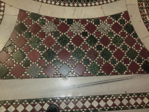
Two Temple PlaceInside there is a stunning Cosmati pavement and fantastic woodwork, as in this wonderful staircase on the right. When the Astor family sold the house it was owned by various businesses and damaged by a bomb in 1944.

The building is now owned by the Bulldog Trust, and in 2011 opened as the first London building specifically to show publicly owned art from the UK regional collections.


Icon of Eleousa, Blackburn Museum and Art GalleryThe exhibition Cotton to Gold, co-curated by Dr Cynthia Johnstone, IES, University of London, and Dr Jack Hartnell, Courtauld Institute, shows the extraordinary collections of the industrial magnates of the north-west of England, the home of cotton manufacture. During the 19th century wealthy cotton mill owners spent their huge wealth on a rather eclectic assortment of items including Roman coins, Tiffany glass, medæval manuscripts, Byzantine icons, ivories and even preserved beetles! Three publicly owned museums in the north-west – Blackburn Museum and Art Gallery, Haworth Art Gallery (Accrington) and Towneley Hall (Burnley) have joined together to present the best artefacts from these great collections.

BB mss - HART20918, Lombardy Missal, c.1400There will also be mediæval manuscripts on show, mainly Books of Hours. These were manuscript books for the lay person who could then follow the Offices of the Day in their own homes. In Psalms it says ‘seven times a day will I praise the Lord’, and indeed this is what happened in religious foundations, starting with lauds or matins at dawn, prime (6 o’clock), terce (9 o’clock), sext (noon), none (3 o’clock), vespers (sunset) and compline (9 o’clock) followed.


BB mss - HART20884, Book of Hours, Bruges, c.1490Many Books of Hours, as in the two shown here, were beautifully illuminated with rich jewel-like colours and lots of gold.

If you want to know more about how the manuscripts were made, then I am running a hands-on workshop and giving a talk. More details about these and the exhibition here.


Exhibition Opening Times: Monday, Thursday–Saturday: 10am–4:30pm Wednesday Late: 10am–9pm, Sunday: 11am–4:30pm, Closed on Tuesday. Admission Free 


Cosmati pavements

Cosmati pavement, Westminster Abbey

The Cosmati pavement at Westminster Abbey, laid down in 1268 on the orders of Henry III, was covered by a carpet for over 100 years. It has recently been restored and the wonderful colours and riot of swirls and whirls has now been revealed. The pavement is particularly special because it is one of the very few in the UK and the only one in such a complete state. (There is an excellent website with much more about the Westminster Cosmati pavement, how it was restored, the lettering, and the history on this link.)

cosmati_inner1The pavement is 7·5 m square and in the Sacrarium or Sanctuary, butting up against the three steps going up to the High Altar. This position must have indicated its importance and significance when the floor was laid. It’s on this pavement that the throne will be placed and the next king will be crowned. Interestingly, during restoration it was found that many of the stones were antique and were salvaged from Roman buildings, presumably in Italy. It is also different from other Cosmati pavements because the background is dark Purbeck marble, rather then white Italian marble as with all other Cosmatesque pavements

Santa Maria MaggioreIt was, in fact, in the church of Santa Maria Maggiore (a splendid building and certainly worth a visit if you are in Rome) that I first noticed the floor, and was intrigued by the patterns and the design, and wanted to find out more. An enlargement of the floor in this church in Rome is on the right.


Monreale Cathedral

Seven members and four generations of the creative Cosmati family based in Rome worked from before 1190 to 1303 and made decorative floors, pulpits, thrones, choir screens and tombs for churches. Colourful and sometimes patterned pieces of stone were cut into geometric shapes of triangles, circles, squares and rectangles and laid in a matrix of white marble. (Right: Monreale Cathedral)


Santa Maria in Trastevere, RomeThe first work of the Cosmati family was by Lorenzo Cosmati in a church in Fabieri in 1190, and the last recorded work was by Deodato who died in 1303.Their name gave rise to the style of pavements which are now in a number of churches, such as the Church of Santa Maria Travestere on the right which is an impressive display of wonderful patterns and colour.


Two Temple PlaceAnd you don’t have to travel to Italy  to see another great Cosmati pavement. There is one at Two Temple Place, which was built for William Waldorf Astor in 1895. Now the house is a gallery and open only during exhibitions. There is a lot of glorious craft in the house, so it is worth visiting if you can. (Right: taken from Two Temple Place written by Barbara Bryant, used by kind permission)

San Cataldo church PalermoIt does seem quite amazing that this one family, the Cosmatis, working for just over 100 years in the Middle Ages, gave rise to something that is still in evidence today and wanted by some of the richest people in the world in the 19th century for their town house. These pavements are walked over by thousands of people yet also delighting those who care to pause and look down. (Right: San Cataldo Church, Palermo.)