Author Archives: Patricia

History of the Book in 100 Books

GutenbergIt would be difficult enough selecting 100 books just in Britain to represent the history of the book from scrolls to codices, to manuscripts to printed books to e-books. And then there’s what’s in the books – fiction, scientific books, company reports, instruction manuals, religious books – and what religions? – Christian (Gutenberg Bible completed in the mid-1450s on the right), Muslim, Judaism, Buddhism, Hinduism, Sikhism etc  – so authors Roderick Cave and Sara Ayad really did have a task on their hands when they took on all the books of the world!


Ptolemy's world mapStarting with cave paintings, this book is divided into 11 sections and ends with digitisation and the future of the book, having taken in mediæval books, books from the East, printed books and printing and the great classics along the way. Atlases are included, such as this of Ptolemy’s world map from the Cosmographia of 1482, and describes all the known world. As he was based in Alexandria the most detail is around the Mediterranean, and the southern hemisphere is lacking a bit!

Elementa GeometriaeScience books are not left out, and Euclid’s Elementa Geometriæ, was translated from Arabic into Latin by Abelard of Bath in the 12th century. The printed version by Erhard Ratdolt, on the right, was made in Venice in 1482, and, amazingly at this early date in printing history, there are printed geometric diagrams.


L'escole de fillesAnd pornography is not new either! In 1668 Samuel Pepys burned a book (another copy on the right) that he had bought for his wife to translate from the French. L’eschole des filles was a dialogue between a young virgin and a more experienced female cousin. Pepys made sure that he read it before burning (hmm! even missing church to do so); he described it as ‘the most bawdy, lewd book that I ever saw’.


Playfair's Commercial and Political AtlasThe History of the Book in 100 Books is comprehensive and has details of a very wide range of selected books (including Playfair’s Commercial and Political Atlas on the right). There is also an extensive bibliography for those who want to read more, and a detailed glossary. Each opening spread has a very useful ‘Connections’ section so that it’s possible to look at other related books. If you’re stuck for a gift for the person who has everything, then this could well be the answer!

Gilding and painting a mediæval letter

CIf you ever wanted to learn how to cut a quill, what the difference is between vellum and parchment, how to deal with real gold leaf and use it in mediæval miniatures and illuminated letters, and how to paint them, then this course is for you. We shall be covering the techniques of gilding and traditional skills, and you will go home with your own initial letter, gilded and painted on vellum, and with gesso laid with a quill that you will have cut yourself.


Lovett courseI’m running a 3-day course in May – Saturday 23rd May to Monday 25th May 2015 – at my studio in Sevenoaks, Kent. Everything is provided – feathers for quills, vellum, gold, burnishers, paints, brushes, etc.

And tea/coffee and snacks and a light lunch is also included in the price.


gilding courseClasses are kept deliberately small so that individual and personal attention is emphasised.


Previous students have been kind enough to be very complimentary about the courses I’ve run:

Excellent – patient and with expertise, generous with materials and information, good humour welcome!

owlHighest level of coverage and specialisation. Everything was well thought out. Help and encouragement was always given. Patricia was very professional and enthusiastic.

Very good introduction and explanations of how to paint a mediæval miniature and the techniques used. Very encouraging to all students.

One of the best course tutors I have had.

Excellently taught – enthusiastic – well thought out and relaxed in a clear and concise manner.

I have achieved a long held ambition, and, thanks to Patricia and the relaxed atmosphere she created, I have amazed myself.

I honestly don’t think the course could have been better.

Every day has been excellent and I have achieved more than I thought I was capable of. Thanks for everything.

Please contact me if you want more details and the application form.

MacDonald Gill’s Westminster maps

photo 6Going in to the House of Commons through St Stephen’s Porch you pass two huge and magnificent wall maps painted by MacDonald Gill. On the left-hand side is a plan of the Houses of Parliament (see right) and on the right-hand side is a map of ‘The Cities of London and Westminster’ – see below.


photo 8The plan is surrounded by wonderful coats of arms of British royalty, and it is interesting to follow the changes over the centuries in the shields of the kings and queens of Britain. This one (right) for Charles II, for example, has the lion of Scotland in the second quarter (top right), and the harp of Ireland in the third quarter. But in the first and fourth quarters, England is represented not only by the ‘leopards of England’ (lions passant guardant) but also by the fleur-de-lis of France, even though England lost all French land in 1558. The fleur-de-lis remained part of the coat of arms of the United Kingdom, and thus represented the claim to the French throne by the English monarch, until 1801, even though by this time there was no French throne as the country was a republic!

photo 9MacDonald Gill, Max, was the brother of the more famous letter cutter, letter designer and sculptor, Eric Gill, Both studied with Master Calligrapher Edward Johnston at the beginning of the last century, and this is shown well in Max’s strong and lively letter-forms – see right – from the Houses of Parliament map. Here the lettering varies from flourished capitals, compressed capitals and a formal minuscule style, with a delightful addendum in Italic where perhaps the text didn’t quite fit!

photo 5The map of the cities (see right) is particularly attractive, and fits the rather unusual shape well. (The maps are on the walls flanking a flight of stone steps.) The map itself is very detailed, and there are also a number of very well-designed heraldic shields representing the boroughs that make up the cities, balancing the arms of royalty on the opposite wall.


photoUp close and personal to the map it is easy to appreciate the detail and sheer artistry of Max’s hand. Buildings are drawn out in 3-D, with scrolls naming the most important. However, up close and personal it is rather worrying to see the obvious cracking of the paint.


photo 3The vibrant shield of Camberwell, shows two wells in the first and fourth quarters – the most important in heraldry. The second quarter (top right) represents Dulwich and so the chevron and cinquefoils from the arms of Edward Alleyn, who was the founder of Dulwich College, were adopted. And lastly, in the third quarter, the lion from the arms of Robert, Earl of Gloucester, represent Peckham, as the Earl was lord of this manor in the twelfth century.


photo 2That for Chelsea is equally lively. The crozier in the centre represents Westminster Abbey which used to hold the borough. The bull in the first quarter (top left) is the symbol of St Luke who is the patron saint of the borough. The white lion in the second quarter is from the arms of the first mayor, Earl Cadogan. The boars’ heads and sword are from the Sloane family, and the stag’s head is from the Stanley arms – both former holders of the manor.

Memento mori – remember (that you have to ) die

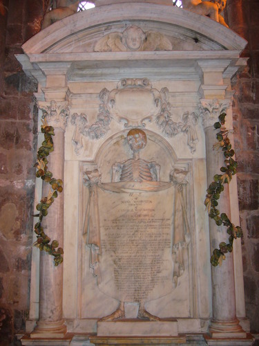
DSCN6043-300x214Children dressing up as skeletons, skulls made out of sweet jelly and white chocolate bones are all part of Hallowe’en, but, as with so many of our customs, these sorts of symbols are not new. It was thought that the veil between heaven and earth was particularly thin on the night before All Saints’ or All Hallows’ Day, and so it was then timely for us to remember our own mortality and to consider our life on earth. All Saints’ /Hallows’ Day is, of course, November 1st, and the evening before that All Hallows’ Evening, or Hallowe’en. Nowhere are we encouraged more to think about the afterlife than with memento mori – remember you have to die. And this is particularly true with some tombs such as that for Dean Fotherby at Canterbury Cathedral in Kent, erected in the seventeenth century (see right).

TombStJohnsChester_mOn Dean Fotherby’s tomb, the bones are in complete disarray, however on the tomb of Diana Warburton at St John the Baptist Church in Chester, erected also in the seventeenth century, her skeleton is modestly draped revealing only her upper chest and head and then her feet, (although her feet do seem rather large for her body and look a little as if they’re wrapped in bandages).


9900350Mediæval Books of Hours also included a memento mori, as they contained, usually towards the end of the book, the Office of the Dead. This Office was recited before the Requiem or funeral Mass, and is a rather long section. The illustration to this Office in a Book of Hours usually depicted death or burial, with a shrouded corpse, or, as here, a draped coffin. The fact that Books of Hours were for lay people ensured that the owners would be familiar with the words of the Office which encouraged a reflection on mortality.


allegory_of_the_vanitiesDeath was also featured in some paintings. Dutch artist Harmen Steenwyck painted An Allegory of the Vanties of Human LIfe in about 1640 (now in the National Gallery). It is a very symbolic painting with the shell representing wealth, the musical instruments indicating the pleasures of the senses, books denoting human knowledge, the chronometer and lamp (which has just gone out) showing the frailty of human life, and all being dominated by the large skull in the foreground – a symbol of death. These paintings are called vanitas, after Ecclesiastes (Old Testament) ‘Vanity of vanities … all is vanity’ (‘Vanitas vanitatum … et omnia vantias’).


Gilding and Painting a Mediæval Letter Course

Lovett courseComments from students on previous courses:

Wonderful fun atmosphere, made something I always thought was so difficult easy.

Patricia was very professional and enthusiastic.

Wonderful and enthusiastic.

Excellent. Very encouraging to all students.

I could see the improvement in my work and my confidence.

I have achieved a long-held ambition, and, thanks to Patricia and the relaxed atmosphere she created, I have amazed myself.

gilding courseI honestly don’t think the course could have been better.

Excellent course, would love to come on another.

Every day has been excellent and I have achieved more than I thought I was capable of. Thanks for everything.

It was a privilege to have attended.

Have you ever wanted to find out how to cut a quill, use vellum, make and use gesso, attach leaf gold and paint a mediæval letter? This is your chance!

gilding courseI am running a three-day course next year, Saturday 23rd, Sunday 24th and Monday 25th May 2015 to do just that. Before the course we shall select the letter online that you would like to produce, based on those in mediæval manuscripts, so that when you arrive in Sevenoaks, no time will be lost. You’ll cut a quill to lay gesso, prepare vellum, make and lay gesso (and take some home), find out how to prepare gesso for the gold to attach successfully, and carry out the painting all with expert tuition. In fact, you’ll do the painting process twice so that your second one will be as good as you can do. And you’ll take home your quill and two letters – your practice one and your final one.

Courses are held in the studio at my home in Sevenoaks, with ample parking. You need to bring nothing with you (apart from a magnifying glass and additional light if you prefer) as all the tools and materials are supplied. So, too, is tea, coffee and home-made cakes and biscuits, and also a light lunch, most of which is also home-made.

Classes are kept deliberately small so that you get almost one-to-one tuition, and, because everything is provided including manuscript vellum and real gold leaf, the course is rather expensive. However, places do fill very quickly, so if you are interested, please get in touch with me as soon as you can. I’ll send you details when you express an interest by e-mail. Use the one on this website, or at the end of my online newsletter.


The stages in creating a simple commission

HymnCalligraphy is a broad church, and just as there is a place for complicated, ‘designed’ pieces, with layered and textured backgrounds, and blocks of text of differing sizes and styles to create an exciting piece of work, so there is a place for pieces where the lettering is foremost and the design allows the meaning of the words to be paramount. One such piece was a commission I had earlier in the year – to write out a favourite hymn to mark a couple’s ruby wedding anniversary.

text 1It started with the whole hymn, and the client had the idea of laying the hymn out with the above verse in the centre and the remaining verses arranged around this. I experimented with writing styles and sizes of nibs, and then wrote out all the verses. I was in a bit of a flourish-y mood while I was doing this, but not all of these would make it into the final piece!


text 2So it was then time to cut up the verses and arrange them so that they looked as good as they could. The larger verse went in the middle, and the other verses were arranged around the edges in what I thought were the best places. However, there was a change of colour between the background paper and that which I was using. This, and the cut edges, often distract the eye, so if I had been going ahead with this design, I would have written it out again on a sheet of paper just to ensure that it all worked, before writing it out as a final piece.

Hymn 3That verse at the bottom bothered me. It made the shape strange, and, in my view, detracted from the central verse which was to be the focus. I removed the verse and it looked so much better.


red and blue textAt this stage, the client decided that, actually, it was only the main verse that was wanted. We had thought of writing the text in ruby red to mark the particular anniversary, but this could have looked a little plain. I suggested mixing two colours in the pen, which gives a variegated effect, as in a poem I wrote out on vellum, right. (The poem was ‘Kite’ which is why there is a black curvy line throughout the text – this was the tail of the kite.)This can be quite challenging to do, and it doesn’t help rhythm and flow, but it does emphasise two individuals coming together with a shared life (well, it does in my view!). I also rather enjoy the challenge of maintaining a consistency of colour and tone.

HymnRather than have the whole verse written out like this, the client selected certain words which meant a lot to him. So it was a little complicated to use the same nib, wash it in the middle of writing a line to use the two colours for one word every line, wash it again to go back to the red, but that’s what a calligrapher is for! I also suggested a very simple leaf decoration on the left-hand side, to add a touch of interest, but not to detract from the words.

The Art and History of Globes

Farnese AtlasEven around the time of Pythagoras in the 6th century BC, the ancient Greeks thought that the earth was a sphere, with Plato (c.429–347BC), a little later, likening the earth to a leather ball. Similarly, the heavens were considered to be spherical in form, and the Farnese Atlas (right) shows Atlas, a Titan, holding the heavens, as a globe, on his shoulders.


Globe, 1606-21Globes were made before 1500, but very few have survived, and it was in the early 16th century that printed globes were made. This new publication, The Art and History of Globes, from the British Library is a detailed and lavishly illustrated book, beautifully designed. The author clearly knows her stuff, and covers the history of globes in a thorough and detailed way. The section on how globes were made is fascinating and one of the best sections in the book for any craftsperson. What follows then are page-after-page of stunning photography of globes, some enlarged over two pages with wonderful close-ups, and detailed information on each. The globe on the right was originally made in 1606 but revised to include the discoveries at the tip of South America in 1616.

Globe 3The North Pole on this globe from 1730 (right) is shown as ‘Parts Unknown’, but the East Coast of America depicts details of new discoveries. The prime meridian line goes through London rather than Greenwich, but after the founding of the Royal Observatory in 1675 at Greenwich astronomers and navigators began to use it as the base zero for longitude.


Globe 4This globe on the right was engraved by Thomas Bowen (c.1733–1790), and includes details of the recent discoveries around the North Pole. The distance from the sun from the equator throughout the year is also shown. However, this globe pre-dated Captain Cook’s voyages, so that part of the world is rather vague!


Globe 1Of course, globes were not just for the earth, but also for the heavens. This celestial globe on the right was made by Thomas Malby in 1869. It was in rather a poor state before it was repaired and conserved.

This wonderful book is not only essential reading for anyone interested in globes, the mapping of the world, and the engraving of maps for globes. But I also think this is a book that would be just the ticket for those who you just don’t know what to get them for Christmas or a birthday! Thoroughly recommended!

A sea of red poppies

poppy 1Bright red poppies have become synonymous in the UK by marking the sacrifice given by those who have lost their lives in conflict. Many of us wear a poppy on Armistice Day (November 11th) having made a contribution to military charities to remember this.


poppies 2A stunning display of brilliant red poppies is being installed in the 16-acre moat at the Tower of London to mark the 100th anniversary of the beginning of the First World War. Each poppy represents one of the 888, 246 British and Commonwealth soldiers killed in the conflict. The first poppy was ‘planted’ on the day that the UK took part in the war, and the last poppy will be placed on 11th November this year, filling the moat. On that day, too, William the Conqueror’s White Tower will be encircled by a sea of red looking like a huge poppy from above, with its round black roof forming the centre.


poppies 3The inspiration for this display came from the poem Blood Swept Lands and Seas of Red written by an anonymous soldier in the First World War, and this was coupled with the idea of creating poppies by the ceramicist Paul Cummins and the inspiration of theatre designer Tom Piper.


poppies 4The poppies are made at a warehouse in Derby. Led by Paul Cummins, a team of 52 people are working for 23 hours a day in shifts. The clay has to be cut, rolled to the correct thickness, the petals stamped out by hand using the correct pressure, then assembled and finally shaped into poppies by a team of three skilled craftspeople. The poppies have a central hole cut in the soft clay before they are fired. This is how the poppies are made.

Once they have been fired and glazed, they are sent to the Tower. Here teams of volunteers assemble the poppies and plant them. The stalks are individual black metal rods, and washers have to be pushed on to them so that the poppy heads don’t slide down once assembled. The ceramic poppies are then carefully placed on the top of the stalks, and the round black centre pushed on the top so that the poppies are held securely and they look like the real flowers. Above: the volunteers are assembling the stalks.

poppies 5Finally the poppies are carefully pushed into the soil of the moat. It is an amazing spectacle, and although it will be dismantled by the end of the year, there will be a lasting legacy. The poppies are being sold for £25 each (to buy, click here), and all the profits will go to military charities.

In addition it is possible to sponsor the name of a British or Commonwealth service man or woman so that it is announced at sunset at the Tower. This list of up to 180 names is then followed by The Last Post. This will stop on November 11th 2014 when the installation is complete. (Click here for details.)

Vellum ‘music’ book

Vellum bookI am always on the lookout for suitable quotations to write out, and, as I am keen on music, when I had a collection of phrases on the topic, I decided to do something with them.


Rough textIt took quite a few years before I could get round to it, but I was eventually able to combine the music quotations with a spare piece of vellum I had and make a vellum book. To start with I experimented with nib size and writing style, and settled on the fallback of Italic. So I wrote out all the quotations to see how many lines each would take and what sort of shape they would be. I wrote out the authors’ names in tiny capitals as a contrast.

Text rough placedThen I cut up the different quotations and used magic tape to attach the authors’ names underneath in what I thought was the best position. I played around with blocks of text to try to get a balance in terms of layout, and placed these in various positions on a large piece of paper.

When I was happy with this, I marked all the positions and took measurements of exactly where each separate block of text, with the writers’ names, started and finished.

text on vellumThen it was time to determine the exact page size. The top margin is usually smaller than the bottom, and the two outer and the inner margins about the same (the ratio for a classically laid out manuscript book is 2 units at the top, 4 units at the bottom, and 3 units at each outer edge and in the gutter [fold]).


detailI selected a reasonably robust piece of vellum so that it wouldn’t buckle and cockle too much, but note the distinct curve of the skin on the above right. This is the piece of vellum without being under weights, and not sewn into a book.The skin was prepared (see Illumination DVD) and the positions of the lines were marked by pin pricks using a set of compasses (see Calligraphy Clip, Measuring lines) then the lines were drawn with a 4H pencil.


detailTo avoid the lettering looking too boring I wrote the text blocks alternately in Chinese liquid ink, and ultramarine Schmincke Calligraphy gouache. I also had the idea for a bit of levity by inserting a raised gesso musical note covered in pure gold leaf, (the same process as used for raised gold in mediæval illuminated manuscripts), between each of the text blocks.

I was fortunate in that my training many years ago also included bookbinding, which I enjoy very much, so making the vellum sheet into a book wasn’t too much of a challenge. Acid-free 230 gsm hp paper was used for the title page and colophon. I was given some lovely Indian hand-made paper marbled with gold swirls which seemed appropriate for the end papers, and also had some black and gold fabric with which I covered the boards for the book. So it was a case of folding, trimming, sewing and sticking and the book was done.

Mediæval stained glass at St Mary’s, Fairford

stained glass at St Mary'sImagine what it must have been like for the typical mediæval worker in the 16th century. Rich dyes for clothes would still have been reserved for the wealthy, so the lives of ordinary people would have consisted of a palette of browns, dull dark blue, rust red, and a bit of green, with a lot of grey when the colour washed out. Going into a church and seeing the wonderful colours in mediæval manuscripts when the books were paraded around the church must have been a sight for dull eyes. This was even more true for those churches that had stained glass. (Above from St Mary’s, Fairford: part of the 12 persecutors of the faith window – on the left: Herod Agrippa, then the murderer of a bishop, and finally a woman-killing man – note the heads being carried by the last two)

stained glass at St Mary'sThe rich, jewel-like colours would have sung out as well-known Biblical stories, saints, and the life of Christ were depicted in wonderful detail. The church of St Mary’s, Fairford, in Gloucestershire, has the most complete set of mediæval stained glass in the country. The Gothic architecture allowed for large windows and here the whole of the Christian story is depicted. (Right: St Bartholomew with his book and a rather large knife; this is a tanner’s knife as the saint was martyred and he was flayed. He certainly doesn’t look very happy, which is not really very surprising!)
St Mary's FairfordFlemish craftspeople based at Southwark worked on the 28 windows at St Mary’s Church, Fairford, Gloucestershire, to produce a stunning array of colour and figures such as the window showing the Judgement Hall of St David on the right. It is thought that Bernard Flower designed them. Flemish craft workers settled in Southwark as it was outside the jurisdiction of the restrictions of the Livery Companies in the City.

St Mary's glassWhat is particularly exciting about the windows if you do visit, is that a new audio-guide has been produced with a cast of the best-known British actors including Joanna Lumley, Bill Nighy, Anna Massey and others, who have all given their time freely. More details here.


gohistoric_20526_m

An amazing find in the back of a workshop in 2003 resulted in the Victoria and Albert Museum acquiring a few panels from St Mary’s. Restoration work of the windows in the 19th century meant that some of the panels were replaced and the originals ended up at G King and Son of Norwich. This company were well-known restorers until they closed. Read more about the history of the panels and their conservation at the V&A here.

It is certainly a church worth making a detour to visit!