Author Archives: Patricia

A new Book of Hours (well 6 pages!)

Page from Book of HoursOver the years I have produced a number of props for television programmes and films, and have also been filmed writing as historical figures with a quill or pointy pen, or demonstrating what I do – illumination with gold and egg tempera, and writing on vellum with quills – as well as being filmed as myself – a scribe and illuminator. Being commissioned to produce six pages for a mock-up Book of Hours for the BBC series of Hilary Mantel’s Wolf Hall was a really interesting job to get.

The skin from William Cowley was a dream – both hair and flesh side – and I chose sections that had a clear scattering of brown hair follicles so that there would be no confusion that it was paper ‘pretending’ to be vellum.

Screen Shot 2015-01-02 at 13.47.25This is a short film clip of the various stages of the book and how it looked once it had been pasted into the book itself.

testing writing


I tested the skin to see how much preparation it required (for all the information you need about using and preparing vellum and parchment, see my video, 3+ hours long on everything to do with manuscript crafts and modern materials), and then experimented with pen nib sizes and letter height so that I could replicate the writing. Once these were determined I was able to rule guidelines and see if my test preparations worked for writing.

The pages are based on the Hours of Joanna of Castille, but the designer has added gold and coloured side panels, and imported mediæval animals and motifs to add interest to the pages. The Hours are quite small – page size is 105 x160 mm (4 x 6 ins approx) – which means that the lettering is tiny – about 2 mm high.

There were two main ways of producing these six pages. One is to start from scratch with the text, and design and lay out the pages, inserting larger initials, designing the motifs and so on. This is rarely a real choice because it adds often more than twice as much to the time, which I certainly didn’t have. The other is to copy an already existing manuscript, which is indeed what I did.

Design transferredI traced the whole page, including the text, to get a sense of the rhythm and form of the script, but decided not to transfer the tracing of the lettering, as this results in rather static rhythm. It did need a lot of concentration to ensure that line endings were reasonably consistent. They looked very even in the original. However, when I was working on the pages I realised that line endings weren’t that consistent in the Joanna Hours. The tracing outline is secured here (right) by red paint – minium in mediæval manuscripts – I use traditional techniques as much as possible.

Book of Hours textI drew lines for the text and wrote out the first page which was actually the second one. It is always better to start not at the beginning if you can, as your writing is often tighter and more cramped when you first set out, and this shows if it’s right at the start. I was fortunate in that I had a transcription of the text; some of it was difficult to decipher, for example, domum or domiun (my Latin wasn’t good enough to translate as I went along). The letter i was rarely dotted, and, with wear, the tiny joining strokes at the top of an n and at the base for a u meant that these letters were difficult to distinguish. This transcription made a huge difference. The red rubrics were written as I went along, but I left spaces for the larger painted initials, and completed them after the writing.

Then it was on to the painting.

tiny monketI very much enjoyed painting the little animals, though these were less than 2 cm high.

There was a monkey (right), a rabbit (below), squirrel and two peacocks (one of them is below the rabbit on the right).


rabbit


peacock
squirrel


The squirrel eating a hazel nut was fun to paint.

snail


And every mediæval manuscript needs a snail!

Book of HoursThere were also strawberries, thistles, roses, and blue and pink flowers of slightly indeterminate nature.


Book of Hours gold baseThen it was on to the gold. There wasn’t enough time to use the traditional mordant of gesso, so I used a modern medium, raised it slightly, and then applied real 23·5 carat gold leaf. Gold leaf on anything other than gesso is never as wonderfully shiny and smooth as in traditional manuscripts, but it will certainly look really illuminated as the pages are turned in the series.

Book of Hours pagesIt did look reasonably shiny, though, but as the book was going to be ‘aged’ and rubbed to looks as if it had been in the family for some generations, I didn’t worry too much about taking care with the gilding.


These six pages were sewn into one gathering, and this was then tipped into an already bound book which was aged to look as if it had passed through a few generations.


Marking the Magna Carta

Magna CartaThe original Magna Carta, or the Great Charter of the Liberties of England, was sealed (but not signed) under oath by King John in 1215 on the bank of the River Thames at Runnymede in Surrey. It limited the powers of the king and accepted that no-one could be punished except through the law of the land; this is a right that still exists. The themes of the Magna Carta have led to just laws in countries throughout the world.

Plans for this great charter were made at St Albans two years beforehand when a Council met in the Abbey on 4th August 1213. To commemorate this event, 800 years later, a new ‘Charter’ has been created in St Albans.

A whole skin of parchment was donated by William Cowley Parchment Works, and the work began. Fairness, Justice, Equality and Human Rights are the essence of the first Magna Carta and these words head the 2013 version.

mayor signingThe 1215 great charter was witnessed by a wide representation of the Barons of England. The new 2013 charter has been witnessed by a representation of the citizens of St Albans and its surrounds as was possible. The Lord-Lieutenant of Hertfordshire with her husband head the columns of signatures, followed by Lord and Lady Salisbury. The High Sherriff of the county also signed, as did the Mayor, Annie Brewster (right).


Cecil ParkinsonThe former Cabinet Minister, Cecil Parkinson was a signatory.


Police chief signingThe Chief Inspector of Police of St Albans, right, also added his signature.


St Albans Street sweeperThe street sweeper made his contribution too. Here he is with his cart.


photo copy 8And the person who donated the skin from William Cowley also added his signature.


photo copy 12Representatives of the Anglican Church and of the Abbey – including the Ringing Master and members of the Choir – of Parliament, the City and District Council have signed.

This huge administrative task was masterminded by Rosemary Stevens.

Included too are a butcher, miller and baker, plumber, electrician, goldsmith, tailor, market stallholder, rugmaker, landscape gardener, a street sweeper (see above) and a street musician. A local garden centre, newspaper and radio are represented, also local socities. Judges from the Crown Court, an architect, archaeologists, sports representative, a famous pub, St Albans School, a bank manager, supermarket manager and the manager of a shop selling the latest technological gadgets – which today may seem rather futuristic, but no doubt by 2114 will seem very quaint – are all represented.

Bowman James RoseSignatures and occupations on their own may have looked a little boring, so colour was added starting with the joining of the signatures of the Bowman James Rose and his wife Liz (right) by an arrow with regal red fletching. Others were linked with suitable symbols and illustrations, including the street sweeper’s cart (see above right), making the document very lively and vibrant.


This is a terrific and significant document and all credit must go to everyone involved in such a wonderful enterprise.

Sixty minutes make one hour, but why?

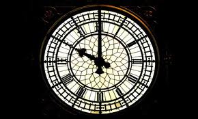
Big benAs children, when we start to count, we usually use our fingers. We have ten of them and so ten and multiples of ten would seem to be the most natural counting system. Yet time, and the angles in a circle, don’t use the decimal system. So, why is this?

Babylonian numeralsIt goes back quite a long way to the numeric system of the Babylonians in Mesopotamia (‘land between rivers’, the rivers being the Tigris and Euphrates, and essentially what is now modern-day Iraq and parts of the bordering countries), which they inherited from the Sumerians. The Babylonians used cuneiform for recording, a system of mark-making whereby a wedge-shaped piece of wood or reed was pressed into wet clay. To create numerals, they used two simple shapes: first an upright single wedge-shape for 1 – repeated for 2, 3, 4, etc –  and then the same shape angled twice to make a sideways v-shape for 10, and again repeated for 20, 30 etc, as on the right.

Why the number 60 was chosen as the base isn’t known, though it is much more easily divided than 10, which can be divided only by itself, 2 and 5. The Babylonians made astronomical calculations 4000 years ago based on 60.

early egyptian sundialIt was the Egyptians who made sundials, which were simply a stake of wood placed in the ground, that divided the day into smaller parts by the length and direction of the shadow. Later the instruments were calibrated to divide the time between sunrise and sunset into 12 parts. At this time, ‘hours’ were about equal, but would vary according to summer or winter.

Water clockWater clocks, or clepsydra, from as early as the 1600 BC in Babylon and Egypt, and probably from 4000 BC in China, consisted of a bowl or dish whereby the flow of water into or out of was measured, which indicated the time. These clocks were the most accurate and most common clocks until replaced by pendulum clocks in the 17th century. (Right, above an original ancient Greek water clock and below a reconstruction.)


EratosthenesThe Greek astronomer Eratosthenes (right) (c.276–194BC) divided a circle into 60 parts to create an early system of latitude. One hundred years later Hipparchus devised a system of longitude lines that ran north to south from pole to pole and also encompassed 360°.

Ptolemy, in about 150 AD, subdivided each of the 360 degrees into smaller segments of 60 parts. The first division of parts was called the partes minutae primae, or first minute, which then became simply minute, and the second segmentation was called the partes minutae secundae or second minute, or second.

Early clockRichard of Wallingford gave a clock to St Albans in 1336 (right). This had a large dial showing the sun and moon’s age, phase, and node, a star map and possibly the planets. As well as this it had a wheel of fortune, and showed the state of the tide at London Bridge. Bells rang every hour with the number of strokes indicating the time. It was only about 500 years ago, though, that minutes became commonly used. Clock displays before that divided the hour into halves, thirds and quarters, or even 12 parts, but never into 60 parts.

Dover Castle clockMechanical clocks saw the introduction of minutes, and an early one is the Dover Castle clock.


foliot balanceIt is driven by a foliot balance rather than a pendulum. Cogs on a wheel drive a level which leads to a weighted beam, and it is this that drives the clock. The foliot balance was later replaced by a pendulum.

Nowadays, of course, time is very accurate, as a second is defined as  the duration of 9,192,631,770 energy transitions of the cesium atom (!). This atomic time, though, has to keep pace with astronomical time, and to do so, not every minute contains 60 seconds. About 8 minutes every ten years consist of 61 seconds.


St Albans’ Psalter

Christina of MarkyateChristina of Markyate (c1096–1155, and probably on the right, closest to Christ), first called Theodora and born in Huntingdon, was clearly a stunner, as it is recorded that various men were attracted to her. The story is that she fled from Burhred, her husband, on their wedding night, having, after a visit to St Albans in her teens, promised to remain a virgin and devote her life to God. It is unlikely, and records suggest, that Christina didn’t actually leave the night of her wedding, though. When she did finally go, she was sheltered by various hermits on the way until she reached Roger, who was a hermit at Markyate, which is close to St Albans. She stayed with Roger until he died, and then took over his cell. Christina attracted other women to her, including her sister Margaret, and eventually the land around Markyate was given to the foundation by Canterbury Cathedral, the previous owners.

St Alban's PsalterChristina was protected by and became friendly with Abbot Geoffrey (1119–1146) of St Albans, who was French and originally from the abbey at near Le Mans. Geoffrey made great changes at the abbey when he took office, commissioning various items for the church including jewelled copes, a silver candlestick, three ampullas, and he also had the shrine of St Albans rebuilt. In addition, Geoffrey commissioned a vita (life) of Christina which has now sadly been lost, but there is a fourteenth century version now in the British Library.

Annunc-CropThe relationship between Christina and Geoffery is an interesting one. Christina called Geoffery ‘my beloved’ and Geoffery called her ‘my girl and beloved maiden’. Christina had visions and she advised Geoffery as a result of these; it was said that she was ‘sensibly reproving him when his actions were not quite right’. However, Geoffrey’s regular visits to Christina did set the tongues of the gossips wagging and it was written ‘the abbot was slandered as a seducer and the maiden as a loose woman’. Perhaps her making him some underwear for his trip to Rome ‘not for pleasure but to mitigate the discomfort of the journey’ didn’t help either of their reputations!
_54632303_psalter-davidIt is likely that the St Alban’s Psalter was made especially for Christina at the instigation of Abbott Geoffrey. The illuminations are simply stunning, particularly those painted by the Alexis Master. The Psalter (Book of Psalms) was made at St Albans Abbey and no doubt kept at the priory at Markyate. Dates in the calendar relate to Christina with the dedication of her priory, and the deaths of her, and family members, are also recorded. In addition there are dates for female saints and virgins in the calendar which does suggest a female owner.


St Albans Psalter

The Psalter has been being re-bound at the Getty Museum, and there has also been an exhibition of all the unbound pages alongside beautiful stained glass from Canterbury Cathedral.


St Albans PsalterWhilst at the Getty, there have been major studies on the manuscript and, as part of this, they have been able to identify the face of the devil scratched out and tiny pin pricks in the eyes of demons. A knowledge of the mind-set of the mediaeval has explained these. People believed that to see, rays of light left the eyes, ‘saw’ and then returned. The pin pricks were only in the eyes of the demons. These then ‘prevented’ a potentially dangerous event of the demons’ eyes being able to ‘look’.

It is a wonderful manuscript, and ideal for copying to learn manuscript painting techniques.


demons_closeup

The pound in your pocket

UK £1 2013-EIt is not easy to design something meaningful which is less than a couple of cm across, but those who work on our coinage do just that. A new set of pounds coins, based on the flowers and plants of the four countries of the UK, have been released last year and this. On the right are the rose and an oak spray of leaves and an acorn for England.

UK £1 Scots 2014The set of four were designed by Tim Noad, a gifted artist and the best heraldic artist at the College of Arms in London for many years. His precise attention to detail is quite astonishing, yet he can capture the characteristics of flowers and plants in a few simple strokes. On the right are the thistle and bluebell for Scotland.

UK £1 NI 2014And here are the shamrock and flax for Ireland, showing just how his training in the stylised designs in heraldry show through in strong pattern and fine detail, but with no superfluous strokes.


UK £1 2013-WAnd lastly, the designs for Wales – a daffodil and leek.

With the announcement in the 2014 Budget that the pound coins are going to be replaced by 12-sided coins in 2017, let’s hope that Tim is one of the designers.

What’s on show at the British Library?

Lovell LectionaryI thought it would be helpful to have an easy link to the manuscripts on display at the British Library. Thanks to Dr Kathleen Doyle for supplying the list. I plan to update this when new manuscripts are added or are removed.

These are they:

Harley MS 4431, ff. 2v-3 Christine de Pizan
Add. MS 20698, ff. 69v-70 The City of Ladies
Harley 7026 ff. 4v – 5 The Lovell Lectionary, England, 1400 – 1410
Egerton 608 ff. 138v – 139 An Echternach Gospel-book, middle of the 11th Century
Harley 2804 ff. 216v – 217 The Worms Bible, central Germany, circa 1148
Add. MS 16977 ff. 186v – 187 Glossed Bible, Paris, Second-half of the 13th Century
Egerton 618 ff. 57v – 58 Early Wycliffite Bible, London circa 1400
Royal 1 C viii ff. 325v – 326 Later Wycliffite Bible. London (?), Early 15th Century
Add. MS 39625 ff. 71v – 72 The Vidin Gospels, Bulgaria, mid-14th Century.
Add MS 39626  ff 292-293 The Gospels of Jakov of Serres
Add. MS 39627 The Gospels of Ivan Alexander
Sloane 1975, ff.42v-43 Herbal
Add 41623, ff.35v-36 Herbal
Add 18850, ff.207v-208 Bedford Hours
Add 82945, ff.18v-19 Wardington Hours
Harley Roll Y.6, first 2 or 3 membranes Guthlac Roll
Add 5111, ff.10-11 Canon tables
Burney 19, ff.63v-64 Portrait of Mark

Girdle Books

Mediæval bookTaking a book with you to read on a journey was rarely an option in mediæval times. Vellum or parchment pages, oak boards and metal hasps and clasps all resulted in a heavy book, usually far too heavy to carry around easily – as with the book on the right. The eighth-century Codex Amiatinus, written in Northumberland and now in the Laurentian Library in Florence, takes two men to carry it – hardly a pocket book!


SmallHowever, there were smaller books. Some Books of Hours and Psalters were tiny enough to carry on a journey, or to look at without having to sit at a table, as this cutie on the right.

g


There were also special ‘carrying cases’ for smallish books, whereby the book was encased in a soft leather or cloth ‘chemise’ which ended in a knot. The knot was then tucked into a belt or a girdle, and these were called, surprisingly enough, girdle books!


Holy familyAt the St Annen Museum in Lübeck, Germany, there is a carving of the Holy Family and St Anne. Spot the girdle books.


girdle bookA black one is being carried in the hand, the the knot being clasped firmly:


girdle bookand the knot of a red leather covered one has been tucked firmly into a golden belt. Note the circular mounts on the covers; these were to stop the leather, or sometimes silk covered getting damaged or dirty when the book was placed on the top of a table or shelf.


girdle bookI was fortunate enough to photograph a girdle book of the Psalms belonging to a private collector. This is not mediæval but from the nineteenth century, it does, though give some idea of the variety of such books. This book comes from Ethiopia and is written on gazelle skin treated to produce vellum. Note the pin prick marks on the right hand side which indicate the line markings.

girdle bookThe script is the ancient language of Ge’ez, which remains now only as the language of the liturgy of a few select Ethiopian orthodoxies. The ink is a very dense black with a vibrant red contrast.


girdle book bindingThe book is bound as a coptic binding which is incredibly flexible, and the cords are thought to have been made from the wild banana plant (see also the St Cuthbert’s Gospel – the oldest European bound book).


coptic bindingThe covers are from cedar wood, and you can see that the covers, as in all coptic (and some other) bindings are drilled such that they can take the cords which are then tied off inside the back cover.


book 'pocket'The book slips inside an animal skin ‘pocket’, which is carefully constructed from stiff vellum-like skin, perhaps a less-scraped skin from the gazelle? The thongs to tie the case together are also animal skin.


book 'pocket'

The case was obviously made for the book because although it is not tight, it is a snug fit and ensures that the book doesn’t move around inside when being carried.


outer case for bookThen there is an outer slip cover which ensure that the whole of the book is protected in transit. This is made of the same type of skin.


book coverAnd lastly, the thongs from the pocket are laced through the top covering to ensure that the book cannot fall out, These thongs, then, can be tied on to a belt for easy carrying. In all the case measures 130 by 110 mm (5 by 4 inches).

This is a book which really can be carried, especially with its handy case – so much better than a Kindle!


Any umb-er-ellas to MAKE today?


Chinese umbrella
It was the son of a shuttle weaver in Derbyshire who gave us the umbrella shape that we are so used to today. Before Samuel Fox (1815–1887), a wire drawer, developed the u-shaped frame, the ribs of umbrellas and parasols were straight, with a hinge which allowed them to be folded. They were also very heavy, made out of wood with a stout handle which was sometimes 2·5 cms, 1 inch wide. The oldest written record for a collapsible umbrella is dated 21AD in China, and they often had a ceremonial role as well as a practical one. This ceremonial role spread to Japan, India and Persia.


88671853411e7c3240aeb5a3eb159d30This Assyrian wall carving at Ninevah shows umbrellas being used perhaps as part of a ceremony, or perhaps just to keep the fierce sun off the king.


UmbraculumThe papal ‘Umbraculum’ has wide gold and red stripes, and is usually quite pointed. It was once used to protect the pope from sun, but now has a significant ceremonial role. All Roman Catholic basilicas throughout the world have the right to have an umbraculum indicating the authority of the Roman Catholic Church, and the umbraculum is usually placed just to the right of the main altar. When the pope visits the basilica, the umbraculum is opened.


Paragon umbrellaIn 1852, Samuel Fox was said to have used left-over stocks of steel stays (from corsets) made from spun steel to construct the metal ribs on his Paragon umbrella (see right), which gave us the characteristic u-shape that we are so used to.


James Ince anMaking umbrellas is still a craft process with a great deal of hand work from skilled practitioners. The oldest umbrella-maker in the country is James Ince & Sons in Spitalfields in the East End, founded in 1805. Richard Ince (shown right cutting out the pieces of fabric to make covers) is the sixth generation umbrella maker.


Making umbrellasThe covers are sewn together in pairs which are in turn sewn to make the eight panels of the canopy. This is then fitted over the metal frame and stitched to the ends of the spokes. The metal ferrule and handle are attached and the cover finally ironed on to the frame to ensure a perfect fit.


James Smith and SonsThe oldest shop selling only umbrellas is still in London on New Oxford Street. James Smith and Sons is pretty much the same as it was when it moved here in 1857 (the first shop opened in 1830 in Foubert Place).


Making paper

hemp wrapping paperThe Chinese clearly knew a thing or two and there is evidence of paper used for wrapping (hemp wrapping paper from about 100 BC on the right) and padding from the 2nd century BC. Finishing it so that it could be used for writing had to wait until the third century AD, but by the sixth century AD, toilet paper was also being produced. And to show that there is nothing new, folded and sewn paper enclosing tea (yes, tea bags) were being used in China from the seventh to the tenth centuries.


mouldThe knowledge and skills of paper making spread across the Far and Near East and Europe and the first reference to a papermill in Britain was that belonging to John Tate near Hertford, and a book printed by Wynken de Worde in about 1495 used this paper. Sir John Speilman owned an early papermill at Dartford in Kent, and other papermills were then established through the country. The first sheets of paper were made on molds constructed of thinner horizontal wires, with thicker vertical wires for support (see right). The impressions of these wires appeared on the sheets of paper, and are called ‘laid lines’, and paper with this appearance, laid paper. As you know if you have tried to print on laid paper yourself, the surface is not good for that, as the ink is hard to impress on the ‘valleys’ between the laid lines.

watermarkWatermarks are added by twisting a wire design through the laid wires, and this is then impressed on the sheets of paper.


wove paper mouldPaper with a smooth surface was first made by a man from Kent – James Whatman (1702–59). The paper surface was called wove because the mesh supporting the paper was woven, and not made of parallel wires. Wove paper is called Vélin in Europe. In 1757 John Baskerville printed his edition of ‘Virgil’ on wove paper produced by Whatman. It took only a couple of decades for this new paper surface to spread to other mills in the UK and abroad.


vatmanThe essence of paper is fibres, these can be from wood, as used for most of our paper, such as magazines and newspapers, or from cotton or linen rag; paper from these last two sources is usually of finer quality, such as writing paper, paper for fine prints, and also paper for calligraphers. The source material is pulped, originally with a large wooden hammer (stamping mills), and mixed with water to do so. The vatman, as on the right, then dips a mold and deckle into this vat of fibres and water and moves the mold and deckle this way and that to ensure an even coating of pulp all over the mold. The mold and deckle are then usually rested on the edge of the vat to allow some of the water to drain away.

mold and deckleThe mold consists of a stout rectangular or square (or sometimes even circular) wooden frame over which is stretched a mesh. The deckle sits on top of the mold, usually with a slight indentation so that it fits securely all round.


deckle edge paperDespite this tight fit, though, very often some of the paper fibres seep out between the mold and deckle, and this creates the characteristic deckle-edge of hand-made paper. You can get deckle-edged paper that is not hand-made, but then this edge is artificially constructed in the paper making process.


paper makingThe couchman (pronounced coochman, and on the right in this print) then takes the mold and deckle, removes the deckle, and skilfully inverts the mold on to a piece of thick felt. Insodoing the paper fibres, now in a sheet, lay squarely on the felt support. The mold and deckle are returned to the vatman, and the couchman lays another piece of felt on top ready for the next sheet of paper. These create quite a high stack of paper sheets and felts.

imgresPressure is added, usually in a small press with an enormous screw, to encourage the water to drain away.


drying paperThe sheets of paper are then laid on ropes in vast rooms to dry completely.


paper surfacesBut this is not the end of the paper-making process. Two additions are needed. First, the paper is finished. If the paper is left as it is with no treatment at all, then the surface is called rough (see bottom left in the picture). If the sheets of paper are passed through hot rollers, rather like a hot iron, then the surface is called hot press (hot pressed – as in top right). If the sheets of paper are passed through cold rollers, then in the UK this is called not (see middle section) because it is not passed through hot rollers! In the US they’re not quite so romantic and the paper is called cold press (cold pressed) because that is how it has been finished.

Then the paper surface needs to be sized if it is to be used for writing or printing, othewise wet ink spreads and bleeds into the paper fibres and looks like tiny spiders (blotting paper isn’t sized). This was done first using animal gelatine. Nowadays, many paper makers add size to the vat of paper pulp, and the paper is then called tub sized. This is useful for calligraphers because if an error needs to be removed and with it some of the paper surface, the size is throughout the paper and not just on the surface, and so the error can be written over.

Changes were afoot though and bleaching paper, the ‘Hollander’ machine which enabled more than just cotton rags to produce fibres (they then were able to add old ropes and fishing nets as well!), size from aluminium sulphate and the mechanisation of paper making all meant that the slow, laborious, but very skilled ways of making paper by hand were gradually, but not completely, replaced.

Fourdriner machineMost paper now is made using the Fourdrinier process (see right). In this the whole paper making process is speeded up and done in one continuous process. Paper fibres are produced from the source material with size added to the vat, the paper pulp is then allowed to fall on to a conveyor belt, the water drained and sucked out, huge paper sheet pressed, and then the massive rolls of paper finally dried, and finished. Paper for printing is often coated as well so that the printing ink stays on the surface. The process of joggling the paper pulp along the conveyor belt while these various processes were going on resulted in the long paper fibres settling in the same direction – hence the problem of tearing clippings from newspapers and magazines!


Children’s Handwriting

children's handwritingTo me, the value of teaching children to write is undisputed; it is a skill that everyone should acquire. Whether they do it well, and their handwriting is a thing of beauty, is not essential – as long as it’s legible – in the same way that most can sing or shuffle a bit but not everyone can be a singing star or a champion at dancing.

As Chief Judge of the National Schools’ Handwriting Competition, and as a practising scribe, I am often asked about how to help children with their handwriting, so here are my Top Ten Tips for parents and carers:

photo copy 71. Encourage children to write, it doesn’t matter what, as long as they get something on paper. Suggest they keep a holiday diary, draw and write captions perhaps instead of thank you letters (which can be rather a chore), write letters to Father Christmas, and let you know, in writing, what they want for birthdays and special events.


2. At the same time, let them see you writing a lot – making to-do lists, writing thank you cards and letters, adding a personal note to birthday cards rather than just ‘best wishes’, writing your own diary perhaps, writing shopping lists. And the worse thing adults can say to children? ‘My handwriting’s awful’ because the message of that is that you have got to where you are as an adult with rubbish writing, and so good handwriting doesn’t matter.

pens and pencils3. Get hold of a selection a pens and pencils and let them try them out to see what suits. Some prefer big chunky pens and pencils, others slim light ones. Insistance on using a fountain pen by carers or schools is, in my opinion, not fair. There are some children, often young boys, who manage to get themselves and their paper covered in ink just by taking the tops of their pens. For these never to achieve a nice piece of writing because wet ink and posh nibs are de rigeur isn’t going to help them feel good about writing.

photo copy 64. Ensure they have somewhere suitable to write. Adult-sized tables and chairs for young children can cause pain if they have to reach up, and they won’t want to write if that’s a consequence. So a chair of the height whereby they can sit comfortably with their feet firmly flat on the floor, and a table which isn’t so low that they have to crouch over, or too high so they have to stretch would be ideal.


5. Arrange an appropriate light. Much of the ‘mood lighting’ in houses nowadays means that children can find it difficult to write simply because they can’t see!

photo copy 5For right-handers, the light source should come from the left-hand side,

photo copy 3


and for left-handers, the light source should be on the right-hand side (the lamp would normally be a bit further away than shown on the right, but the picture looked a bit strange when I did that!).

In daylight, simply turn the table and chair around by the window so this happens. During the evening, a cheap table lamp will do the business.
photo copy 5


6. And on the subject of right- and left-handers, to avoid left-handers having an ‘over-the-top’ grip, simply ensure that for them the left-hand corner of the top of the paper is highest. This is so easy, not at all rocket science, and it makes all the difference! Left-handers often adopt the ‘over-the-top’ grip because when paper is placed in front of them with the top edge straight, they can’t see what they’re writing, and also smudge what they’ve written if using wet ink. Changing the paper angle by having the left-hand corner at the top resolves this.

photo copy 4

For right-handers the right-hand corner of the top of the paper should be highest.


photo copy


7. Although I don’t like to be didactic about this, a conventional grip does avoid pain. So the pad of the thumb and the part of the middle finger between the tip and first knuckle hold the pen,


photo copy 2and then the control is given by the forefinger, which should be relaxed and not tense.
photo copy 3


Left-handers might like to try to hold their pen or pencil a little further away from the tip, and rotate the hand slightly more to the left to help with seeing what they’ve written and to avoid smudging.


photo copy 4


$T2eC16hHJF0E9nmFTL6RBP8tTs1VCw~~60_35There are triangular grips which slide on to the pen or pencil, or even pencils that are themselves triangular, which help in maintaining this grip. I wouldn’t like to condemn grips which are like a claw, or where the wrist is high, but they can cause tension in the hand, arm, shoulder and back when writing and that can lead to pain. Once handwriting is associated with pain, then why continue writing?


8. Encourage, encourage and encourage. Find one or two good letters well written and praise to the heavens on these, then suggest that if they can write those letters as well as that, then they can try to write others in the same letter families well, using the same or very similar strokes.

photo copy 8Letter families are: Letters that start with a straight stroke and usually have a joining stroke or curve at the base – i,l,t,u,y,j. Letters that start with a downstroke and then arch (and beyond) – r,n,m,h,b,p,k (if using a looped, closed bowl style). Letters (most of – e is the exception) which start with a curve to the left –  c,e,a,d,g,q,o. Diagonal letters (although depending on the lettering style, some of these may be more curved and fit in with the first letter family) – v,w,x,z. And then odds of f and s, and the letter k if the bowl isn’t closed as a loop.

photo copy 99. People don’t expect to play a musical instrument well, or be able to do ballet without practising. It may be a chore but it gets results. Some good exercises, on lined paper, once children have started to join up are repetitions of letters are i l and t, to get the heights right, then the letters r n and u to help with arches and joins; o c and e to help again with joins. And while encouraging children to do this, why not sit down and do it yourself at the same time to show that it’s important, as this will improve your writing too!

10. And the last isn’t a tip as such but a fact. Of course we all know that learning to write helps hand-eye co-ordination and encourages concentration and the ability to sit still for a period of time. In addition to this, research at Washington University concluded that children who are taught to write at a young age are better at composition and reading and also have better memories. They also found that children ‘wrote’ more quickly when hand-writing their compositions than when ‘writing’ them on a computer, even for those who had learned to touch type. Many authors, too, find that handwriting allows ideas to flow more easily as the brain keeps up with the speed of the handwriter. What better proof then to emphasise the importance of everyone learning to handwrite and how much it helps children’s learning in so many other ways.

So write letters to children (many children have never received a letter, let alone a hand-written one) and handwrite to thank people – everyone, not just children, likes to receive a letter and do e-mail thanks or phone calls really cut the mustard? Write every time you can – especially when children are around – and why not encourage your local school to enter the National Schools’ Handwriting Competition which is completely free and every child and adult (yes including caretakers, cooks, auxiliaries, TAs, helpers etc) in the school can enter? What better way to encourage everyone to value the importance and significance of handwriting?

Many thanks to my hand model; she knows who she is!