Author Archives: Patricia

Gerald Cinamon – Man of Letters

Cover of Gerald Cinamon's bookAlmost without realising it our book buying is influenced many times by the design. Without knowing the contents, we select or reject a book often simply by the cover.

Gerald Cinamon, Jerry, is a past master at this. A recent publication, coinciding with an exhibition of his work at the Institute of Contemporary Arts this year, Gerald Cinamon: Collected Works Since 1958, and the accompanying video: Close Not Touching, shows some of the breadth of his work, and it is simply stunning! Sadly the exhibition has now closed, but his book is still available. The cover of the book, right, is in his favourite bold red, used in a number of other of his designs, too.

Cover design for Penguin Books 1967Jerry, born in the US, started his career well before there were computers, when type and image could be shifted around simply by a click of a mouse. His were the days of Cow Gum and Letraset letters. The title of the video Close Not Touching was taken from the use of Letraset, where letters were pressed from a transparent sheet on to paper, and were – close, but not touching. How very much easier it is for designers now. This design for Architecture and Art, made for Penguin books in 1967, shows just what an eye for really strong design, and a sense of humour, can achieve.


Design for wine list for a restaurant


This is a real favourite – a design for a family restaurant in Devon. The use of the wine glass distorting the letters, although they remain completely legible, suggests not only the movement of the tide coming in and out of the shore, but also the possible effects on someone’s vision of too much strong drink!


bbc poster image

A simply stunning design is this for the BBC, used both for posters and recital programmes. It is so simple but so effective in the way that the bowl of the letter b has been reversed to make the c, and any heaviness in letter-form has been avoided by truncating the downstroke. The letters are all very readable and clear, even though they are reduced in form so much. Jerry writes that he really enjoyed seeing his posters displayed at the Royal Festival Hall when he went there for a concert.


Cover for Penguin's 50th anniversarySimple and ingenious – this cover is for the Fifty Penguin Years exhibition catalogue in 1985. Here is that wonderfully vibrant red again, but the 25th penguin is in silver, and the 50th in gold. Penguin book covers were renowned for their limited use of colour, usually just one colour and black, so special permission had to be granted to do a silver and a gold run in addition!

This book is a real visual delight, each page, with its informative captions, shows another stunning design. There is a foreword by Ken Garland, a biography of Jerry and an interview with him and David Pearson (who is also in the video).

The book is available from Jerry’s website and costs £20 plus postage. I cannot recommend it more highly for anyone interested in lettering, design, and a really great man.

Luck be a Lady …

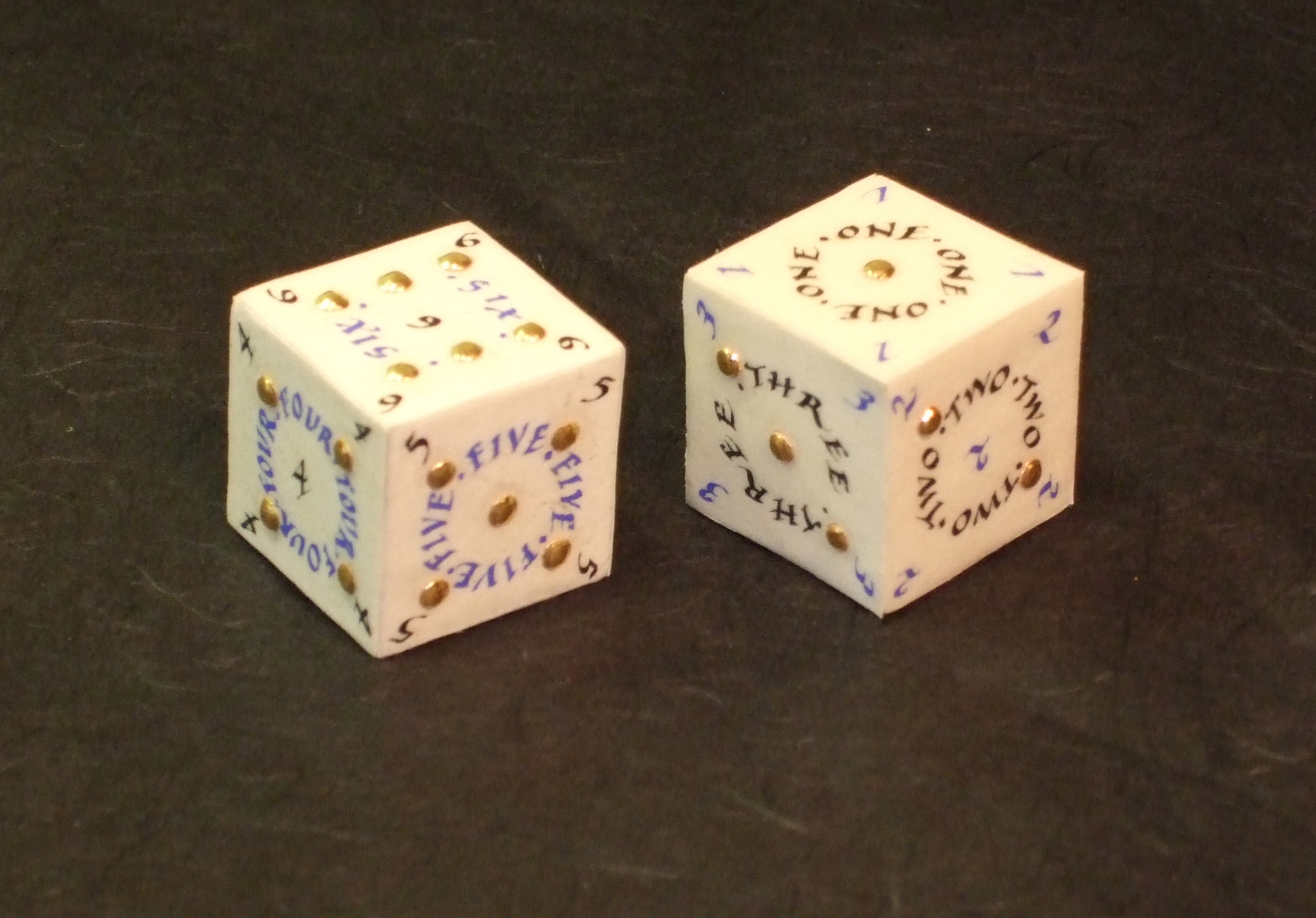
Wooden cubeIn my view, calligraphy doesn’t always have to be two-dimensional. I really like pieces that aren’t hung on a wall, and making calligraphy books is a favourite. I had a different idea from a book, though, and that was to make some calligraphy dice, not just any old dice, but ones made with slunk vellum (very fine skin), with real gold leaf covered dots, and with the numbers written with a quill. First, I needed some wooden cubes which could be covered, and once I had these, the experiments started.


Wooden cubes covered with paperThe problem with using slunk vellum, though, is that it is by nature very thin, and so the darker wood could be seen easily beneath the skin – not a good look. I experimented with covering the wood with paper. The paper itself needed to be reasonably robust otherwise it too would show the wood through. However, none of the covering styles I experimented with were suitable as the skin still showed through what was beneath – the folds in the covering paper. In the end I simply used archival quality PVA and pasted this on one side of the wood. I then placed this on a square of paper slightly larger than one side of the wooden cube, and pressed and held down. When dry, I used a knife to trim off the paper close to the edges of the cube, so there were no folds at all that could show through.

Strips of slunk vellum with pencil linesNow to setting out the dice. I experimented with various layouts, and needed to ensure that whatever style I chose, I could fit in numbers such as 6 and 1, which have three letters, as well as the number 3 with five letters (normally no problem, but I was working on an area of just over 2.5 cms (one inch), and the lettering was to be written as circles within that, so an even smaller space!). When I was happy with my design, I cut two strips of slunk vellum, treated it carefully (see my DVD for more details of treating skin for writing and gilding and lots more [download the order form]), and used a sharp 4h pencil, compasses, stencils for the circles and a straight edge to set out each face of the dice. Rather than working with small squares of fiddly and curling up vellum, I kept them as a strip for ease.

L b L 4I made a new batch of gesso (my DVD again), and laid it with a quill, making sure that each dot was round and stood proud of the skin surface. I use a scientist’s crucible for both gesso and pigments and ink, rather than a usual flat paint palette, as the former has a smaller surface area for the moisture to evaporate. Traditionally (!), we use the end of a paintbrush to stir the gesso, as the ingredients for gesso need to be constantly mixed. Using a quill to lay gesso usually means that there are fewer air bubbles, and this was the case in this instance.

Partly gilded dotsWhen the gesso was completely dry, I polished the dots with a burnisher (you might be able to see the shine on the dots of the top vellum strip). Then to lay the gold leaf – this was 23.5 ct, almost pure, gold leaf. I got up early one morning, because laying gesso needs a certain amount of humidity, and set to. Gilding the dots was a little fiddly, but no more so than in some other jobs I had done. The curved-bladed knife is to scrape away excess gold when the gilding is complete.

Writing completed on the vellum stripsAnd on to the writing. I used a quill, recut so it was sharp (yup, that DVD again!), and wrote the letters and numbers in Chinese liquid ink and in ultramarine Schmincke Calligraphy gouache (the best to use for calligraphy). I had planned for the two dice to look different, one with blue numbers and black lettering and the other with black numbers and blue lettering.

Finished illuminated dice


When the writing had dried completely (always leave at least half a day for this on best pieces), I erased all the guidelines, and then carefully trimmed each square using a straight edge and metal rule. Finally, and really carefully, I pasted each side of the dice, and firmly placed the appropriate square of illuminated vellum securely. Usually I would use a bookbinder’s bone folder to press the surface down, but this wasn’t possible with the gilded dots. I allowed the finished dice to dry and here they are.

And why ‘Luck be a Lady’? Well, those of you who are as firm musicals fans as me will know that this was sung in Guys and Dolls by Sky Masterson. The first line in his song ends with ‘tonight’, but I wanted luck to be a lady for more than just ‘tonight’!

Was Moses Born with Horns?

Michelangelo's Moses, with tablets and hornsThis very famous Michelangelo statue from the Church of San Pietro in Vincoli, Rome, shows Moses with the most exuberant and lush beard, which he seems almost to caress with his left hand, which is at the same time holding the stone tablets of law. However he also has two horns sprouting from his head.


God instructing Moses (with horns), Aaron (as a bishop with mitre and crozier) and an attendantImages of Moses with horns were used in manuscripts, too. This delightful miniature in a British Library manuscript of a rather youthful God, possibly a golden angel peeping over his right shoulder and clearly in a blue sky, is explaining the proper forms of sacrifice to a rather young horned Moses (unbearded, unlike the wonderfully soft curly bearded locks of Michelangelo’s Moses), a young Aaron – shown as a Bishop with his crozier and mitre – and an attendant.


Miniature from the Bury Bible showing MosesA favourite manuscript, the twelfth-century (about 1355) Bury Bible, now in the Parker Library at Corpus Christi College in Cambridge, has magnificent miniatures (although some are almost 30 cm, one foot square, so not so mini, though more on this in a later blog) painted by ‘the incomparable Master Hugo’. This is one is two-storey and shows Moses, in the upper part he is instructing the Israelites using the recently received laws, and below that, Moses is pointing out the birds and animals Jews can and cannot eat by law. The Jews are recognised by their Jewish hats – brims with a conical middle part. Moses has bright white, very obvious horns. Note, too, the stunning borders, intricate colourful patterns on a black background which are very characteristic of Master Hugo. Another design device he uses is to paint a plain dark green rectangle behind the main figures, which focuses the viewer on the central action. Master Hugo’s palette and painting style is quite simply stunning (more on this later too).

So why should Moses be shown with horns in this way? Was he born with horns? Other images of Moses, before he went up on Mount Sinai show Moses un-horned, so it was when he went to get the tablets of law from God that the horns appeared.

There are some theories about this. First, when Jerome was translating the Old and New Testaments into Latin Vulgate in the fourth century, it is thought that he may have mistranslated the Hebrew word qaran – meaning to shine – to qeren – meaning horn. As Hebrew was usually written without vowels, this confusion is understandable. Horns can also be quite shiny, so context is quite important. This theory seems perfectly reasonable and is one that many find very plausible.

However, when Jerome translated this text into Latin his words were: splendor eius ut lux erit cornua in manibus eius ibi abscondita est fortitudo eius (Exodus 34), which can be translated as: His brightness shall be as the light: horns are in his hands; There is his strength hid.

Now the horns seem to be not on Moses’ head but in his hands!

Others have thought that again there is no confusion by Jerome. The sun’s rays can be considered as horns in shape, and horns can be polished until they shine and reflect the light.

Statue of Pan, with horns, and DaphnisSome feel that horns are a symbol of ancient mystery. Greek and Roman gods, such as Pan (seen right with Daphnis), Triton, Dionysos, and Bacchus were horned, and so the special god-like attributes of those with horns – those who were divine and honoured – may have been applied by artists to Moses once he had received the tablets of law from God.


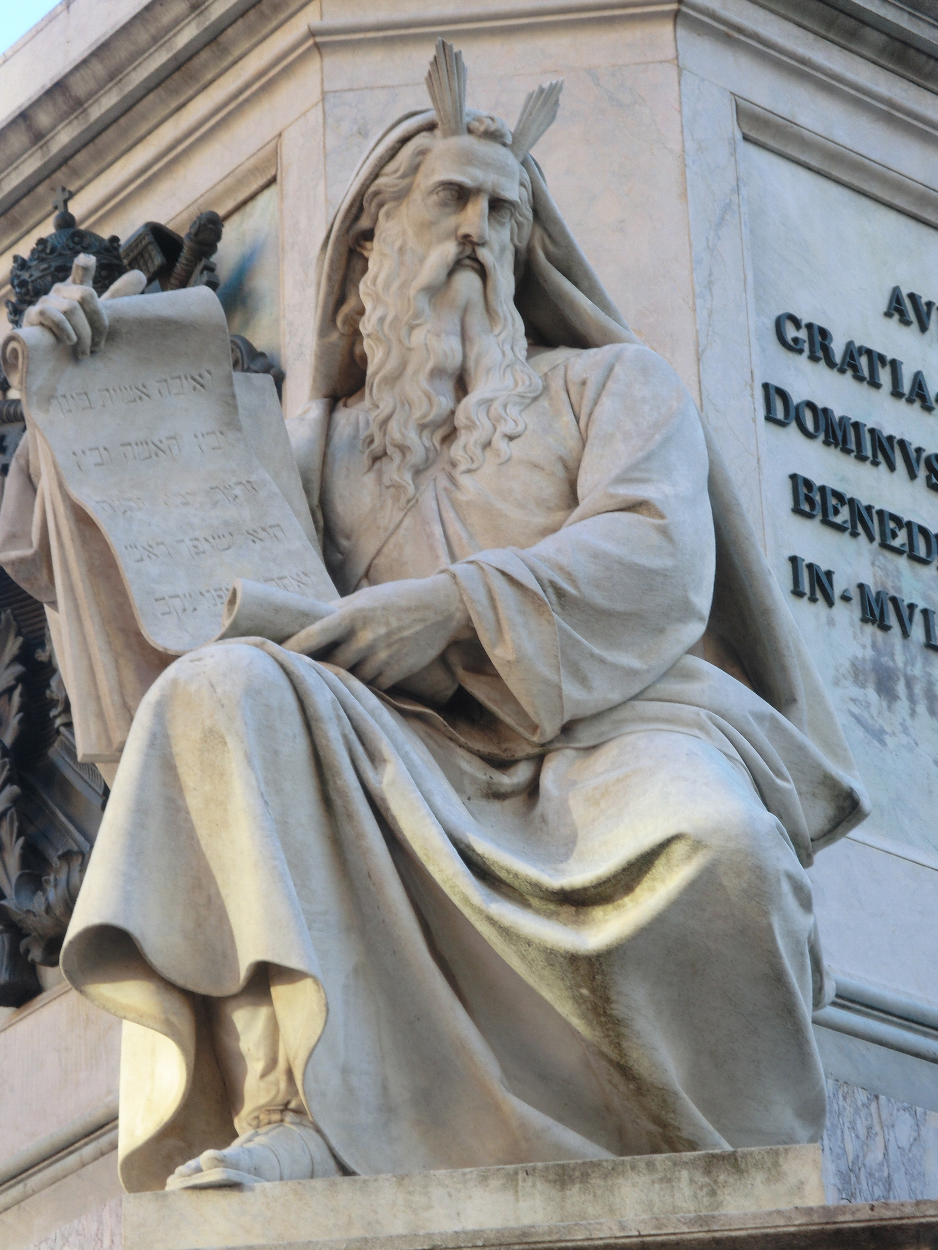
sculpture of Moses with horns that look like beams of lightOn a recent trip to Rome, I was delighted to see in the Piazza di Spagna, close to the Spanish Steps, at the base of the Colonna dell’Immacolata, a statue of Moses where the sculptor had decided to cover every eventuality. Here is Moses holding the tablets of law and with horns on his head, but the horns are shown as beams of light as well!