Author Archives: Patricia

Durham Cathedral all lit up!

Durham Cathedral 1Durham Cathedral like you have never seen it before. This wonderfully majestic Romanesque Cathedral, put up by the Normans to replace the original Anglo-Saxon White Church built to house St Cuthbert’s shrine, was more than colourful when, as part of the Durham Lumière Festival, images from the Lindisfarne Gospels were projected on to the building.


Durham Cathedral is illuminated as the Lumiere Festival opened in Durham City, UK, on 17 November 2011. The biennial festival of light, which runs until 20 November, features works by 30 international and British artists. Ross Ashton's Crown of Light installation seen projected onto the cathedral.
The Gospels themselves are stunning, but when shown as enlarged as they are here, the true artistry of Eadfrith is emphasised.


This is an interesting reference to it, albeit in the Daily Mirror!


Gold on Parchment

Gold on ParQuills, vellum and parchment (they are different!), real gold, egg tempera paints, the development of scripts, how manuscripts were made, how quills are cut, the sequence of manuscript painting, scribes, all this and more will be covered in the ‘Gold on Parchment’ session that I’ll be giving at the State Library of New South Wales in Sydney on Monday 6th January from 5.30-7.30pm. Entrance is free. Do come along if you’re in the area (yes, I know it’s a long way, but you might enjoy it and could even be worth the airfare!!).

Worship and Glory exhibition

Litany of LoretoAn exhibition of amazing craftsmanship and true artistry is on until December at the Royal School of Needlework at Hampton Court Palace. The main attraction is the twelve Litany of Loreto embroidered pieces made in the early 20th century. Sadly the RSN website contains few images, but these here may tempt you to get to the exhibition.

Litany of Loreto


The panels are in muted colours, and show incredible skill with the needle. Shading is done purely by cross hatching using slightly darker colours.


Litany of Loreto


This close up shows just how subtle the embroidery is, with slight shading on the upper eyelid, and just the hint of tears.


Litany of Loreto


And this shows a larger section of that panel where the hair really does look as if the slight wave has been painted rather than stitched. Note too the wonderful expression on the child. It is quite astonishing that this has been achieved by needle and thread alone.


Litany of LoretoAnd finally an even larger section showing where the detailed sections above came from.

Drawing the street

Drawing the Street image 1A wonderful new exhibition in Newcastle-under-Lyme library is on show only until November 30th, 2013 but is well worth making the effort to get there if you can. It shows a drawn record of the buildings on the streets mainly in and around Newcastle-under-Lyme.


Drawing the street image 2Conservation Architect Ronnie Cruwys, whose exhibition it is, is a fantastic draughtswoman and she is applying her incredible skills to record the buildings in the streets so that the amazing range and mix of buildings that we may well pass every day and not give them a second’s thought are shown. By doing this, Ronnie is making a record for the future.

Drawing the street image 2She has a great eye for detail, and includes passersby and pets on occasion to bring the drawings to life and give them a scale. Some of the buildings in the drawings she has made have already made way for replacements, and these are rarely as charming as their predecessors!


The exhibition has had rave reviews:

So impressed by the magnitude and detail of the whole project – your talent is amazing! What a wonderful way to open our eyes to the buildings around. 

Fantastic detailing, great use of colour makes the town look like a place you’d like to shop in (what a pity it isn’t). Spread your wings, other streets, a focus on certain buildings (pubs might be popular) maybe these pics could inspire great things in Newcastle!

Absolutely beautiful – keep up the good work. Great historical pictures (for our future children)! 

Your drawings are amazing, taking care of the tiny details made the drawings look as if they are documenting the streets very well, also the scale and dimensions are very true.

There are also prints and postcards available. These are all on Ronnie’s website, but seeing the real deal in person is so much better!


On the rebound – a 14th century book

Cover of choir bookMany of us don’t fully appreciate the work that has to be done behind the scenes to ensure that manuscript books in exhibitions are presented in the best possible way. In the Victoria and Albert Museum, a choir book made in Tuscany, probably Florence, in around 1380 for a religious house of nuns is one such. It contains the chants to be sung in the Masses for saints on their feast days.


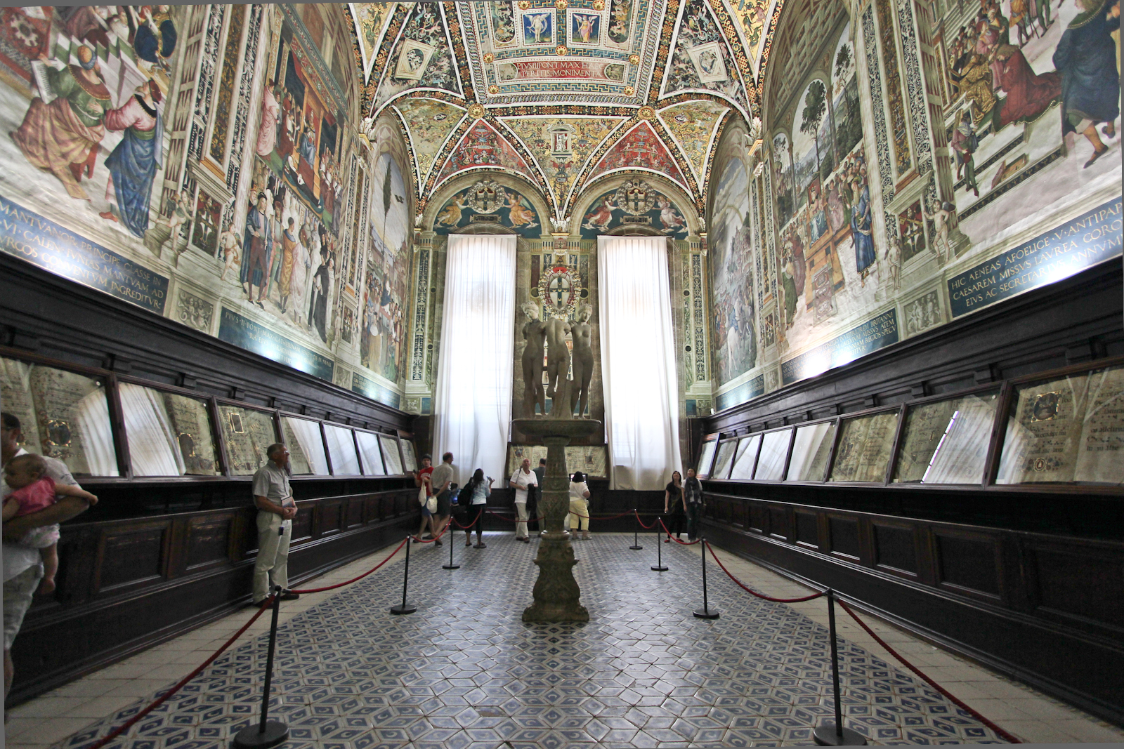
Piccolomini LibraryThese choir books were usually large enough to be propped on a stand so that all the choristers could see the words and music at the same time. Many of them are quite huge, and there is a glorious collection of these books which can be seen by the public in the Piccolomini Library at the cathedral in Sienna, Italy.


Choir book before restorationThe V&A book, though, was not in a good state of repair. It had been stored upright rather than flat and this had put a strain on the binding such that the front cover and the first few quires were separated from the rest of the book. Handling the book was challenging without causing further damage.


Detail of damaAlso, the inside was in a sorry state. It was very dirty, and some of the pigments and gold leaf had started to detach. There is a large chunk of gold leaf that has fallen off in this illumination and the other areas of gold look damaged too.


Partially cleaned manuscript pageSo the decision was made to completely rebind the book and also clean and consolidate the pigments. Most of the cleaning was done by using a soft eraser, although there was some use of a chemical sponge. The results can be seen here on the right and below. The pigments were also analysed and a whole range of colours including the precious lapis lazuli (ultramarine) and Enlargement of cleaned areavermilion (cinnabar), as well as red lead (minium), lead white, (ceruse), azurite (citramarine) and organic pink (probably madder looking at the manuscript). The non-destructive tests on the ink were inconclusive, so it is not clear whether it was oak gall or carbon ink used.


Book sections sewn on to alum tawesThe book was rebound, including removing the metal bosses on the covers to enable the latter to be attached to a new spine. A series of photographs of this process is shown on the website page and it is a fascinating record of a true craft process.

‘Gutsy lettering’ and all that jazz – Michael Harvey

Michael Harvey typefacesSome of the names of the fonts available on our computers can be quite intriguing, and the stories behind them even more so. When Michael Harvey designed his first he called it Zephyr after the car he was driving, and his later fonts were named after his passion for jazz – Ellington, Mezz and Strayhorn. They are strong, clear and simple designs which have stood the test of time.

Michael Harvey book jacketDesigning book jackets was another of the strings to Michael’s bow. Initially influenced very much by the letter-forms he had been taught by Joseph Cribb, who was Eric Gill’s first apprentice, Michael then went on to work with the wood engraver Reynolds Stone, who encouraged him to free himself from what could have become a straight jacket. Despite the constraint of being able to use only one or two colours at the time, Michael made sure that his book jacket designs fairly leapt off the shelves, as with his own book here.


Sainsbury wing letteringPerhaps the best place to see his work easily is outside the Sainsbury Wing of the National Gallery. The architect, Robert Venturi, said that he wanted ‘really gutsy English lettering’ and Michael was able to oblige with letters having strong serifs and a good contrast in the widths of the strokes. He approved of being involved in the whole design process rather than what is sometimes the case – architects simply picking a design out of a font catalogue almost as an afterthought. The commission really was huge, though, and Michael required the assistance of letter cutters and designers themselves, Brenda Berman and Annet Sterling of Incisive Letterwork, to help him carry it out.

Page from Michael Harvey's bookMichael also taught for many years at the University of Reading, running the course Letter-forms, and many are those who have benefited from his skills and knowledge. I remember talking with him about teaching and him saying that it was as much about learning as it was teaching, with which I wholeheartedly agreed. His books on lettering are worth every penny, with strong layouts, copiously illustrated with his own designs and artworks, and often with his drawings as well. Michael believed very strongly in the importance of drawing.

He and I also felt that copying was useful, but his words are far better than any I could give: ‘A model is not an end but a beginning. Copying a good model is a good start … No matter how much one tries to reproduce another person’s style we add something of ourselves.’

Michael sadly died last month after a long illness.

  • Harvey, Michael. Letters into words. London: Clowes, 1973.
  • Harvey, Michael. Lettering design: form and skill in the design and use of letters. London: Bodley Head, 1975.
  • Harvey, Michael. Creative lettering, drawing and design. London: Bodley Head, 1985.
  • Harvey, Michael. Carving letters in stone and wood. London: Bodley Head, 1987.
  • Harvey, Michael. Calligraphy in the graphic arts. London: Bodley Head, 1988.
  • Harvey, Michael. Reynolds Stone: engraved lettering in wood. Netheron: Fleece Press, 1992.
  • Harvey, Michael. Creative lettering today. London: A. & C. Black, 1996.
  • Harvey, Michael. Adventures With Letters. Bridport: 47 Editions, 2012

Kites flying high!

Finished Kite artworkI was asked to write out this poem for a special birthday present, and was delighted when the budget stretched to calfskin manuscript vellum, and real gold leaf on gesso base. As soon as I read the words, I had an idea of the shape and feel of the design. The poem talks at the end about the kite taking off, itself alone, and so I saw the kite flying free through the piece as the wind took it. To do this, and to create that feeling of the flight through the air, the piece just had to be long and narrow, there was no question of any other shape.


Kite 1I experimented with various sizes of lettering – the lines are quite long and there are six verses, so it couldn’t be too large. On the other hand, pieces that are hung on the wall, as this was intended to do, need to have larger lettering than that in books, for example, which are held in the hand, as people read further away from a wall-hung piece. I wrote the verses out fairly quickly on to Layout paper (for types of calligraphy paper, see Calligraphy Clips – Paper), and then cut these up into strips and placed them either side of a quickly drawn kite. The piece didn’t hang together, though, and rather than unite the verses, the tail of the kite seemed to separate them.


Kite 2So I changed the design a bit and pulled the verses together. I did have an idea of the size of pen to use for the lettering, and maintained that thought of the verses being slightly offset, and so wrote out the first more formal rough on to proper paper. Layout paper is fine for first trials, but it doesn’t always give the real feel of how long the lines will be, what the final spaacing will be, and so on, so after experimenting I do then prefer to use a good quality piece of paper. As someone once said, paper is no use if it’s stored under the bed or in a drawer; it needs to be used!


Kite 4So I was pretty sure about the dimensions from this writing out, what shape the kite should be, and how the tail would fall in the piece. I used two large, wide L-shaped pieces of card, placed carefully to make a rectangle, to determine the margins, and then cut the vellum such that it could be stretched round a piece of wood. For more information about vellum, why it needs to be stretched, and how to do the stretching see my Illumination DVD. It stretched beautifully flat and I then set to marking out the skin using a compasses and a 4H pencil (again see Calligraphy Clips for Measuring Lines). I mixed up Paris Blue and Madder Red Calligraphy gouache (again Calligraphy Clips – Ink and paint) and fed this into the nib as I wrote. When there is illumination well away from lettering, it is usual to do the writing first, as in this case. The centre line was marked on the skin and, taking a deep breath, I drew on the tail of the kite freehand.


Kite piece, gesso laidThe illumination and decoration was next. I mixed up some new gesso and laid it with a quill. I turned the piece upside down for ease of working and so that laying the gesso would be away from the area of writing, although my paper guard did slip a little as you can see here. The gesso is still wet and glistens in the light. It is also possible to make out the markings of the hair follicles. And there is a better idea in this enlargement of the variegated colours of the red and blue gouache.


kite piece, briar hedgeAgain masking off the lettering, I then went to the lower part of the panel to concentrate on the briar hedge. This had been designed especially for this piece, and consisted of pink roses with gold centres and rose leaves with prickles on the leaves and the intertwining stems. Almost pure real gold leaf (23·5 carat) was placed over the dried, scraped and polished gesso. Raising the gold from the surface like this makes it shine and catch the light.

Once the gilding was done, the flowers and leaves were painted, as well as the kite and blue kite bows. The title and dedication was finally added, and then, the next day, the pencil lines removed with a soft eraser.


A ‘must have’ diary …

British Library diary 2014 coverThe British Library Diary for 2014 is exquisite! Page after page of fantastic manuscripts, in rich jewel-like colours, greet each week. The images are taken from the collection of Royal Manuscripts given to the nation by George II in 1757, but with additional miniatures from selected other collections too. The cover (right) shows the Earl of Shrewsbury, with his sumptuous red velvet and fur-lined robe, decorated with circular blue and gold Orders of the Garter, presenting his book to Margaret of Anjou. It doesn’t look a very happy court, though; no-one is looking in the least bit pleased, and most seem to be actually sneering! The backcloth of blue and red squares shows the arms of England at the time. The claim to lands in France meant that the gold fleur-de-lis on a blue background took precedent in heraldry to the gold leopards of England on a red background.

Medieval miniature from the British LibraryThe very sharp printing means that it is possible to see all the details. In this miniature from the Bedford Hours (c.1410–30), Clovis, who became the first king to unite France in 481 when he was 15 years of age, is being helped on with his armour. At the same time his queen, Clothilde, is handing him his shield showing the arms of France. Note the cute little dog looking on admiringly, and the rather pathetic stone lions guarding the entrance. In the upper part of the miniature, God is giving a cloth painted with the French arms to an angel, indicating that Clovis was a Christian and so blessed. In the countryside around there is a rather fierce lion, a rabbit munching a very red apple, and a wolf making off with a sheep, and the shepherd shaking his fists as a consequence.

Medieval miniature from the British LibraryAnother book being presented is depicted in this miniature of c.1475. Here the author Jean de Wavrin is painted on his knees in front of Edward IV. The king’s robes again show the gold fleur-de-lis on a blue background, and they contrast with the rather dull grey of the writer’s clothes. Edward’s throne is quite magnificent with a wonderful red back cloth and an interesting trefoil decoration attached quite high up. Two hats are quite fun, and must have looked rather strange when viewed from the front, as the large black plumes on the blue (right) and green (left) hats look as it they would have stuck up rather like coxcombs! The burgundy wallpaper does look particularly fine. Note the arms of England sliding off the bottom of the page, with France in the first and third quarters, which are always regarded as the most important in heraldry, and England in the second and third – less important.

Medieval miniature from the British LibraryThis miniature from the Wells Apocalypse (early 14th century) shows the writing very clearly, and the prescissus, or cut off, endings to the letters are really distinctive. Note the tops of the ascenders of the letters l in the third line, and the bottoms to the letters i, u, s (looks a bit like an f) and i in the fourth line. Some think that these shapes were made by simply turning the pen to its full width horizontally, but the letters l suggest a different method. Note the little tail at the top on the right hand side, particularly with the second l (line 3). This small tail indicates that the letter was started from the right and then the pen was moved down to the left to make the downstroke. The tail wafting in from the left and the thickening of the stroke at the top was then added on afterwards. Similarly, the bottom of the strokes are made by maintaining the pen nib at an angle of about 30° which results in a slanting end to the letter, and then ‘filling’ in the rest of the stroke to make it look cut off at the end. Sadly the woman shown in the initial A doesn’t look too impressed by it all, despite her very elaborate headdress!


Are columns always straight?

Columns at the British LibraryColumns have been used for thousands of years to make impressive porches over significant buildings, or to record something important, such as Trajan’s or Nelson’s Columns, and the impression is that if they weren’t straight we would notice. However, if you look really carefully at columns, such as these from the British Museum, you’ll see that they have a very slight bulge just below half way.


Temple of Vesta, Rome


Parthenon in Athens


This is, of course, not new. This shape for columns was also used for those on the Parthenon in Athens (left). The columns on the beautiful Temple of Vesta in Rome (right), have a similar slight bulging just below half way. It is more difficult to make this out, though, with the railings in the foreground and the metal supports to the columns.

Pantheon in Rome


More obvious perhaps are the columns at the front of the Pantheon in Rome, the temple to all gods. Let your eye focus on the black space between the columns and it may be easier to make this out.


This shaping is called entasis, and is defined as the slight convexity of the column shaft which is introduced to correct the visual illusion of concavity. If the brain believed what the eye was telling it, without entasis the building would look as if it could not be supported by the columns.

lettering by Michael HarveyNow the space between the columns is the ‘counter space’, and this shape is thus slightly concave, going in just above halfway down. This is the shape that most good letterers use in their downstrokes. In drawn letters, this is quite easy to see as here. In this alphabet by Michael Harvey the swelling on the downstroke of the outlined letter B is quite obvious, so, too, is the increased width at the base of the outline stroke on the downstroke of the letter N. However, this shape to the downstrokes can also be seen quite clearly in the smaller letters in the black alphabet.


Letter F in British Library manuscript


This letter-shape was also used in mediaeval manuscripts. The downstroke (or minim as used by academics) of the Lombardic Capital letter F here in this British Library manuscript shows distinct signs of swelling at the top and bottom of the double stroke. (Note, too, the slight discolouration of the vermilion pigment at the top and on the right-hand stroke.)


Peter Thornton calligraphyIn Calligraphy, when using a broad-edged nib to make just one downstroke rather than those above which use two or more strokes, the technique is called ‘pressure-release-pressure’. So there is pressure on the pen to start the downstroke, this is then slightly released just above half way between the guidelines for x-height, and then pressure is applied again nearer the base guideline. British calligrapher Peter Thornton, now living in the US, is one of the best practitioners of this technique (see above right). It is, though, one that can be learned and applied after practice, and it does make a great deal of difference to how letters look. If you’ve not tried it before, then why not get out your pen and have a go?

Here lies the beautifully lettered gravestone …

Langar 3It is rare to get a whole batch of beautiful gravestones, and even rarer to be able to spot the hand of real craftspeople at work. This is clearly the case in the graveyard of St Andrew’s Church in Langar, Nottinghamshire. The church is a Grade I listed building, and is quite wonderful inside, and large, too, for a small country parish. But nowhere on all the records of the church does it mention these wonderful stones, such as the one on the right. Carved in slate, the lettering is still as crisp as they were when first made. This one to William James is dated 1809, and although it has little text, the decorative surrounding is quite wonderful. A grieving woman tugs on a rope or swash from an urn, and this is balanced on the right hand side by the same swash being caught up on the branch of a tree.

Gravestone from Langar Church

This early gravestone dated 1720, some 80 years before the one above, is not quite so fine. Here a rather Chinese-looking sad cherub spreads its wings with wonderfully carved feathers to protect Anne James, who died when she was only 42. The curly letters in the words of ‘Here’ and ‘James’ contrast with the fairly restrained lettering of the rest of the gravestone, but see how the letter carver has had a bit of fun by extending the serifs into spirals on some of the ascenders, such as the l of lies, and the B and d of Body in the first line.


Gravestone at Langar ChurchThis one from 1730 is very interesting, and again not of the same quality as some of the later others. I did tweet about this soon after we had visited the church (follow me on Twitter) as I find it so interesting. This, too, has a delightfully sad angel at the top, with eyes this time that are remarkably similar to those in the Lindisfarne Gospels. There is a great deal to learn from this stone about forward planning and the need to sketch something out to resolve any design issues before you start. So in the larger capitals at the top, there are conventional abbreviations and contractions with the letter e tucked into the v of the y to make ye, the letters h and e conjoined in he, and a slightly smaller letters at the end of the second and third lines. But what happens towards the bottom? Choosing that size of lettering has meant that the letter cutter has not had room to complete the lines, and so the remaining one or two words in each line have been squashed above or below. Charming though it is, it really doesn’t work!

Gravestone at Langar ChurchBut this one certainly does! A wonderfully vibrant and lively border of swags, foliage and flowers really draw the eye in rather than distract from the lettering. The exuberantly flourished H of Here at the top contrasts with the second line, and the third again with the fourth. The advantage of planning is also shown at the base where the four lines of lettering sit neatly within the left and right borders, although the last two lines have slightly smaller words, but this doesn’t detract from the overall feel. And we have a name! W Barnes was the sculptor. This is rare indeed to have this information.


Langar 5And the high standard continues. It seems that W Barnes had a workshop where he was able to pass on his skills. The name Wood has been carved near the base on the right of this later stone of 1810. The unusual curved lettering, sitting neatly into the flourishes or just underneath contrasts with the conventional straight lines of the rest of the citation. It is likely that the gravestone was carved in one hit, even though Richard died just a few days short of a year after his wife, but it is interesting to see the two ways in which his named has been carved, once in Copperplate and the second time in Small capitals.


Graveyards can be a rich source of inspiration for letterers when they include stones as fine as these.