
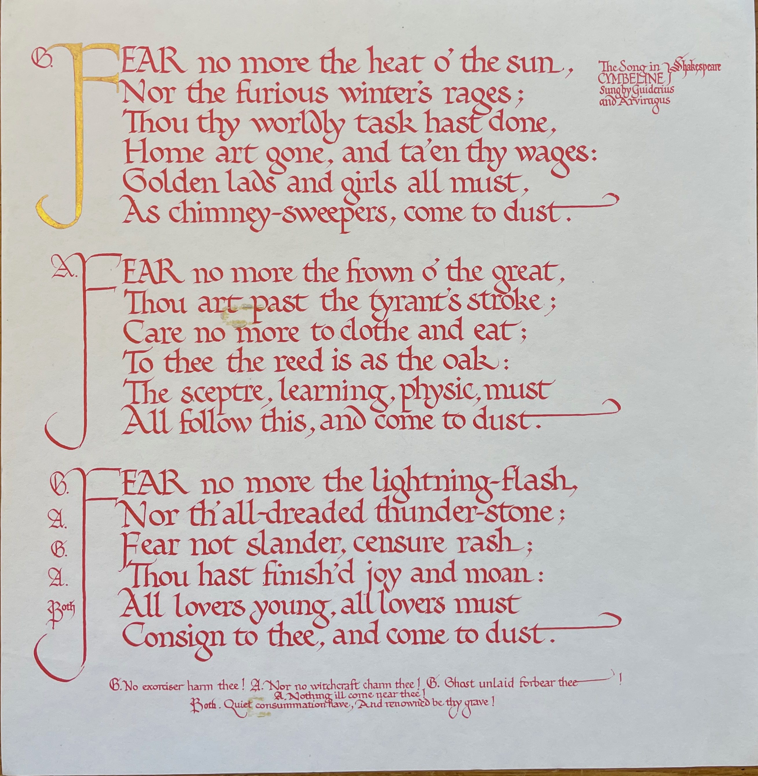
 Calligraphy is often a much neglected artform when it comes to being included in collections in libraries, galleries and museums, contemporary calligraphy even more so, yet is can be one of the most expressive combining text with colour, gold and illustrations. How wonderful, then, that Stanford University Library have decided to rectify that and create a collection of worldwide, contemporary calligraphy (initially focused on the western alphabet) as a three-year project, possibly extended. The launch of this was on the 150th anniversary (+ 6 months) of Edward Johnston’s birth in Uruguay on 11th August 1872 (already international!). His work, shown here, is already at Stanford.
Dr Ben Albritton and Patricia Lovett MBE are the Co-Directors, and are also on the Judging Panel, Patricia being Chief Judge. The keynote for the collection is excellence, but membership or fellowship of prestigious calligraphy organisations is not a prerequisite. Anyone can send in photographs of their best piece for consideration, but it is stressed that excellence in letterforms, design, use of tools and materials and creativity are paramount. Assessment will be made by submission of photographs, so their clarity is crucial – these should include one of the whole piece and additional close ups. Accompanying these in the same email must be the application form. There is a limited budget for buying artworks but it is also possible for calligraphers to donate their work if they wish (which will mean the Collection will be larger than envisaged!). All details are here. It is hoped that there will be an exhibition at the end of the three-year project as well as a conference/ symposium.
 Dr Ben Albritton, Co-Director of the Collection, is the Rare Books Curator and Bibliographer for Classics. He writes ‘I focus on enhancing, enlarging, and celebrating the Rare Books and Early Manuscripts collections of the Stanford University Libraries. Working with curatorial colleagues across many different departments in the library, I aim to provide support to Stanford faculty and academic programs using Special Collections materials, and to raise awareness of our collections amongst research communities around the world. I am passionate about the use of our materials in teaching, and work closely with faculty and students in class sessions and research projects. In order to connect more researchers with our materials, I also am eager to work with colleagues in the library to provide digital access to more and more of our primary source materials. To support these broader goals, I also work with rare book dealers and library donors to make sure that Stanford’s rare books collections are growing in ways that fulfil current research needs while also anticipating future areas of interest.’
 Patricia Lovett MBE, Co-Director of the Collection and Chief Judge, is a professional scribe and illuminator who specialises in the skills and techniques of mediaeval manuscripts but in a contemporary way. She has written over a dozen books, her latest being the ‘Art and History of Calligraphy’ published by the British Library, and is working on another for the British Library to be published in 2023. Patricia co-curated the collection of contemporary calligraphy and the ‘Calligraphy Today’ exhibition for the Fitzwilliam Museum, and has worked with the British Library on their ‘Genius of Illumination’, ‘Anglo-Saxon Kingdoms’ and ‘Gold’ exhibitions, being filmed to show techniques for the last two. She was awarded a National Honour for services to calligraphy and heritage crafts.
 The four remaining judges of international highest repute include Gemma Black from Australia. Gemma writes: ‘I grew up making things. I made music, books & letters. The formal discipline of learning the piano fed directly into my calligraphy and lettering training firstly through the Roehampton Institute in London then on to other allied art training in watercolour, bookbinding & printmaking at a variety of other institutions including the Australian National University School of Art. I feel fortunate to belong to a strong and rich tradition, the evolution of letterforms and to work with likeminded people in the field. Not only do I belong to this rich tapestry of human communication, lettering, I breathe it.’

Peter Halliday from the UK is practitioner, teacher, author, calligrapher and lettering artist spans over sixty years. As he was taught by Maisie Sherley, herself taught by students of Edward Johnston, Peter gives an almost unique link with the early calligraphy revival. He was Chair of the Society of Scribes and Illuminators and Founder Chair of the Calligraphy and Lettering Arts Society as well as author of the National Diploma in Calligraphy. Peter was a Founder member of Letter Exchange. Peter’s creative approach to the lettering arts is both imaginative and innovative. Using a wide range of materials, respect for the traditions of illumination, especially gilding, gives his work a special place based on creativity, tradition and integrity.
 Katharina Pieper from Germany is a freelance calligrapher who, from 1988, has taught lettering and calligraphy at many prestigious institutions, and since 1991she has been invited to teach workshops all over the world. Her calligraphic work has been published worldwide in exhibitions, books and journals and she has also written articles for journals in Germany, England, Belgium, Austria, Switzerland and the US. With her books, calligraphy, and paintings she is represented in many public and private collections. In 2016 she founded the Stiftung Schriftkultur e. V, and in 2017 opened a gallery with a museum, library, workshop rooms and the Jean Larcher archives in Gut Königsbruch in Homburg.
 Julian Waters is the son of revered calligrapher Sheila Waters and pre-eminent bookbinder/conservator Peter Waters. His other great mentor was the legendary Hermann Zapf. Julian has taught workshops for lettering professionals worldwide, and typography, lettering and font design courses at The Corcoran School of Art, Cooper Union, NY, Letterform Archive, and Wells College. Julian’s book design and lettering clients have included U.S. Postal Service, National Geographic, agencies, publishers and memorials. His typefaces include Adobe Waters Titling Pro and “ThJefferson” for Monticello. His work has received many awards and has been widely published and exhibited.
On a personal note, I am thrilled that this Collection is taking place, and honoured to be working with Ben as Co-Director – and how inspired of him to do this! For many years I tried to persuade the British Library to buy contemporary calligraphy and they do have a few pieces, but certainly not enough! However, a chance remark I made to Dr Stella Panayotova meant that she and I worked on the Collection of Contemporary Calligraphy at the Fitzwilliam Museum and the accompanying ‘Calligraphy Today’ exhibition, which was extended twice because it was so popular! How wonderful, then, that with a budget (albeit limited!), this new Collection is now taking place, but rather than by invitation as at the Fitzwilliam, this is for all those practitioners at the highest level who can submit their work to be assessed by this amazing panel of judges. Every practitioner judge is at the top of their game producing outstanding calligraphic artworks, and is also skilled in assessing lettering. This is such an exciting project and what a privilege to be part of it!


