Ultramarine – beyond all other colours

The intense bluef80dBMaryWeaving of ultramarine, from lapis lazuli stone, is like no other colour, as Cennino Cennini, at the beginning of the 15th century, wrote in his book ‘The Craftsman’s Handbook’ – a colour illustrious, beautiful and most perfect, beyond all other colours. It was the colour adopted for the robes of the Virgin Mary (see right) as the cult of the Virgin grew towards the end of the first millennium. The intense blue was thought to be a similar colour to the sky, which emphasised the proximity of Mary to God, and it was also very expensive and so would be used only for the most precious things, indicating Mary’s importance.


223E521400000578-0-The_golden_mask_of_Tutankhamun_pictured_has_been_permanently_dam-m-4_1421981422109The colour was not restricted to manuscripts only, however. It was also used by the pharaohs of Egypt, famously in the funeral mask of Tutankhamun, where lapis lazuli blue alternated with yellow gold in his headdress. Clearly the value and rarity of the stone along with the brilliance and depth of the colour was recognised as being suitable for the highest in the land.


IMG_1324When I first started learning about vellum, quills, calligraphy and painting, ultramarine (Latin for: over the sea) mainly came from the Badakshan mines, at a place called Sar-e-Sang in north-west Afghanistan. Sar-e-sang means place of the stone, appropriately enough. A tiny pan of the colour, about one quarter of a pan of watercolour, cost £70, and that was some time ago. Nowadays a new, excellent, source from Chile, has reduced the price significantly, and you can buy small pans of ultramarine watercolour, similar in size to shell gold for less than £20 from Cornelissen,


images-1The pigment was made by first grinding the stone and then mixing with pine resin, mastic, and wax or linseed oil and boiling the compound. After soaking, the mass was kneaded in lye (lye was obtained by leaching ashes which were high in potash or potassium carbonate) until the blue colour came out.


imagesThe best and strongest colour came out of this first batch. Further kneading yielded less strong – and cheaper – pigment and finally ultramarine ash was formed, which is a blue-grey transparent pigment. When I first started learning you could get tubes of ultramarine ash watercolour, and it was a lovely colour to use as it had tiny fragments of the stone which glistened in the light – wonderful for painting skies. It is still possible to get ultramarine ash powder to make into paints, but I haven’t been able to find tubes of ultramarine ash paint for many years.

CIMG1315There are recipes online for making egg tempera, but few of them are exact, and nor is mine! The method for making egg tempera is shown on my DVD, and there are details also in my latest book on Illumination. So, if you want to make your own ultramarine egg tempera (or any egg tempera) then you will need:

  1. Powdered pigment (available from Cornelissen)
  2. Ground glass slab and muller (also available from Cornelissen)
  3. Teaspoon and a little water
  4. Flexible kitchen spatula
  5. 2 small containers such as crucibles or tiny flat-bottomed jam jars
  6. A fresh egg
  7. Three clean cups
  8. A few sheets of paper kitchen towel
  9. Sharp-bladed pointed knife
  10. Ink dropper
  11. An old saucer or smooth glazed tile
  12. Small paintbrush

(As this involves a powder, you might want to wear a face mask for safely, particularly if you are susceptible to powders in the atmosphere.)

The method:

  1. Use the flexible spatula to mix gently a teaspoon of pigment powder with drops of water.
  2. When the consistency of a flexible paste (you may need to add more water with the ink dropper, but always add individual drops to the mix, rather than a huge squirt which will make it too wet and difficult to grind) grind on the ground glass slab with the muller in a figure-of-eight motion for about 3 minutes until it is a very smooth paste (you can use a pestle and mortar but it isn’t quite as good). Grinding with water first enables a better mix with egg.
  3. Scrape the resulting paste together into a crucible or tiny flat-bottomed jam jar.
  4. Separate the yolk from the white of the egg, allowing the white to drop into one cup and the yolk (unbroken!) into another.
  5. Have paper kitchen towels to hand and slide the yolk really carefully out of the cup on to your palm (fresh eggs tend to be better as the yolk sac is thicker).
  6. Carefully pass the yolk from the palm of one hand to the palm of another, wiping your hands alternately on paper kitchen towels to remove any trace of the white.
  7. When the egg sac is quite ‘dry’, with your non-dominant hand carefully pinch the yolk sac and hold it over the third clean cup.
  8. Prick the sac with the knife and allow the yolk to fall into the cup; discard the egg sac.
  9. With the knife lift a small amount of the pigment paste into the clean crucible or tiny jam jar.
  10. Use the ink dropper to suck up some of the egg yolk.
  11. Add a few drops of the yolk to mix to smooth paste.
  12. With the brush paint a patch on to the saucer and allow to dry.
  13. When dry use a fingernail to lift the corner of the paint. If it comes off in one piece and sort of keeps its shape then this is the correct amount of egg and you can use it as paint. If it breaks up and is powdery then there is not enough egg, so add another drop or two and repeat. If it is too sticky to use, add a couple of drops of water and repeat this process. It is very much trial and error, but you will soon ‘feel’ when the egg and pigment mix is about right.
  14. Egg tempera keeps for a few days on the saucer, but do not cover completely or it goes bad (and stinks!). Just loosely place a piece of paper on top.

Gappy – a celebration of a great Indian poet

CIMG2267It must be really difficult to write about someone you have never met but who is remembered with great affection in the family. This was the challenge for the daughter of a close friend of mine. Her grandfather was Edward Mendonça, a celebrated Indian poet, and his centenary was last year. A book of a collection of his poems was planned to mark this. Would Neisha, a gifted poet in her own right, contribute a poem?

Many families have pet names for grandparents, and ‘Gappy’ was that for Edward Mendonça. So Neisha wrote:

Gappy

And so it was

That you should live and I should live

At separate times, in separate worlds.

So that I’ll never know your touch; the small expressions of your face;

The paper-soft feel of your grandfather skin, or the comfort of your laugh from afar.

I have no memory of you that’s only for me.

But I have endless tales: of love, of joy, of kindness …

And I know that you are wonderful,

And still here – in words, in memories and in enduring love.

IMG_0840As with so many of Neisha’s poems, I loved this as soon as I heard it. It had elements of reaching back through half-remembered, or half-told memories to try to form the feeling of a person long since gone. I played around with the words until I was happy with them, wanting a free and unstructured piece. Then to the paper – what to write it on? I found a single sheet of hand-made Indian tissue-like paper, slightly crumpled. This was exactly the feeling that I wanted. I tested the paper for writing, and although it was a bit of a challenge, it seemed to work with a bit of care.

IMG_0837The effect I was aiming for was that of reaching back into the past for memories, some clearer than others, some about to disappear. I had the idea of tearing the paper into strips and writing each line at the base of a single strip, one overlapping the other. BUT I had just that single sheet of paper and there was little room for wastage, so it was very tense! I placed the written lines of my rough on the torn strips of tissue paper to see how it would work and made a few adjustments.

IMG_0842Then I started, using a very narrow nib and Indian red, which I thought appropriate in the circumstances, I placed each line of ‘rough’ above where I was to write. I worked my way along each line, taking into account the position of the words on the line above, and also the shape of the torn paper. As I worked down the piece, I laid each line on top of the other as I did so to check that it was working as a whole.

CIMG2268When I had finished writing I pasted the upper part of the torn paper strips on to the back of the one above, and left the bottom part loose – not attached. Sticking everything down securely and perfectly wasn’t the effect I was aiming for! The piece needed to be free and slightly ethereal, and yes, a bit torn round the edges! Of course, there are always things that I would have changed, and had I a second piece of paper, I could have planned it much better, but the overall effect was the one that I had in mind at the start – going back in time through layers of memory, some better remembered than others.

Vellum and Acts of Parliament

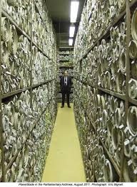
Parliamentary archives - Acts of Parliament (4)Vellum has been used for printing or writing Acts of Parliament almost since they were first recorded. In 1999 there was a move to print these Acts on paper, which was defeated. However, on 14th October this year, William Cowley, who are the last vellum and parchment makers in the UK, heard from their MP, Mark Lancaster, that there was to be a House of Commons meeting where the end result could well be that printing on vellum would cease.


imagesI was actually at a committee in the Houses of Parliament when I got this message, and went on to a meeting just after with one of the Heritage Craft Association’s patrons, Lord Cormack. He kindly agreed to write a letter in support of the continuation of the use of vellum, and also gave me invaluable advice.


A phone call with Paul Wright of William Cowley that evening, and a further conversation with Lord Cormack clarified the situation. The House of Lords agreed in 1999 to discontinue printing on vellum, however the House of Commons disagreed and so the use of vellum has continued. The discussion and vote was to be by the Administration Committee, chaired by Sir Paul Beresford MP (http://www.parliament.uk/biographies/commons/sir-paul-beresford/103).

I wrote to Sir Paul Beresford and contacted as many people as I could who worked in conservation, museums, libraries, as book binders, and also other practitioners. I explained the situation briefly, and asked them to contact Sir Paul themselves.

There are three main points about paper and vellum and then one about the craft:

codexsinai_lg

  1. Vellum lasts. We have vellum documents that are over 2,000 years old, and whole books from around 350 AD (see right: Codex Sinaiticus in the British Library) which can still be consulted and used, pages turned etc. If vellum had not been used, the new Archbishop of Canterbury would not be able to kiss the St Augustine Gospels (brought over in 597 with St Augustine) when enthroned, we wouldn’t have the Domesday Book (1086), nor be celebrating 800 years of the Magna Carta with all the significance of the rights of people. Paper does not last anything like as long. Archival paper lasts for about 250 years; it may last longer if it is stored in special conditions, but no specialist will actually guarantee the ‘500 years’ that has been suggested. In any case, this is not 2,000 years!
  2. vellum makingWe have been told that the cost of printing Acts of Parliament is about £103,000 per year. We know from William Cowley that they receive about £47,000 per year for supplying vellum. This means that printing and other costs are £56,000. These costs will apply whether printing is on vellum or on paper, as there are no extra costs for printing on vellum nor any different inks needed. So the saving would be the cost of vellum, £47,000, minus the cost of archival paper, which we have been told is about £20,000. The saving is, therefore, £27,000. This relatively tiny amount is what the decision rests on!
  3. CIMG1640Vellum isn’t only green but green-plus, as it is a byproduct of the meat and dairy industry. Male calves are killed for veal (veal and vellum have the same derivation) when they are a certain size if they aren’t selected for breeding and as they can’t produce milk. Once processed, their skins go to be tanned for the leather industry, more than we think go to landfill as we produce more skins than are required, and a few are used for vellum. No forests are cut down, no harmful chemicals are used, no energy-using machinery is required to produce vellum. The only energy is that of the parchmenter, who has taken 7 years to learn the craft skills.
  4. images-1William Cowley is the last vellum and parchment maker in the UK, and takes the passing on of skills seriously. It takes 7 years to train an apprentice to journeyman level, and they have one being trained at the moment. Supplying skin to parliament considerably boosts the sales of vellum and the effect cannot be over-estimated. It will have a serious effect on William Cowley if this supply stopped. We are losing too many of our heritage crafts by default and many of them are, like Cowleys, currently thriving businesses. (for the difference between parchment and vellum etc see:  https://www.patricialovett.com/vellum-and-parchment-and-a-special-offer/)

b6994e70-79b8-11e5-_999169cOn Saturday 24th October, there was an article in The Times*, and also a piece in their ‘comment’ section. Both were broadly positive, although there were errors. First, the cost of vellum is nothing like the £80,000 per year quoted, and secondly, no calves would be ‘saved’ by not printing on vellum, simply more calfskins would go to landfill. I sent email a letter to the Times correcting these facts but sadly my letter wasn’t published!  *(http://www.thetimes.co.uk/tto/news/politics/article4594895.ece)

Screen Shot 2015-11-02 at 15.53.57During that Saturday, I was asked if I would be interviewed for BBC World Service, the PM Programme, and Radio 5, which I did. During Sunday I was asked if I would be interviewed for BBC2’s Daily Politics programme on Monday (http://www.bbc.co.uk/iplayer/episode/b06myj7x/daily-politics-26102015) . I was able to make all 3 main points on vellum vs. paper, and also raise the fact that William Cowley were the last makers of vellum producing a world-class product. Wonderfully, the two MPs also being interviewed agreed with me, the Labour MP pointing out that we were the sixth richest country in the world and were arguing over such a small sum. To round off this ‘media frenzy’ (!) I was interviewed a few weeks later by Jeremy Vine on Radio 2, where we had half an hour, interspersed with music, to flesh the debate out more.

select committeeThe House of Commons committee, meanwhile, had voted ‘unanimously’ to discontinue the use of vellum. One member of the committee, James Grey MP (http://www.parliament.uk/biographies/commons/james-gray/261) was slightly delayed to the meeting and would have voted against the proposal to print on paper. In the House of Commons later that day, James Grey made a Point of Order where he said that it was recorded that the vote of the committee was unanimous, when in fact he had objected to it, and also that this vote should be one needing a vote of the full House. He went on to say that he thought this ‘a disgraceful piece of heritage vandalism’.

So it is likely that there will be a debate in the House of Commons, with a free vote.

In addition, Sharon Hodgson MP, who is also Chair of the All Party Parliamentary Group for Art, Craft and Design Education has taken this matter up, and has tabled a series of excellent and pertinent questions. (http://www.parliament.uk/biographies/commons/mrs-sharon-hodgson/1521). These relate to the actual cost (we have queried the £80,000 figure), how much would be saved by not using vellum, how much it would cost to create a special storage environment, what the advice is from archival experts in terms of the longevity of paper, how much it would cost to reprint the Acts of Parliament when the paper has deteriorated, and so on.

So the matter is not closed and I would urge everyone in the UK to write to their MP to point out that the cost implications are not the only thing to bear in mind when the continued supply of vellum and parchment is questioned, and the cost of the conservation of paper and re-printing of the Acts of Parliament at some time in the future need also to be taken into account. Many thanks to those of you who have kindly already written to your MPs. It is important and it does matter!

Marbling paper

MarbledPaperCroppedAs with so many other aspects of writing and book binding, it seems that the Chinese and then the Japanese have been marbling paper for centuries before the Europeans. Marbling consists of floating ink or paint on a surface to create a pattern. The colour may be simply dropped on to create random blobs or the ink/paint may be blown or swirled using an implement to create a pattern. A sheet of treated paper is then carefully placed on the paint and the pattern transfers to the paper. In China the pattern on the paper was called ‘drifting, or flowing sand’, and in Japan, a few centuries later, the paper was called ‘floating ink’, which is exactly what it was!


691px-PaperMarbling005France1735The process came to Turkey and here it was called ebru, ‘clouded paper’, which may relate to the specific designs. The Turks used it as a background for writing important documents because each sheet is unique and so the document could not then be forged.


Marbled_edgesIn Europe, marbled paper was used both for book covers as well as for the endpapers (above). The patterned paper ensured that slight damage due to constant or rough handling wasn’t so obvious than if the cover had been plain. Intriguingly, even the edges of the book block was sometimes marbled (right).


360px-Encyclopedie_volume_4-275Each sheet of paper produced by marbling is unique and workshops developed a number of different patterns. The tools and materials needed were, and are, quite simple (see below for easy marbling). A watertight tray is filled with a substance that will hold the ink on the surface. Water will do this, but to control the marbling effectively, something more viscous is better. Irish carrageen moss produces a gel which is ideal. One or more colours of paint is then dropped on to the surface and allowed to spread for a random pattern, or combed or twirled to produce more controlled patterns.


Screen Shot 2015-10-12 at 16.48.41Paper which has usually been treated with alum is gently laid on the surface and the pattern on the gel transfers to the paper. The paper is then carefully lifted and washed to remove excess colour. This process is explained in this clip of Jemma Lewis marbling paper for the Folio Society here.


Screen Shot 2015-10-12 at 16.54.46Cockerell and Son was probably the best known in the last century for their marbled papers used not only in the books bound and restored in his bindery but also by many other people. This is rather an old film, but it does show just how wonderful the production process is, and the craft skills involved in something that looks so simple.


If you want to make some marbled paper but don’t want to go to a lot of expense, here is a simple process which I have used for children and adults. You will need:

* a large watertight tray such as a baking tray or roasting tin (clean!)

* sheets of photocopying paper (of a size which will fit easily into the tray, you may need to cut the paper in half if it doesn’t go in easily)

* bottles of permanent ink in a small selection of colours (not more than 4 is best, and even one will do)

* a cocktail stick or chopstick or end of a paintbrush or something similar to stir the paint

* ink droppers if you can get hold of them or small spoons to drop the paint into the tray

* lots of old newspapers to cover the table or surface which should be done before you start.

* Cold water

1. Pour the water into the tray until it is about 1–2 cm, half to an inch deep. Allow to water to settle completely.

2. Have the sheets of paper ready, separated into individual sheets beside the tray (be careful not to splash any water or ink on them).

3. Open the ink bottles and select the colours you want to use. If the spoons won’t go into the neck of the bottles, decant some of the liquid into small bowls.

4. Use the ink droppers or spoons to drop ink on to the surface of the water allowing the ink to spread. Try as many colours as you want to but it’s best to limit the colours. Use a chopstick etc to swirl the pattern if you wish.

5. Quickly place a piece of paper on the ink ensuring as far as you can that there are no air bubbles. Lift the paper and the pattern will be on the paper. Place the paper, pattern up, on the newspapers. Quickly place another sheet on top and there should be the pattern again, although fainter. It is unlikely that you will be able to marble a third sheet of paper, but you could try.

6. Allow the paper to dry. It is unlikely to be flat but you can use the paper to cover books and folders, and even to cover pencils and make a set of them (ideal gifts from children!).

7. Tip the water away (be careful as the ink is permanent!) and repeat as often as you wish.


Sheila Waters’ wonderful interpretation of ‘Under Milk Wood’

Under milk wood

Please note: I am not now selling this book but have left this post up for interest.

Once in a generation you come across a real tour-de-force, a masterpiece, and this is the case with Sheila Waters’ illustrated and calligraphic interpretation of Dylan Thomas’ Under Milk Wood. It is simply stunning! In the accompanying notes to the book Sheila writes: I realised that the manuscript I was making would be a legacy that I would leave behind, that should long outlast me ….


Screen Shot 2015-10-18 at 14.08.11To have a sneaky peek inside the book, here is a short clip.


SW1

 *****PLEASE NOTE: I am not now selling this book so please contact Sheila directly.

(Special Offer! Sheila’s book is available full size in a strictly limited edition, together with her notes and explanation of the thought processes behind creating the book and how she did it. This article has details of Sheila’s ideas for the design, and page-by-page notes on the illustrations. Each copy of the book will not only be signed by Sheila, but she will also write your name inside. This is a terrific, once-in-a-lifetime offer. So the book (signed by Sheila and with your name in it), and the accompanying 27-page article (in a special folder) of the background to the manuscript, which has been set in typefaces designed by Julian Waters, Sheila’s son, costs £100. This includes postage to UK addresses. This is a wonderful opportunity not only to enjoy and own the book itself, but to use it for your own studies of a contemporary Caroline minuscule written by the supreme master who developed this hand from mediæval manuscripts. Again please note: I am not now selling this book so please contact Sheila directly.)


Sheila Waters 1The cover of the book is stunning, with an impressive blind embossed panel on ivory paper (above). This panel is repeated inside the book, with Sheila’s typical majestical Roman Capitals in black with intricate drawings and vibrant colours as shown on the right. This panel alone took Sheila a month to design and execute.


SW2She took a long while to decide on the most appropriate writing style, and the accompanying notes about the book have examples of some of the lettering that Sheila considered and then rejected. Her final choice was a neat, very slightly sloping formal hand based on that in the 9th-century great bibles mainly from Tours in France – Caroline Minuscule. Being Sheila, though, it has been given a modern twist and her own distinctive style. This contrasts, on some pages, with a delicate light Italic for selected parts of the text.


SW1aSheila chose black and a specific limited colour scheme for the opening spreads, which was echoed in the layout of the pages. The one on the right is one of the green pages where the text columns are towards the centre of the book. This page also shows one of the extraordinarily detailed illustrations – Captain Cat and his dreams.


In the text Lord Cut-Glass owned 66 clocks ‘all set at different hours’, imagine trying to illustrate all of them! Sheila chose 22 clocks, all different and all authentic – and created an amazing design. Note Lord Cut-Glass’s face peering out of the grandfather clock at the top, his hand just above half-way holding a pocket watch, and his boots supporting the base of another clock. Ingenious!


SW 4This book is so much more than a sum of its parts. Dylan Thomas’ words are simply wonderful, but to have them written here in such a way, and illustrated so inventively and skilfully too, means that the result is a real joy and such a treat for the eyes. This is not a cheap offer, but it is a chance to treat yourself in a big way, and own what just has to be one of the true manuscript masterpieces of the twentieth century.

Mad about madder

CIMG2459The gorgeous rose pink used in many mediæval manuscripts comes from the root of the madder plant – rubia tinctorum. In my copy of the miniature David as a psalmist from the Westminster Psalter (see right), it is used both for David’s thick and luxurious ermine-lined cloak as well as the background to the border. David wearing a pink cloak isn’t quite what might be expected, but it was a popular colour in the Middle Ages.

Madder was used mainly as a dye in ancient times. There is cloth dyed with madder in the tomb of Tutankhamun and also evidence of its use to around 1500 BC, However, Raman spectroscopy has shown that its use extends even further back. A leather quiver dating back to 4,000 BC was also found to have been dyed with madder.

searchThe madder plant itself is not particularly spectacular. It is from the same family as coffee and the plants grow to about 60–100 cm high. Small yellow flowers appear at the end of June and dark grey or black berries develop by the end of September. The whole plant dies down in the winter and looks like straw. The roots which produce the colour are harvested after 3 years, although the best colour comes from roots of plants at least 5 years old, when the roots are pencil-thick. Even older plants have much thicker roots and those about 15 years old have roots 2–3 cm thick.

search-1Once the soil has been removed the roots are cut into short strips. The centre of the roots are yellow when fresh but turn red on exposure to air. Fresh roots produce a more orange colour, and dried roots more red. The roots are soaked for 24 hours and then pulverised and soaked more which releases the colour.

imagesIn mediæval times small pieces of cloth (clothlets) would be soaked in the coloured liquid which they absorbed, and then allowed to dry. The pigment could then be transported easily. When it was needed, the clothlets were soaked again to reconstitute the coloured liquid and this mixed with an adhesive such as egg or gum Arabic to make usable paint.

rosemadderEarly on Spain produced most madder but by the 13th century it was cultivated all over Europe. It is said to grow best in chalky soil, yet it did well also in the sandy soils of the Netherlands. Madder has always been expensive and by 1860, the UK imported £1.25 million-worth of madder each year. In 1804 the colourist George Field changed the method of extracting the dye which made it more productive, and his work was acquired by William Winsor of Winsor and Newton.

British_Library_medieval_manuscriptIn the 19th century alizarin, a dye derived from madder, was synthesised making the colour not so expensive but it doesn’t have the softness and translucence of the beautiful madder as in the manuscript on the right.

Schmincke Calligraphy Gouache

CIMG2401It is often very confusing when starting out in calligraphy to be faced with bottles of different inks, some specifically for calligraphy, some for drawing and some for fountain pens. What’s best to use? To avoid any confusion I would strongly recommend paint rather than ink, and, in some cases, paint is actually far better than ink on challenging papers or when writing in books. So if using paint, then the only paint I would recommend is Schmincke Calligraphy Gouache. I know I’m a bit biased because I did work with Schmincke to develop the paints, but my payment ended there, and I now recommend them because they are really good!


IMG_2390

******Schmincke Calligraphy Gouache special offer! L Cornelissen, main suppliers of Schmincke Calligraphy Gouache, have very kindly arranged a fantastic offer! THIS IS ONLY FOR SUBSCRIBERS TO MY NEWSLETTER, and if you are a new subscriber, it is expected that you are honourable and subscribe for at least a year and hopefully longer, rather than being dishonourable and subscribing to get the offer and then unsubscribing a month or so later (subscribe here) then the price of the set of 12 x 20 ml tubes in a wooden box with an explanatory leaflet is £83 instead of £115 +p+p. (The cost of p+p from Cornelissen for non-UK is very reasonable). If you would like to have this set, which will last most people a lifetime if they are calligraphers and/or painters of mediæval miniatures (ie don’t use a whole tube at one go!), then send me an email through my website and I’ll send you back your own personal code which you then use when you contact Cornelissen. You will also need to send me a screenshot of your subscription confirmation or the most recent newsletter.

***PLEASE NOTE: It is just me doing this, I’m not a business nor do I have administrative help or a PA, and dealing with every request for this offer takes time. There are occasions when I am really busy probably working on commissions, designing, teaching, preparing lectures and talks, writing articles for journals, writing and doing the artwork for my books, being the Secretariat for the All-Party Parliamentary Group for Craft, working on the Stanford Calligraphy Collection, answering and writing emails, and occasionally having a little bit of time to myself! There may therefore be, a delay in dealing with your request, and occasionally it may get lost in the quite considerable number of messages I receive!

Layout 1The colours chosen for the set are based on Michael Wilcox’s book, Blue and Yellow Don’t Make Green, which is well worth reading if you’re not familiar with it. This means there are two reds, two blues and two yellows. In addition there is a green – oxide of chromium (which works particularly well with a pen), burnt Siena as the brown (mix it with ultramarine for a great grey), Jet black (a great black ink), permanent white, goldpearl and silver – both metallic pigments. All are particularly finely ground so pass well through a pen and also almost all have great coverage so pencil guidelines don’t show through (important for we calligraphers!)


IMG_1898For more information about the selection of colours and how to mix them, there is a special Calligraphy Clip here. Please note that Redpearl is no longer available in the set, nor two blacks, but silver is included.


CIMG2423The tubes are a good size, and in calligraphy and painting miniatures, you don’t need much paint, so they will last a long time. Palettes for most paints are usually wide to allow for big brushes, this means the paint evaporates quite quickly, this is not what we want for calligraphy. I use small science crucibles for mixing paint as they have less surface area for evaporation. Squeeze about 1 cm (just under half-an-inch) of paint into the palette, slice this off with a knife to get a good edge and to prevent excess paint transferring to the screw of the tubes and making it difficult to open next time. Add water to the paint drip by drip; this is best done with an ink dropper (available at Cornelissen); if you add water from your brush, you don’t know how much liquid it is holding and so may add too much and then have to add more paint – and so it goes on!

CIMG2403The consistency of paint you want is that of thin, runny cream, so add sufficient water and mix up all the paint until that is achieved. If the paint is too thick then it won’t flow through the pen, and if too thin then it won’t cover pencil guidelines. The consistency is the same for painting mediæval miniatures.


CIMG2404Always add dark colours to light as you will need less pigment. It takes a lot of a light colour to make a difference to a dark colour, but only a touch of a dark colour to change a light colour. See my Calligraphy Clip about this paint to find out an easy way to reproduce mixed colours. It is important to mix up all the paint before using it. On the right there is clearly some red still unmixed and this could change the colour in the pen when using.


CIMG2402I never wash up palettes or throw paint away. Using crucibles, I simply pop on the lid and leave them. When I want to use that colour again, I add water drop by drop until the paint has softened and then use a brush to gently stir and add more drops of water with the ink dropper to mix to the consistency of thin, runny cream.


CIMG2424The same applies with paint palettes; I don’t wash them either, and, as they’re used by students on my courses, they often have quite a mix of paints on them. I love these porcelain palettes with many tiny wells which are ideal for the small amounts of pigment used for miniature painting. They also come with a lid which provides another surface for mixing, but you do have to let the paint on the lid dry before putting it over the welled part of the palette. I forgot this once – oops!.

Layout 1So to mix good colours using the Schmincke Calligraphy Gouache set, use those which have a tendency towards one another. So for a good orange choose a red which has a bit of yellow in it – vermilion – with a yellow that has a bit of red in it – cadmium yellow. To get a less pure orange, here I mixed cadmium with madder. Madder has a bit of blue in it, so works well with ultramarine, which has a bit of red in it to make a good purple (better than the colour shown on the right!). A less pure purple is made by mixing madder with Paris blue. Paris blue has a bit of yellow in it so makes a great green if mixed with lemon yellow which has a bit of blue in it. A less good green is made by mixing Paris blue and cadmium yellow. Oxide of chromium is a bit of a dull green so add other colours to liven it up. And burnt Siena and ultramarine make a grey with great depth – you’ll never use just black and white again once you’ve mixed this!

The metallic gouaches do need a bit of practice, and I show how to use them both on my DVD – Illumination – and also in my book Illumination – Gold and Colour. Order here.

IMG_2466The Schmincke Calligraphy Gouache set comes with a useful two-sided leaflet which explains more about mixing paints and also has some ideas for using the paints too (again this is the old leaflet, but the new one is very similar).

Gilding and Painting a Mediæval Letter Course

Lovett courseComments from students on previous courses:

Wonderful fun atmosphere, made something I always thought was so difficult easy.

Patricia was very professional and enthusiastic.

Wonderful and enthusiastic.

Excellent. Very encouraging to all students.

I could see the improvement in my work and my confidence.

I have achieved a long-held ambition, and, thanks to Patricia and the relaxed atmosphere she created, I have amazed myself.

gilding courseI honestly don’t think the course could have been better.

Excellent course, would love to come on another.

Every day has been excellent and I have achieved more than I thought I was capable of. Thanks for everything.

It was a privilege to have attended.

Have you ever wanted to find out how to cut a quill, use vellum, make and use gesso, attach leaf gold and paint a mediæval letter? This is your chance!

gilding courseI am running a three-day course next year, Saturday 23rd, Sunday 24th and Monday 25th May 2015 to do just that. Before the course we shall select the letter online that you would like to produce, based on those in mediæval manuscripts, so that when you arrive in Sevenoaks, no time will be lost. You’ll cut a quill to lay gesso, prepare vellum, make and lay gesso (and take some home), find out how to prepare gesso for the gold to attach successfully, and carry out the painting all with expert tuition. In fact, you’ll do the painting process twice so that your second one will be as good as you can do. And you’ll take home your quill and two letters – your practice one and your final one.

Courses are held in the studio at my home in Sevenoaks, with ample parking. You need to bring nothing with you (apart from a magnifying glass and additional light if you prefer) as all the tools and materials are supplied. So, too, is tea, coffee and home-made cakes and biscuits, and also a light lunch, most of which is also home-made.

Classes are kept deliberately small so that you get almost one-to-one tuition, and, because everything is provided including manuscript vellum and real gold leaf, the course is rather expensive. However, places do fill very quickly, so if you are interested, please get in touch with me as soon as you can. I’ll send you details when you express an interest by e-mail. Use the one on this website, or at the end of my online newsletter.


Sixty minutes make one hour, but why?

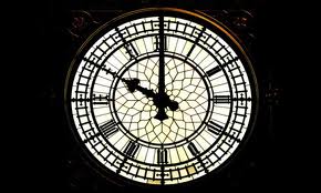
Big benAs children, when we start to count, we usually use our fingers. We have ten of them and so ten and multiples of ten would seem to be the most natural counting system. Yet time, and the angles in a circle, don’t use the decimal system. So, why is this?

Babylonian numeralsIt goes back quite a long way to the numeric system of the Babylonians in Mesopotamia (‘land between rivers’, the rivers being the Tigris and Euphrates, and essentially what is now modern-day Iraq and parts of the bordering countries), which they inherited from the Sumerians. The Babylonians used cuneiform for recording, a system of mark-making whereby a wedge-shaped piece of wood or reed was pressed into wet clay. To create numerals, they used two simple shapes: first an upright single wedge-shape for 1 – repeated for 2, 3, 4, etc –  and then the same shape angled twice to make a sideways v-shape for 10, and again repeated for 20, 30 etc, as on the right.

Why the number 60 was chosen as the base isn’t known, though it is much more easily divided than 10, which can be divided only by itself, 2 and 5. The Babylonians made astronomical calculations 4000 years ago based on 60.

early egyptian sundialIt was the Egyptians who made sundials, which were simply a stake of wood placed in the ground, that divided the day into smaller parts by the length and direction of the shadow. Later the instruments were calibrated to divide the time between sunrise and sunset into 12 parts. At this time, ‘hours’ were about equal, but would vary according to summer or winter.

Water clockWater clocks, or clepsydra, from as early as the 1600 BC in Babylon and Egypt, and probably from 4000 BC in China, consisted of a bowl or dish whereby the flow of water into or out of was measured, which indicated the time. These clocks were the most accurate and most common clocks until replaced by pendulum clocks in the 17th century. (Right, above an original ancient Greek water clock and below a reconstruction.)


EratosthenesThe Greek astronomer Eratosthenes (right) (c.276–194BC) divided a circle into 60 parts to create an early system of latitude. One hundred years later Hipparchus devised a system of longitude lines that ran north to south from pole to pole and also encompassed 360°.

Ptolemy, in about 150 AD, subdivided each of the 360 degrees into smaller segments of 60 parts. The first division of parts was called the partes minutae primae, or first minute, which then became simply minute, and the second segmentation was called the partes minutae secundae or second minute, or second.

Early clockRichard of Wallingford gave a clock to St Albans in 1336 (right). This had a large dial showing the sun and moon’s age, phase, and node, a star map and possibly the planets. As well as this it had a wheel of fortune, and showed the state of the tide at London Bridge. Bells rang every hour with the number of strokes indicating the time. It was only about 500 years ago, though, that minutes became commonly used. Clock displays before that divided the hour into halves, thirds and quarters, or even 12 parts, but never into 60 parts.

Dover Castle clockMechanical clocks saw the introduction of minutes, and an early one is the Dover Castle clock.


foliot balanceIt is driven by a foliot balance rather than a pendulum. Cogs on a wheel drive a level which leads to a weighted beam, and it is this that drives the clock. The foliot balance was later replaced by a pendulum.

Nowadays, of course, time is very accurate, as a second is defined as  the duration of 9,192,631,770 energy transitions of the cesium atom (!). This atomic time, though, has to keep pace with astronomical time, and to do so, not every minute contains 60 seconds. About 8 minutes every ten years consist of 61 seconds.


The pound in your pocket

UK £1 2013-EIt is not easy to design something meaningful which is less than a couple of cm across, but those who work on our coinage do just that. A new set of pounds coins, based on the flowers and plants of the four countries of the UK, have been released last year and this. On the right are the rose and an oak spray of leaves and an acorn for England.

UK £1 Scots 2014The set of four were designed by Tim Noad, a gifted artist and the best heraldic artist at the College of Arms in London for many years. His precise attention to detail is quite astonishing, yet he can capture the characteristics of flowers and plants in a few simple strokes. On the right are the thistle and bluebell for Scotland.

UK £1 NI 2014And here are the shamrock and flax for Ireland, showing just how his training in the stylised designs in heraldry show through in strong pattern and fine detail, but with no superfluous strokes.


UK £1 2013-WAnd lastly, the designs for Wales – a daffodil and leek.

With the announcement in the 2014 Budget that the pound coins are going to be replaced by 12-sided coins in 2017, let’s hope that Tim is one of the designers.