Any umb-er-ellas to MAKE today?


Chinese umbrella
It was the son of a shuttle weaver in Derbyshire who gave us the umbrella shape that we are so used to today. Before Samuel Fox (1815–1887), a wire drawer, developed the u-shaped frame, the ribs of umbrellas and parasols were straight, with a hinge which allowed them to be folded. They were also very heavy, made out of wood with a stout handle which was sometimes 2·5 cms, 1 inch wide. The oldest written record for a collapsible umbrella is dated 21AD in China, and they often had a ceremonial role as well as a practical one. This ceremonial role spread to Japan, India and Persia.


88671853411e7c3240aeb5a3eb159d30This Assyrian wall carving at Ninevah shows umbrellas being used perhaps as part of a ceremony, or perhaps just to keep the fierce sun off the king.


UmbraculumThe papal ‘Umbraculum’ has wide gold and red stripes, and is usually quite pointed. It was once used to protect the pope from sun, but now has a significant ceremonial role. All Roman Catholic basilicas throughout the world have the right to have an umbraculum indicating the authority of the Roman Catholic Church, and the umbraculum is usually placed just to the right of the main altar. When the pope visits the basilica, the umbraculum is opened.


Paragon umbrellaIn 1852, Samuel Fox was said to have used left-over stocks of steel stays (from corsets) made from spun steel to construct the metal ribs on his Paragon umbrella (see right), which gave us the characteristic u-shape that we are so used to.


James Ince anMaking umbrellas is still a craft process with a great deal of hand work from skilled practitioners. The oldest umbrella-maker in the country is James Ince & Sons in Spitalfields in the East End, founded in 1805. Richard Ince (shown right cutting out the pieces of fabric to make covers) is the sixth generation umbrella maker.


Making umbrellasThe covers are sewn together in pairs which are in turn sewn to make the eight panels of the canopy. This is then fitted over the metal frame and stitched to the ends of the spokes. The metal ferrule and handle are attached and the cover finally ironed on to the frame to ensure a perfect fit.


James Smith and SonsThe oldest shop selling only umbrellas is still in London on New Oxford Street. James Smith and Sons is pretty much the same as it was when it moved here in 1857 (the first shop opened in 1830 in Foubert Place).


Making paper

hemp wrapping paperThe Chinese clearly knew a thing or two and there is evidence of paper used for wrapping (hemp wrapping paper from about 100 BC on the right) and padding from the 2nd century BC. Finishing it so that it could be used for writing had to wait until the third century AD, but by the sixth century AD, toilet paper was also being produced. And to show that there is nothing new, folded and sewn paper enclosing tea (yes, tea bags) were being used in China from the seventh to the tenth centuries.


mouldThe knowledge and skills of paper making spread across the Far and Near East and Europe and the first reference to a papermill in Britain was that belonging to John Tate near Hertford, and a book printed by Wynken de Worde in about 1495 used this paper. Sir John Speilman owned an early papermill at Dartford in Kent, and other papermills were then established through the country. The first sheets of paper were made on molds constructed of thinner horizontal wires, with thicker vertical wires for support (see right). The impressions of these wires appeared on the sheets of paper, and are called ‘laid lines’, and paper with this appearance, laid paper. As you know if you have tried to print on laid paper yourself, the surface is not good for that, as the ink is hard to impress on the ‘valleys’ between the laid lines.

watermarkWatermarks are added by twisting a wire design through the laid wires, and this is then impressed on the sheets of paper.


wove paper mouldPaper with a smooth surface was first made by a man from Kent – James Whatman (1702–59). The paper surface was called wove because the mesh supporting the paper was woven, and not made of parallel wires. Wove paper is called Vélin in Europe. In 1757 John Baskerville printed his edition of ‘Virgil’ on wove paper produced by Whatman. It took only a couple of decades for this new paper surface to spread to other mills in the UK and abroad.


vatmanThe essence of paper is fibres, these can be from wood, as used for most of our paper, such as magazines and newspapers, or from cotton or linen rag; paper from these last two sources is usually of finer quality, such as writing paper, paper for fine prints, and also paper for calligraphers. The source material is pulped, originally with a large wooden hammer (stamping mills), and mixed with water to do so. The vatman, as on the right, then dips a mold and deckle into this vat of fibres and water and moves the mold and deckle this way and that to ensure an even coating of pulp all over the mold. The mold and deckle are then usually rested on the edge of the vat to allow some of the water to drain away.

mold and deckleThe mold consists of a stout rectangular or square (or sometimes even circular) wooden frame over which is stretched a mesh. The deckle sits on top of the mold, usually with a slight indentation so that it fits securely all round.


deckle edge paperDespite this tight fit, though, very often some of the paper fibres seep out between the mold and deckle, and this creates the characteristic deckle-edge of hand-made paper. You can get deckle-edged paper that is not hand-made, but then this edge is artificially constructed in the paper making process.


paper makingThe couchman (pronounced coochman, and on the right in this print) then takes the mold and deckle, removes the deckle, and skilfully inverts the mold on to a piece of thick felt. Insodoing the paper fibres, now in a sheet, lay squarely on the felt support. The mold and deckle are returned to the vatman, and the couchman lays another piece of felt on top ready for the next sheet of paper. These create quite a high stack of paper sheets and felts.

imgresPressure is added, usually in a small press with an enormous screw, to encourage the water to drain away.


drying paperThe sheets of paper are then laid on ropes in vast rooms to dry completely.


paper surfacesBut this is not the end of the paper-making process. Two additions are needed. First, the paper is finished. If the paper is left as it is with no treatment at all, then the surface is called rough (see bottom left in the picture). If the sheets of paper are passed through hot rollers, rather like a hot iron, then the surface is called hot press (hot pressed – as in top right). If the sheets of paper are passed through cold rollers, then in the UK this is called not (see middle section) because it is not passed through hot rollers! In the US they’re not quite so romantic and the paper is called cold press (cold pressed) because that is how it has been finished.

Then the paper surface needs to be sized if it is to be used for writing or printing, othewise wet ink spreads and bleeds into the paper fibres and looks like tiny spiders (blotting paper isn’t sized). This was done first using animal gelatine. Nowadays, many paper makers add size to the vat of paper pulp, and the paper is then called tub sized. This is useful for calligraphers because if an error needs to be removed and with it some of the paper surface, the size is throughout the paper and not just on the surface, and so the error can be written over.

Changes were afoot though and bleaching paper, the ‘Hollander’ machine which enabled more than just cotton rags to produce fibres (they then were able to add old ropes and fishing nets as well!), size from aluminium sulphate and the mechanisation of paper making all meant that the slow, laborious, but very skilled ways of making paper by hand were gradually, but not completely, replaced.

Fourdriner machineMost paper now is made using the Fourdrinier process (see right). In this the whole paper making process is speeded up and done in one continuous process. Paper fibres are produced from the source material with size added to the vat, the paper pulp is then allowed to fall on to a conveyor belt, the water drained and sucked out, huge paper sheet pressed, and then the massive rolls of paper finally dried, and finished. Paper for printing is often coated as well so that the printing ink stays on the surface. The process of joggling the paper pulp along the conveyor belt while these various processes were going on resulted in the long paper fibres settling in the same direction – hence the problem of tearing clippings from newspapers and magazines!


All Party Parliamentary Group for Art, Craft and Design Education

westminster hallVisiting the Houses of Parliament is always a privilege. It is not all as originally mediæval as I would like, in that only Westminster Hall, begun in 1097 by William II (William Rufus), and ready two years later, has original features. But the work by the architects Barry and particularly Pugin in the nineteenth century, after the fire that destroyed much of the original building, means that it definitely all has a very Gothic slant, and it is always a joy to be surrounded by such history and such rich design.

photo copy 10I was delighted, when I went to my first meeting of the APPG for Art, Craft and Design Education to see hand-craft at work. Just at the top of the main steps from Westminster Hall (the top of the picture above) they were re-laying the tiles to the pavement. This showed great craftsmanship in that the right mix of mortar, the right amount to be laid, and the correct pressure in tapping a wooden mallet all needed great skill. The designs reminded me when I was learning heraldry of the ways in which we had to fit lions and other heraldic beasts into particular shapes without losing the character of the animal (this was when I learned calligraphy and illumination as well). Notice that the lions in the square tiles above have four legs, swirling tails, heads etc etc but still fit into the shape.

photo copy 11I arrived very early for the meeting because of train times, and noticed a piece of M C Oliver’s calligraphy in the Central Lobby explaining the designs in the mosaic situated in the wall above this text. The lettering style is very typical for the period and written in a strong hand on stretched vellum. I am not sure whether we would find his very closely textured lettering with potential clashes of ascenders and descenders and tiny margins acceptable nowadays!


But I was there to represent craft and the Heritage Crafts Association at this committee and so had this to focus on. Chaired by dynamic Sharon Hodgson MP, Shadow Minister for Women and Equality, and supported by NSEAD, the agenda was wide-ranging. After the first item I was able to give a brief introduction to heritage crafts and the Heritage Crafts Association, mentioning some of our challenges. Other items covered were the Art Party Conference, and a fascinating insight into art, craft and design education by HMI Ian Middleton who mentioned two reports: Making a Mark, and Drawing together: art, craft and design in schools. Ian is also Ofsted’s National Lead for Art, Craft and Design in Education. The problems of Discount Codes for children choosing subjects to study for GCSE were also raised and it seems that subjects in the arts and crafts were most hit. A student could take Maths and Stats for example, with both subjects counting for school published statistics, but taking photography as well as design, or graphics and design, would count as only one subject when schools added up their GCSE successes. This is not likely to encourage take up of art, craft and design subjects! Yet these subjects involve different disciplines and were usually taught by different specialists (unlike Maths and Stats). The UK has some of the best innovators in the world in terms of designs and craft. Encouragement at all levels should be happening, not discouragement for reasons of statistics! The NSEAD proposed Day of Action was also raised. This is likely to be on June 14th and is an opportunity for art, craft and design teachers and amateur and professional practitioners to take their skills to the community and to schools to give everyone a chance to experience the skills involved.

It looks like a group keen to raise issues and get answers, and will certainly add to the excellent work being done by the Craft Industry Board.

Gold and Parchment in Sydney


photo copyThe highlight for me of our brief stay in Australia was the talk on Gold on Parchment that I gave at the State Library of New South Wales. The Australian Society of Calligraphers and the State Library had done a great job of advertising the talk. This (right) was in the Sydney daily paper. Although it was advertised as mainly for calligraphers, it was clear on the day that there were also people from the library itself, including conservators, and those interested in manuscripts and history.


State Library, NSWThe State Library is a beautifully light and airy modern building almost opposite the Botanical Gardens, right in the heart of the city of Sydney. There was a stunning exhibition of photography on display while we were there.

State Library NSW old building


On the day, though, the State Library realised that the room they had first allocated would be too small, and so they transferred the location for the talk to a larger room in the older library building. This was a wonderful red sandstone historical building looking out over the Botanical Gardens themselves, and a real landmark.

State Library, NSW

To get there we were taken through the library where there was a great mix of old and new, like this huge room lined with bookshelves and with a magnificent ceiling, yet with a modern glass staircase in the centre.


Gold on Parchment talk


The room was a large one, but it quickly filled, and in the end there were over 200 people with some standing at the back for the whole two-hour presentation!

 
Gold on Parchment in SydneyI was delighted that the short video of me cutting a quill, which I filmed the day before we left and then quickly imported into the Powerpoint presentation actually worked! There were interesting questions at the end, and I was delighted by the interest shown. Huge thanks are due to everyone involved in the State Library Events department (especially Samantha Hagan who kept very calm while we struggled to get the video clip up and working, and didn’t worry too much when we overran), and to the Australian Society of Calligraphers who were so welcoming and kind, especially Liz Firth who was my contact, and Bob Howe, the current President. I was even asked to do a repeat for the conservators, but sadly we were leaving the following day – perhaps next time!


Christmas or Xmas?

Chi rho from KellsThere was an article in the paper towards the end of last year which posed the question of whether people would have Christmas or Xmas. The suggestion was that Christmas would be a time of having a loving day with family and friends, caring and sharing, and Xmas would focus on the commercialisation of the season. In fact, Christmas and Xmas, as many know, are one and the same thing. X representing the Greek letter chi, which is the initial letter for Christ. In early manuscripts the names for God and Christ were thought to be so holy that they should be written not in Latin as the rest of the text but in Greek, the language of the early New Testament. These names were called the Nomina Sancta (holy names).

Chi rho in LindisfarneIn Insular Gospel books, at the end of the genealogy of Christ in Matthew 1:18, the page is often marked by large decorated initials, such as the one above in the Book of Kells. The letter chi is very large, followed by a smaller rho (looks like the letter p), and this is entwined with the letter i.

Contrast this with that in the Lindisfarne Gospels on the right, where again the letter chi is enlarged, but the letters rho and iota (i) are clearly visible, albeit smaller. The letters on the following line have been outlined in red dots, but are unfinished. Then follows beautifully painted angular letters with colours that bring a subtlety to the whole page. Note, too, the unfinished letter C towards the end of the third line.

Chi rho in St Gall Gospel Another insular book is the St Gall Gospel shown on the right. St Gall in Switzerland has a famous library with many manuscripts online. It is certainly worth looking at for early books. This Gospel was written by Irish monks around the year 750. The manuscript has the distinctive decoration of many of the books of this time, with, in a strip at the base, interlace, and decorating the space between the chi and the rho, La Tene swirls and geometric decoration.


Chi rho from Stockholm Codex AureusThe Stockholm Codex Aureus has a well-known history, being written probably in Canterbury in the mid-eighth century. It was stolen by the Vikings, its elaborate, decorated cover ripped off, and then bought back ‘with much gold’ by Alderman Alfred and his wife Werburgh to present to the church. There is a note to this effect written in Old English in two lines at the top of the page and continued at the bottom.

Heritage crafts and a National Honour

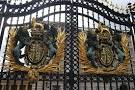
Buckingham Palace gatesA great day for heritage crafts – the first national honour was awarded today, and what a day that was!


photo copyWe had been advised to get there early, and so we were, and queuing with Brian Rea, from Northern Ireland Policing, and his family, at one of the wonderful Buckingham Palace gates.

Fortunately it was a fantastic day. Last night there were gale force winds and horizontal heavy rain. If this is the weather tomorrow, I thought, my hat will be flying off my head and be completely ruined!


BUCKINGHAM PALACE LOOSOnce we had had our tickets and passports checked, we were led through the central archway of Buckingham Palace and into the building itself. Then we were directed to the cloakroom and loos – the latter quite extraordinary. Vast wooden seats covered a rather ancient loo, with a wooden ‘stirrup’ pull up handle instead of a chain or lever.


Access_BP_grandstairs_lgThen up an amazing gilded staircase, where guests/family went one way and recipients the other. We were led into the picture gallery, and once our names were checked, a hook was pinned to our jackets. This meant that when the medal was awarded, it was simply looped on to the hook.


Picture GalleryThe picture gallery was stunning – if only we could have just looked at the wonderful art – but there were so many interesting people to meet and find out why they were being awarded honours. They ranged from Pamela Goldberg who got hers for the Breast Cancer Campaign, Wing Commander Teresa Griffiths, who is doing sterling work at Birmingham Hospital with those who have been injured in conflicts, Christine Edwards for Higher Education, and our celebrity Adele (Adkins), the singer.

First Football Match In Buckingham Palace Gardens To Celebrate 150 Years Of The Football AssociationThe awarding procedure was then explained to us – not too complicated – and we were then told to wait until our names were called. We were taken out in batches, through some wonderful rooms, and then led across the back of the huge ball room to a parallel corridor and were checked yet again at the entrance to the ballroom. One by one our names and awards were announced. Forwards, stop, curtsey/bow, forwards to The Prince of Wales, medal awarded, chat and then go. (picture on right is of the Duke of Cambridge presenting awards earlier this year). It was a thrilling moment, not least because, coincidentally, In Paradisum, from Fauré’s Requiem, one of my favourite pieces of music, was played by the orchestra just as I went forwards for my award.

The Prince of Wales, President of the Heritage Crafts Association, was charming, as indeed he was to everyone I spoke to afterwards. He was interested in what we were doing and very supportive. Once out of the ballroom, I did give a little jump of celebration, but then remembered that there were video cameras everywhere (you could buy a film of your own presentation) and hoped they didn’t catch that rather non-MBE behaviour! The hanging pin was removed for us, and the medal was put into a smart box, then we were shown to the back of the ballroom to watch the remaining people being awarded.

When everyone had received their awards, The Prince of Wales left after the National Anthem, escorted by ghurkhas, and the Yeoman of the Guard marched out.

Patricia Lovett and her MBEI met up with my family in the Ballroom, and took my medal out of its box straightaway and pinned it on. As I said to the people as we walked out at Buckingham Palace – if you’ve got it, flaunt it! Then it was out into the courtyard for our photos.

This is the first time heritage crafts have been nationally recognised like this, and the first time for calligraphy for about forty years. The Heritage Crafts Association is working hard to nominate deserving traditional craftpeople for honours and we hope to see many more makers in future New Year and Queen’s Birthday lists.

And the singer Adele? Well apart from standing next to her and her smiling back in the picture gallery, and spotting her a few rows in front in the ballroom, we didn’t see her again. Speaking to the photographers they said that celebrities and VIPs are usually fast tracked through afterwards.

What a fantastic experience!

A modern flagellum

IMG_0522Beating the sin out of your body with a mediaeval flagellum may have worked in those times, but to me, this is a shocking use of beautiful writing and wonderful animal skin. I saw a flagellum first in the old British Library, when it was still housed within the British Museum in Great Russell Street. There was a well-used wooden handle, and Biblical texts in a form of Gothic Black Letter written on strips of animal skin, which were attached to the handle. The skin was rather discoloured, which it would be if it had been used to beat the body.

enlargement of modern flagellumI thought that, following my theme of loving a lot of lettering that is 3D, I’d try my hand at making a modern flagellum. But what to write? Although I love the words of the St James Bible, I thought that to use biblical texts would simply be a copy. I then realised that there were words and phrases that seemed to be beating the living daylights out of the English language – pre-owned, meaning second-hand, faux, meaning fake, compact (with houses and flats) meaning tiny, economical with the truth, meaning lying. I also have a bit of a thing about verbs being used as nouns, and I’m sorry, but it’s the grammar police here, different from (not different to), fewer for numbers (rather than less than), and so on.

We had a great time one evening with our friends suggesting words and phrases, and then I set to. It may be flagellum, but I wanted to make it beautiful. So I chose some really creamy vellum, used Chinese red and black stick ink, and separated the individual words and phrases along each strip with a gold leaf dot on raised gesso. I marked out with pencil and a straight edge the strips on the vellum – the plan was to make long strips and fold them in half, and then attach them together – and set to. Once the gilding and writing were done I cut up the strips using a sharp knife and straight edge (not too clever with the raised and gilded dots, but there we are!), folded the strips in half and then sewed them all together with bookbinder’s thread.

I am not skilled in wood turning, but I know a man who is, our piano tuner! So we discussed the dimensions and he made the handle. I tried ramming the strips into the cup-shape in the handle but they didn’t stay there very effectively, so I then flooded the inside cavity with acid-free PVA, and it held.

Unlike the mediaeval flagellum which had been used and so the vellum strips were quite flexible, this vellum is stiff, and so, when displayed, each strip has to be separately attached to the backing (with white bluetac). I just wonder what people will think of this in years to come!

Drawing the street

Drawing the Street image 1A wonderful new exhibition in Newcastle-under-Lyme library is on show only until November 30th, 2013 but is well worth making the effort to get there if you can. It shows a drawn record of the buildings on the streets mainly in and around Newcastle-under-Lyme.


Drawing the street image 2Conservation Architect Ronnie Cruwys, whose exhibition it is, is a fantastic draughtswoman and she is applying her incredible skills to record the buildings in the streets so that the amazing range and mix of buildings that we may well pass every day and not give them a second’s thought are shown. By doing this, Ronnie is making a record for the future.

Drawing the street image 2She has a great eye for detail, and includes passersby and pets on occasion to bring the drawings to life and give them a scale. Some of the buildings in the drawings she has made have already made way for replacements, and these are rarely as charming as their predecessors!


The exhibition has had rave reviews:

So impressed by the magnitude and detail of the whole project – your talent is amazing! What a wonderful way to open our eyes to the buildings around. 

Fantastic detailing, great use of colour makes the town look like a place you’d like to shop in (what a pity it isn’t). Spread your wings, other streets, a focus on certain buildings (pubs might be popular) maybe these pics could inspire great things in Newcastle!

Absolutely beautiful – keep up the good work. Great historical pictures (for our future children)! 

Your drawings are amazing, taking care of the tiny details made the drawings look as if they are documenting the streets very well, also the scale and dimensions are very true.

There are also prints and postcards available. These are all on Ronnie’s website, but seeing the real deal in person is so much better!


‘Gutsy lettering’ and all that jazz – Michael Harvey

Michael Harvey typefacesSome of the names of the fonts available on our computers can be quite intriguing, and the stories behind them even more so. When Michael Harvey designed his first he called it Zephyr after the car he was driving, and his later fonts were named after his passion for jazz – Ellington, Mezz and Strayhorn. They are strong, clear and simple designs which have stood the test of time.

Michael Harvey book jacketDesigning book jackets was another of the strings to Michael’s bow. Initially influenced very much by the letter-forms he had been taught by Joseph Cribb, who was Eric Gill’s first apprentice, Michael then went on to work with the wood engraver Reynolds Stone, who encouraged him to free himself from what could have become a straight jacket. Despite the constraint of being able to use only one or two colours at the time, Michael made sure that his book jacket designs fairly leapt off the shelves, as with his own book here.


Sainsbury wing letteringPerhaps the best place to see his work easily is outside the Sainsbury Wing of the National Gallery. The architect, Robert Venturi, said that he wanted ‘really gutsy English lettering’ and Michael was able to oblige with letters having strong serifs and a good contrast in the widths of the strokes. He approved of being involved in the whole design process rather than what is sometimes the case – architects simply picking a design out of a font catalogue almost as an afterthought. The commission really was huge, though, and Michael required the assistance of letter cutters and designers themselves, Brenda Berman and Annet Sterling of Incisive Letterwork, to help him carry it out.

Page from Michael Harvey's bookMichael also taught for many years at the University of Reading, running the course Letter-forms, and many are those who have benefited from his skills and knowledge. I remember talking with him about teaching and him saying that it was as much about learning as it was teaching, with which I wholeheartedly agreed. His books on lettering are worth every penny, with strong layouts, copiously illustrated with his own designs and artworks, and often with his drawings as well. Michael believed very strongly in the importance of drawing.

He and I also felt that copying was useful, but his words are far better than any I could give: ‘A model is not an end but a beginning. Copying a good model is a good start … No matter how much one tries to reproduce another person’s style we add something of ourselves.’

Michael sadly died last month after a long illness.

  • Harvey, Michael. Letters into words. London: Clowes, 1973.
  • Harvey, Michael. Lettering design: form and skill in the design and use of letters. London: Bodley Head, 1975.
  • Harvey, Michael. Creative lettering, drawing and design. London: Bodley Head, 1985.
  • Harvey, Michael. Carving letters in stone and wood. London: Bodley Head, 1987.
  • Harvey, Michael. Calligraphy in the graphic arts. London: Bodley Head, 1988.
  • Harvey, Michael. Reynolds Stone: engraved lettering in wood. Netheron: Fleece Press, 1992.
  • Harvey, Michael. Creative lettering today. London: A. & C. Black, 1996.
  • Harvey, Michael. Adventures With Letters. Bridport: 47 Editions, 2012

Gerald Cinamon – Man of Letters

Cover of Gerald Cinamon's bookAlmost without realising it our book buying is influenced many times by the design. Without knowing the contents, we select or reject a book often simply by the cover.

Gerald Cinamon, Jerry, is a past master at this. A recent publication, coinciding with an exhibition of his work at the Institute of Contemporary Arts this year, Gerald Cinamon: Collected Works Since 1958, and the accompanying video: Close Not Touching, shows some of the breadth of his work, and it is simply stunning! Sadly the exhibition has now closed, but his book is still available. The cover of the book, right, is in his favourite bold red, used in a number of other of his designs, too.

Cover design for Penguin Books 1967Jerry, born in the US, started his career well before there were computers, when type and image could be shifted around simply by a click of a mouse. His were the days of Cow Gum and Letraset letters. The title of the video Close Not Touching was taken from the use of Letraset, where letters were pressed from a transparent sheet on to paper, and were – close, but not touching. How very much easier it is for designers now. This design for Architecture and Art, made for Penguin books in 1967, shows just what an eye for really strong design, and a sense of humour, can achieve.


Design for wine list for a restaurant


This is a real favourite – a design for a family restaurant in Devon. The use of the wine glass distorting the letters, although they remain completely legible, suggests not only the movement of the tide coming in and out of the shore, but also the possible effects on someone’s vision of too much strong drink!


bbc poster image

A simply stunning design is this for the BBC, used both for posters and recital programmes. It is so simple but so effective in the way that the bowl of the letter b has been reversed to make the c, and any heaviness in letter-form has been avoided by truncating the downstroke. The letters are all very readable and clear, even though they are reduced in form so much. Jerry writes that he really enjoyed seeing his posters displayed at the Royal Festival Hall when he went there for a concert.


Cover for Penguin's 50th anniversarySimple and ingenious – this cover is for the Fifty Penguin Years exhibition catalogue in 1985. Here is that wonderfully vibrant red again, but the 25th penguin is in silver, and the 50th in gold. Penguin book covers were renowned for their limited use of colour, usually just one colour and black, so special permission had to be granted to do a silver and a gold run in addition!

This book is a real visual delight, each page, with its informative captions, shows another stunning design. There is a foreword by Ken Garland, a biography of Jerry and an interview with him and David Pearson (who is also in the video).

The book is available from Jerry’s website and costs £20 plus postage. I cannot recommend it more highly for anyone interested in lettering, design, and a really great man.