
 The London Underground has a very distinctive and unifying look with the names of the stations, directions, and the distinctive roundel. This is due to one man, and he was the calligrapher Edward Johnston. Johnston could be said to have been the father of modern calligraphy working in the first half of the last century. In 1913 the Underground’s publicity manager, Frank Pick, commissioned Johnston to design a company typeface; his brief was for ‘bold simplicity’ and the design was finished in 1916.
 Johnston designed just one weight of type, and this was based on the very calligraphic proportions of 7 pen nib widths of Roman Capitals, with the proportions being the same and letters i and j having diamond dots. However, there is no weighting (thicks and thins) to the strokes in that they are monoline, and it was a san serif design. Johnston was very particular about his designs and apparently when one of his students offered to create a bold weight, Johnston blanked him for many years.
 The London Underground roundel appeared in 1908 as a red disc and a blue bar. Edward Johnston took the roundel and developed it into the design that is used on stations today with the name horizontally across the centre.
 From 1919 Johnston’s bull’s eye roundel was used on publicity, the outsides of stations and platform nameboards. He went back to the design and gave exact guidelines for the proportions.
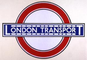 Johnston was asked again to design the London Passenger Transport Board under the name of London Transport in 1933. This sign was used on all vehicles, signs and publicity.
It isn’t too surprising how a strong design such as this has lasted through the decades.