For The King on the Occasion of the Coronation

It’s not often that you’re asked to carry out a commission for The King to be presented to mark His Majesty’s Coronation, and it was such a privilege to be asked to do so. It was also a special privilege to be able to propose texts rather than this being prescribed. At the time of this request I was looking into suitable extracts for my latest book ‘The Art of the Scribe’ (published Spring 2025), and this quotation from Shakespeare – John of Gaunt’s speech from ‘Richard II’ seemed most apt. Starting with the phrase ‘This royal throne of kings …’ and with other appropriate regal references in the speech as well – it matched the occasion. (Admittedly, John of Gaunt is lamenting the decline of the realm under Richard II, but that section wasn’t included!)


Such a piece needed a lot of thought and preparation and I was keen to ensure that as many pertinent references were made. First, of course, it had to be on stretched vellum, and a beautiful skin was selected by William Cowley – the most perfect ivory-white. Then, without question, it had to be in gold – yellow shell gold – and with pure leaf gold on gesso as part of the composition. I tried it in my go-to Italic script and wrote out the whole passage as here.


This, though, was too ‘blocky’, and, on re-reading, it seemed that the speech was reaching a crescendo at ‘This blessed plot, this earth, this realm, this England’ (you can almost hear the actor’s voice rising in volume until the last two words are almost shouted). But writing each phrase on a separate line broke up the design too much.


In the end I decided to write the four phrases in two lines, with ‘this England’ in capital letters. This seemed to work better. However, for this piece italic just didn’t seem right, so I went back to a script developed during the reign of another King Charles, actually a Holy Roman Emperor, that of Caroline Minuscule used in many manuscripts during the time of Charlemagne in the ninth century. But how would it look written in gold? I tried out the first line on an offcut of the vellum being used and it seemed to be just right.

The gesso crown was rather tricky as it was so small (about 1·5 cm) and only a nodding representation could be made to the pearls atop the arches of the crown, and the fleur-de-lis and crosses patey which rise from the gold rim. The different shine on this part of the piece echoed but also contrasted that of the shell gold.


It was framed in Sandringham oak – wood saved from an ancient oak tree in the parkland which would have resonated with His Majesty for whom, we know, it is a very special place. The letter received back by Gallyon indicated that King ‘was touched to receive this beautiful piece of commemorative art’. And I felt that it was a real honour to have been asked complete it.

St Paul’s Church, Covent Garden – the Actors’ Church

Many visiting Covent Garden have little idea that there is a church behind the magnificent portico, in front of which conjurors, acrobats and magicians impress the audience and, hopefully, pay for what they see.

(Please note: Images 1, 3, 4, 5, 6, 7, 8, 9, 10 © 2025 Patricia Lovett MBE)

This portico is part of the grand plan of the Earl of Bedford, Francis Russell, who was laying out a large piazza in this part of Covent Garden. As can be seen here, the Church sits well with the arched columns on the north side of the piazza, and paths laid out behind a railed fence in a huge area of gardens. The church itself was built between 1631–33.

However, this grand entrance isn’t used; the access to the church from the piazza is via two arched entrances either side of the portico (they can be in the first image) and then round the sides of the church to the west entrance. The reason for it not being the main entrance is that the church faces east and this is the direction that it is thought the congregation should face – towards Jerusalem and where Jesus lived. No exception was made by the Bishop of London at the time, Bishop Laud (1573–1645) and so the ‘entrance’, which has never been used, is behind the high altar. The church is large, 50 by 100 feet and 38 feet high.

It is called, and is, the Actors’ Church because Charles II, on the Restoration, licensed two ‘Patent’ theatres – the Theatre Royal in Drury Lane, and the Royal Opera House at the other end of the piazza to the church, both within the church’s parish. Inside are many plaques commemorating significant actors. Here are some of them.

The pulpit is particularly splendid and is thought to be by Grinling Gibbons or by one of his pupils. The famous, and unbelievably talented wood carver attended the church for decades.

Also in the church is the Aubrey Leyborne Theatre, a model theatre that was built in 1928 to show  how theatres work. It shows scenery, flats and the rigging system to move the flats up and down.

Outside the west front is an oasis of calm. The graveyard, now a beautiful garden, provides respite for those who want to site and contemplate. When visiting Covent Garden, why not spend a bit of time behind that portico of entertainers and enjoy the tranquil and calm of the Actors’ Church, St Paul’s, Covent Garden?

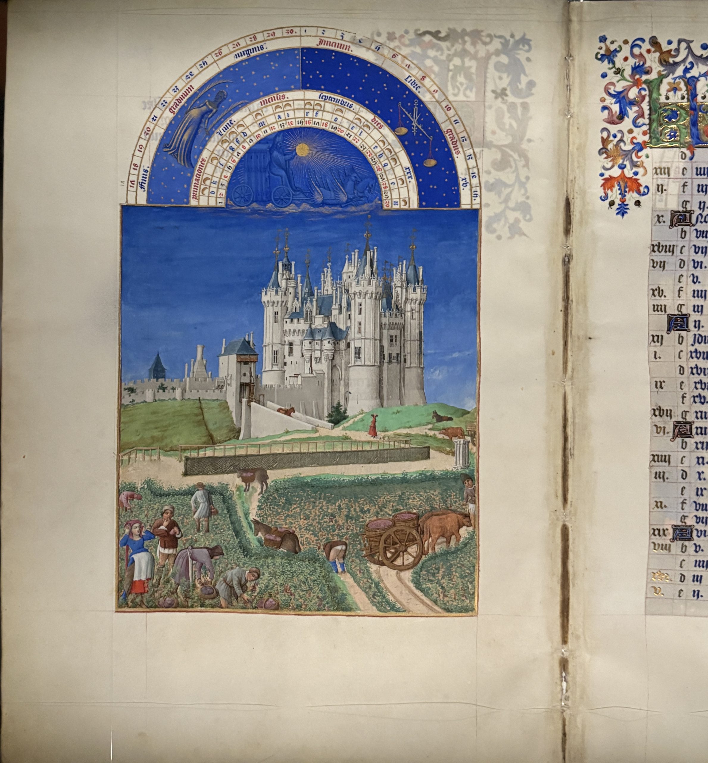
August in The Très Riches Heures of the Duc de Berry

© Patricia Lovett MBE 2025

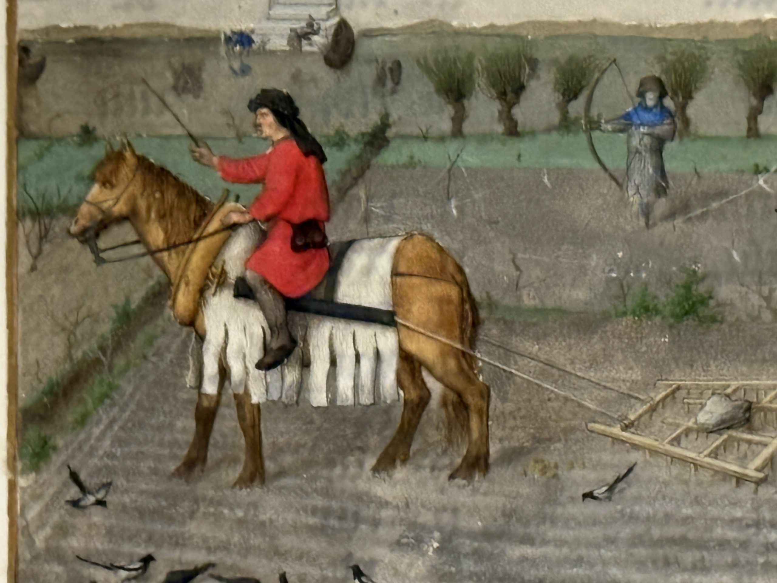
August is the month for hawking in the Très Riches Heures of the Duc de Berry, painted and illuminated by the Van Lymborch Brothers. A party of five, three women and two men, are mounted on three horses setting out to do just that. Two of the women are riding side saddle behind men, and the third woman, the most richly attired, is riding side saddle on the most sumptuously decorated horse. Behind them, very much in the background, are people swimming and others stacking the corn into sheaves ready to be carried on a cart by two oxen, one black and one brown.


© 2025 Patricia Lovett MBE

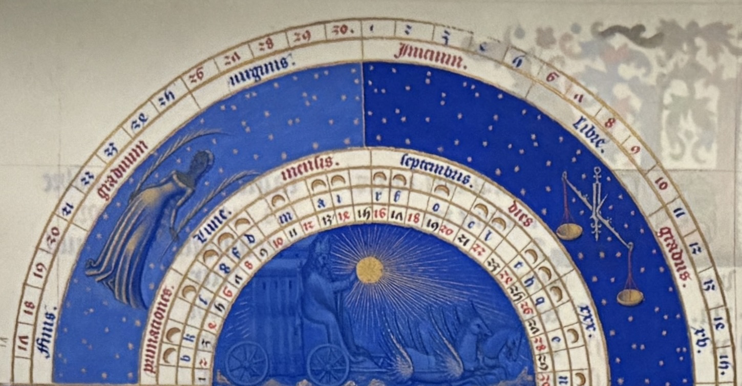
Ultramarine blue semi-circles top the main image with the appropriate signs of the Zodiac for August, Leo and Virgo, they are surrounded by a sprinkling of stars. In the innermost section of the semi circle is the relentless sun charting its way across the sky in a chariot. Semi-circles of shell gold, polished to a brilliant shine, also adorn the image. It is clear that all the semi-circles were constructed with compasses.


© 2025 Patricia Lovett MBE

The castle in the background is the Château d’Étampes, near Paris. The Van Lymborch Brothers included a number of the Duc de Berry’s castles and châteaux in their paintings and this one looks particularly splendid with its high main square tower, five smaller towers, three of them with turrets, and a high encircling wall.


© 2025 Patricia Lovett MBE

In the river below the castle, the Van Lymborch Brothers have shown people enjoying themselves swimming and splashing around in the water.


© 2025 Patricia Lovett MBE

A man in a white long-sleeved shirt has an over tunic of grey with the skirt slashed high on his thighs. He is wearing a straw hat and a thick glove to protect his hand from the two hawks sitting on his arm. His very long pole drags behind him on the ground and he is stylishly wearing one long red sock and one black one. It’s clearly hot as he has no leg covering above the knee.


© 2025 Patricia Lovett MBE

The most richly dressed woman has a cloak of glorious ultramarine lined with white fur (in this weather?) which drapes low over her and the body of white horse. The cloak has a circlet of gold decorated with circles and two long braids of gold which are attached to the cloak but extend way beyond it and the horse. These are painted in shell gold and the fine detail is amazing with such a tricky medium. The bridle, headband and straps on the horse are also in the most expensive pigment of ultramarine and again with shell gold painted patterns. The saddle cloth is in cinnabar (vermilion) also a very expensive pigment, and again with shell gold decoration.


© 2025 Patricia Lovett MBE

© 2025 Patricia Lovett MBE

Enlargements of the decorations show the fine detail of the decorations and the white fur peeping out from the slashed hem and cuff of the cloak:


© 2025 Patricia Lovett MBE

One of the other women is wearing a black dress with red sleeves, and what looks like gold kid gloves. Her contrived linen headpiece will at least keep her face shaded from the sun but it must have been a bit tricky to wear and keep on! She is behind a man in a pale blue cloak decorated with a silver pattern and a shirt with a wide white lace collar. He is wearing a stylish straw hat.

It is difficult to show in these images how small the pages of the book are and thus the paintings. The Van Lymborch Brothers were incredibly skilled working with such fine detail as such a small scale.


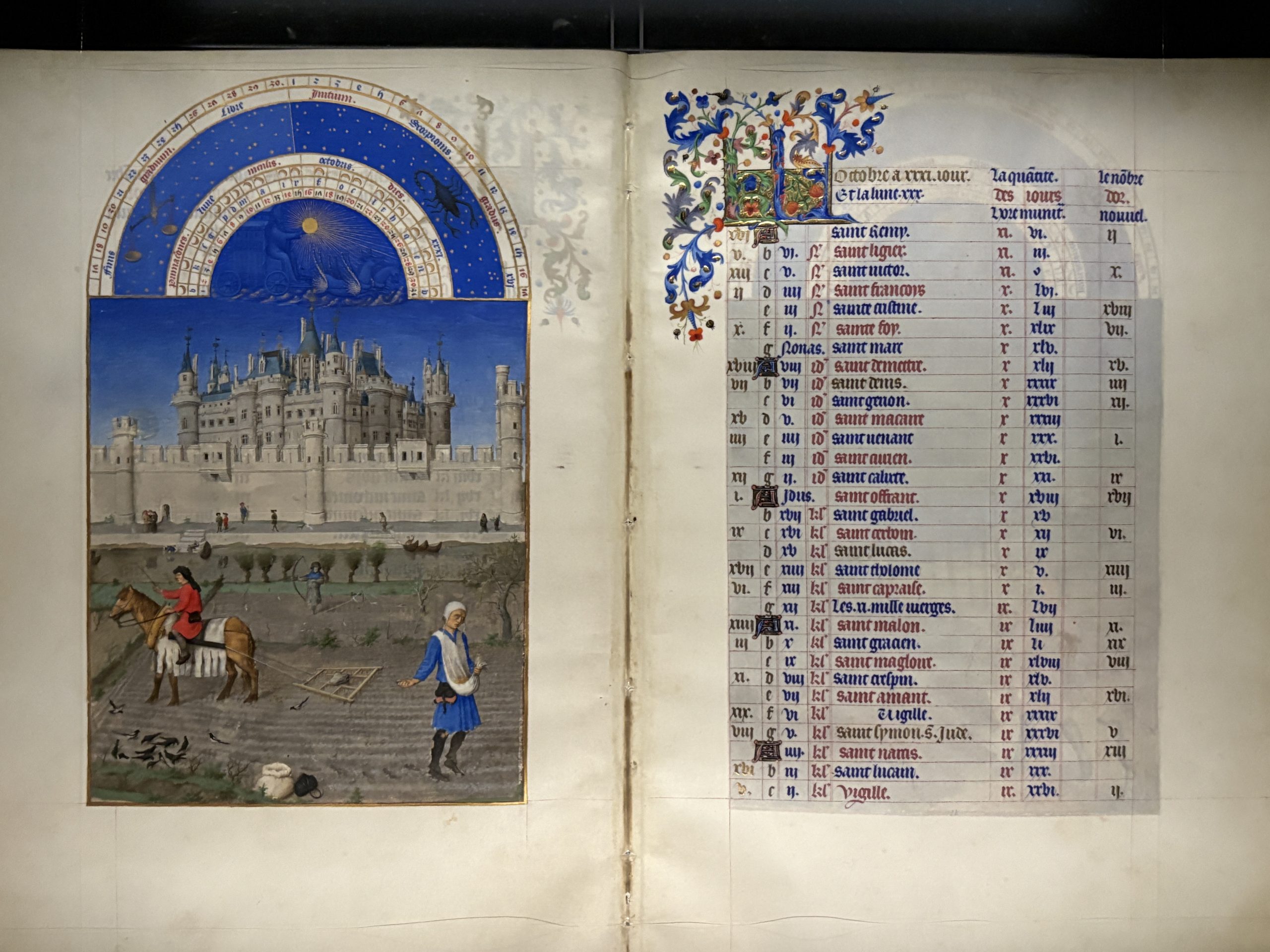
July from the Très Riches Heures of the Duc de Berry

The Très Riches Heures of the Duc de Berry is an absolutely masterpiece. Created by the Van Lymborch Brothers (previously Limbourg), Herman, Paul and Johan, they consist of page after page of the most magnificent and exquisite paintings. This post focuses on the calendar page for July; there are other blogposts on this website.

Photographs here are all my own, (© 2025 Patricia Lovett) and taken at the exhibition of the Très Riches Heures of the Duc de Berry at the Château of Chantilly in the summer of 2025.

July is the month for harvesting wheat and shearing sheep. Two men towards the lower half of the miniature are cutting wheat with sickles, and, as they do, the blue and red flowers are being revealed. At the bottom right a woman in a blue dress and a man are shearing sheep. This particular painting is interesting because the angles of the château in the upper part of the image are reflected in the diagonal stream and the edges of the field. The mountains left and right at the top echo the shapes and draw the eye down and into the page.


The detail in the sheep shearing scene can be seen in this enlargement. Both shearers are using large shears which are operated not from handles through which thumb and fingers go, but by pressing on the blades themselves held open by a circular spring. The wool coming off the sheep being sheared by the man is shown falling on to the ground where it is in a large pile. He is wearing a fashionable bucket hat with a piece of pink fabric hanging down to protect his neck from the sun, but his clothes are rather worn and ragged, the sleeves are frayed and the knees of his breeches are worn away. The woman has a glorious deep blue dress which looks in better repair, and a black hood again for protection from the sun. Relieved of their thick wool coats, the sheep are grazing peacefully.

The other workers in this miniature are the reapers the other side of a small reed-lined stream. One of them has succumbed to the heat and is wearing just a white shirt and underwear; his partner’s tunic is split up to his thigh. Both are wearing straw hats to protect them from the bright sun.

The Duc de Berry was very fond of his castles, palaces and châteaux, and the Van Lymborch Brothers often incorporated them in miniatures in his books. This is a depiction of the Château de Poitiers, an unusual triangular- shaped building with a raised wooden walkway on stone supports providing the entranceway over the moat.

This is shown in greater detail in this enlargement. It is not quite of a high enough resolution to make out the precise strokes used by the brothers to show the curve of the tower and turrets, the covered wooden walkway, and the steeply gabled windows in the roof.


At the top of each calendar miniature are Zodiac signs for that month, here Cancer the crab followed by Leo the lion are set in a dark blue sky with golden stars. The sun, stars and semi-circular lines and divisions are in shell gold which is applied with great precision. There will be other posts on the calendar months on this website.

Here is more on the Très Riches Heures and the Duc de Berry.

Mediaeval decorated letters to colour

I’ve been lucky enough to have worked closely with the British Library for what is now decades. Many years ago I was helping the Education Department which had a lot of school visits. The problem always with such visits is how to occupy those who finish any set tasks quickly before the rest of the class. I suggested producing a series of outline drawings taken from illuminated and decorated mediæval manuscripts that could be coloured in, and then produced six of them.

Having a clear-out recently, I came across them again, and thought that they could be shared with a wider audience, hence this blogpost. They are copyright, but free for personal and educational use, simply click on the picture/link below for a high resolution pdf to print out; they’re sized for A4.

I’ve copyrighted them because they mustn’t be used by anyone or an institution to print out or use in a publication and make money from them.

Please, though, feel free to print these outline letters for your own use, for children and grandchildren, for courses, and for classes.

As the British Library’s website, including the digitised manuscripts, is still not completely available, colour images are here if possible, otherwise black and white photos or similar images are posted.

Copy the original colours if you wish, or go freestyle – they’re your letters to colour, so your choice.

The first is the magnificent letter B from the Ramsey Psalter (BL Harley 2904).


And the outline letter is here, click on it to download the high-resolution PDF:

Worksheet 1

David and Goliath, mediaeval manuscriptI wasn’t able to get a coloured image of the miniature from BL Harley MS 2895, but this is from a similar period and indicates the colours that would be used.


And the outline letter is here, click on it to download the high-resolution PDF:

Worksheet 2

Again, no colour copy copy of the letter ‘N’ from the actual manuscript, but a black and white image is here, and below it a similar letter in colour:


And the outline letter is here, click on it to download the high-resolution PDF:

Worksheet 3

Yet again there are no colour images available for the York Psalter; here it is in black and white:


And the outline letter is here, click on it to download the high-resolution PDF:

Worksheet 4

Hosea from the Worms Bible:


And the outline letter is here, click on it to download the high-resolution PDF:

 Worksheet 5

Finally, this magnificent lettering and decoration from the Lindisfarne Gospels:


And the outline letter is here, click on it to download the high-resolution PDF:

Worksheet 6

‘The Art of the Scribe’

The Art of the Scribe cover‘The Art of the Scribe’ is the latest book published by the British Library in Spring 2025. It focuses on the scripts and the illumination and decoration used in the seven major periods of mediæval and Renaissance book production. Each of the seven chapters includes information about manuscripts of those times, what they were, who they were produced by – the scribes and illuminators – and the people associated with the books. There is also a detailed second section on tools, materials and techniques for calligraphy (including analysing texts, spacing of letters, words and lines, layouts, and serifs), illumination, painting, and simple book binding.

The Art of the Scribe, a pageFor each of the seven writing styles there are clear exemplar letters with guides for writing each one – here are Uncials as in the St Cuthbert Gospel in the British Library. Both the alphabet is shown as well as the letters arranged in families that have similar strokes – this makes learning and practising the letters much quicker.


The Art of the Scribe, a pageIllustrations are large, often taking up the whole page as here – a page from one of the huge bibles produced at the monastery of St Martin, Tours, in France. The script is Caroline Minuscule and is a lovely dancing script, very legible, and wonderful to write.


The Art of the Scribe, a pageAt the end of each of the seven chapters are three graded projects – foundation, intermediate and advanced. This is a favourite from Caroline Minuscule – a zig zag or concertina book using text from Dorothy Wordsworth’s ‘Grasmere Journal’ describing the walk when the ‘host of golden daffodils’ was seen. The illustration along the bottom matches the text, with a few daffodils to start with and then more and more.


The Art of the Scribe, a pageThe second section consists of a comprehensive consideration of materials, tools and techniques; for tools and materials – what is needed, how to use them and how to take care of them. The pages here are how to mix gouache for ink and paint and how to mix repeat colours.


The Art of the Scribe, a pageThis double spread is about vellum, how it’s made, types of skin – vellum and parchment – and the differences in thickness in the skin which affects the final result in use.


The Art of the Scribe, a pageIncluded in the section on tools is a section on quills, quill curing and quill cutting – all clearly illustrated with excellent photographs by the British Library photographer, Jonathan Vine, and with step-by-step instructions. Just visible on the left are the final steps for laying gesso, adding gold leaf (illumination) and painting a mediæval miniature.

Here is a sneaky peek inside the book showing the seven chapters – Uncial, Caroline Minuscule, English Caroline Minuscule, Gothic Textura (Black Letter), Bâtarde, Humanistic Minuscule and Italic – and also the second section of detailed information.

‘The Art of the Scribe’ is available from the British Library bookshop, and I have a limited number of copies for sale where I am happy to write in a name calligraphically; contact me through this website for this and for the cost of p+p (it is a heavy book, so that isn’t cheap!).


Stanford University Calligraphy Collection – Mary Noble

Everyone associated with the Stanford University Calligraphy Collection was delighted when UK Calligrapher, Mary Noble, donated three of her artworks to the growing Collection. Mary is a calligrapher at the top of her game and specialises in innovative lettering as well as beautifully written brush lettering as shown here with ‘Et Semel …’, a Latin quotation written by Horace.

Mary’s thoughts behind producing this piece were: ‘My love affair with Rustics drew me to seek an appropriate Latin quotation that would feature all my favourite letters! As I had recently witnessed words said then regretted, this quote was perfect. The pencil translation is in Rustics-inspired letterform focusing on the strong diagonals.’

Mary’s writing can also be free and expressive as here in this quotation by John Muir. Using a ruling pen and a pointed nib, the word ‘Wilderness’, as Mary writes, required a very free form to the lettering.

She says about this piece: ‘John Muir’s outlook on life and all living things always encourages hope, and at more than a century after his death they are potent reminders of what we may lose. the word ‘wilderness’ demanded free interpretation, grounded by the contrasted line of text. The gold is to hint at secrets to be enjoyed in nature.’

Mary’s third piece – ‘What do you do for your soul?’ – shows a different approach again. Using her favoured brushes, and this time with a lead pencil as well, Mary writes that she enjoyed making every letter!

‘I was posed this question some years ago by Sue Cavendish, who was quoting a past friend in the calligraphy world. It gave me pause to think, and to enlarge the thought with the later-found proverb – ‘the desire accomplished is sweet to the soul’. Assembling this composition was my response to the question, as I enjoyed making every letter.’

We are all delighted that we have such excellent and different work from a truly inspiring calligrapher and are pleased that her work is represented in this most prestigious Collection which goes from strength to strength.

‘Maidens and Monsters’ by Chantry Westwell

How wonderful to have a whole book that focuses on women in mediæval manuscripts, but also in it being such an informative and comprehensive book. In the Middle Ages women were often put into very restrictive categories of virgin, saint, temptress and crone. Chantry enlarges these categories to Warriors, Murderesses and Femmes Fatales; Holy Women; Powerful Women; Tragic Heroines; Partners and Lovers; Mystical, Magical and Allegorical Women.


The research done by Chantry is really impressive, for example that on Salome considers that, in the Herodian dynasty, there were three women named Salome – which one was she? Intriguingly, Salome, despite her connection to John the Baptist, here holding his head on a platter, is not named in the New Testament, this happening only in the latter part of the first century by Flavius Josephus. There is, though, no mention of her suggestive or acrobatic dancing as in some stories and it is thought more likely that Herod executed John for political reasons rather than rewarding Salome for her cool moves!


Margaret of Antioch appears in the Holy Women section. In manuscripts she is often shown with a dragon, either with a foot on the dead body in victory or climbing out of its stomach. In fact Margaret had quite a tortuous journey before she got to this point, refusing the Roman governor of the province in which she was living resulted in her being put on the rack, beaten and raked with iron combs until her bones were exposed, attacked by this dragon and then a black demon, and also boiled in a cauldron as here – not the luckiest woman!


Hairy Mary, or St Mary of Egypt, enjoyed life to the full as it were until she joined a group of pilgrims, ‘servicing’ them along the way, until she had a sudden conversion. She then went into the desert with little food and eventually her skin became black, her hair white, and, in some versions, grown all over her body for modesty. In this image she really is miraculous being in the desert with monkeys!

This is such a marvellous and enjoyable book, full of information with the results of Chantry’s extensive research presented in the most user-friendly way. It is very highly recommended and not just for those interested in women, but also those who love stories, who are interested in manuscripts, and those who just like a good read!

The Stanford University Calligraphy Collection and Gemma Black

The Stanford University Calligraphy Collection is a remarkable initiative by Dr Benjamin Albritton in creating a unique collection of the calligraphy and lettering of the best calligraphers in the world. This collection is particularly significant because it is at one of the most prestigious universities already known for its focus on letters and lettering in all forms. This is truly an amazing project and all calligraphers and letterers at the top of their game are invited to take part; details here. One of those who has completely embraced this project is one of the prestigious judges, Gemma Black from Australia.

One of her ambitions since early days has been to write out the United Nations Declaration of Human Rights. This was a daunting task, but in her characteristic inspiring manner Gemma produced a series of stunning separate pages, each page devoted to one declaration.


She devised a particular and unique style of letterforms, majuscules, or capital letters, with elements of Uncials, producing a rhythm and flow to the written sections. The text is remarkably legible despite the lines touching with no space between them and with letters nested or sharing strokes.


The illustrations consist of ‘figures’ of differing heights and shapes in various subtle colours placed on a straight line with a delicate wavy shape below. These tie the whole series of separate sheets together into one harmonious whole. Gemma is shown here; behind her the series of individual declarations have been hung creating what must have been a wonderful exhibition.

To see more of this amazing body of work, click here, and here.

Trajan’s Column II

IMG_0281Trajan’s Column in Rome, completed in 113 AD, commemorates the victory of the Emperor Trajan over the Dacians. It is stunning when viewed in real life as it towers over the ruins of Trajan’s Forum and Market, being 98 feet (30 metres) high. The main part of the column consists of a frieze in bas relief which shows in great detail the preparations, movement of troops and battles that took place before the final victory, with Trajan, not surprisingly, being the tallest of all the figures in the column. There are 20 drums in all around which the figures wind, each drum weighing about 32 tons. It truly is a magnificent example of Roman engineering.


IMG_0262It is the base of the column, though, which is most interesting to calligraphers and letterers because it shows exquisitely carved Roman Capitals, regarded by many as the purest examples. It has been only recently (post written May 2024) that it has been possible to get anywhere near this part of the column to view the lettering.


IMG_4762An exhibition in spring 2024 at the Coliseum detailed how the column was constructed. Huge blocks of Carrara marble were moved from the quarries in Lunigiana sliding on wooden poles and being pulled by a team of oxen.


IMG_4764The stone drums were shaped into circles and the inner staircase cut as well. What is amazing is the accuracy of each block which had to fit on the next. The masons also had to allow for the fact that to make the columns look straight, there needed to be a swelling just below half way. This is explained in a blogpost on this website here. The huge round blocks were then loaded on to ships using a system of pulleys and a lot of labour as shown here.


IMG_4767 2Once at the forum, they needed to be put into position. The stone blocks were far too heavy to use a simple system of pulleys, and so a tower was built as here.

Either side of the column were two libraries, one for Greek texts and one for Roman, with bookshelves to store the scrolls. It was possible from balconies on these buildings to view the carvings spiralling round the column close up.


IMG_4771At the base of the column during construction was a huge wooden treadwheel. A similar one is shown carved into the family tomb of the Haterii. During the reign of Domitian (81–96 AD) Haterius was working on the construction of buildings and would have used a treadmill as the one carved on his tomb. The treadwheel had 5 men inside and ropes held by more men outside acted as brakes. There were two parallel wide poles creating the crane’s mast between which was the wheel’s axle; this all made up a strong block and tackle system.


IMG_4768 2This is shown more clearly here. The sheer mass of the wood being used for construction is amazing, and also the strength of the men using this machinery.


IMG_4737The spiral stone staircase carved inside the blocks led to the top of the column where there was a viewing platform. It must have been quite a sight, climbing the stairs and reaching the top for a view over Trajan’s Forum and the main Forum itself!


IMG_4812But, of course, it is the carvings on the outside of the column that are the true stars! Twisting round the column, with no allowance given from one stone drum to the next, a narrow carved line stands proud and separates the scenes one from another.


IMG_4823Here preparations are being made for the battles, with Neptune looking on benignly, no doubt giving his blessing to the campaign. The detail on the clothing, the wooden ships, the horses, a wooden bridge and building walls is really wonderful.


IMG_4821And even the base has the same care and attention to detail, with enviable precision of carving. Note the carefully carved garland of individuals leaves, and the metal ‘scales’ on the cuirass in the middle.

It truly is one of the wonders of the ancient world, and still astounds today.