Tag Archives: manuscripts

Medieval and Renaissance Interiors

IMG_2879 2Medieval and Renaissance Interiors is a brilliantly colourful book published by the British Library and is generously illustrated with many high quality manuscript images. Eva Oledzka, the author, takes us beyond what we usually see – the figures – to the room that the people are in, their surroundings, the furniture, walls, ceilings, windows, and the glimpses we sometimes get to rooms beyond.


IMG_2875 2The book is comprehensive in that it covers the context of architecture and interiors, doors, stairs and windows, floors, ceilings and walls, furniture, heating, lighting and hygiene, and displays of wealth. This calendar page for February, painted by the Limbourg brothers for Jean, Duc de Berry, shows a peasant’s cottage with a family warming themselves by the open fire. The author notes the rod attached to the wall to hang clothes and the mattress or bed in the background, probably for the whole family. This is the earliest depiction of a snowy landscape in the history of art.


IMG_2876 2One of my favourite manuscripts is the Sforza Hours, particularly the pages painted by the court painter Giovan Pietra Birago; the book was made for Bona Savoy, Duchess of Milan. In this miniature the author notes not only the paintings on the wall – spalliera – typically Italian – showing St Peter and St John looking for the house where the Passover is going to be celebrated, but also the plate on the table and the glass tumblers being filled with wine by the two boys in the foreground.


IMG_2877 2The scribe Mark is shown here with his lion very conveniently peeping over the scribe’s sloping board with a pen case and inkwell in his mouth (as lions are known to do!). However it is the washing facilities in the foreground that are noted. There is a wash stand on a beautifully carved pedestal, a jug of water above it, and tucked into this, a towel. How often when I have inky fingers would I appreciate such a convenient way of washing my hands!


IMG_2878 2And here is King Henry VIII praying in his bedroom, with a painting of a very elaborately carved four poster bed draped with ultramarine blue cloth decorated with gold – how fitting for a king! Notice too the patterned colourful tiles on the floor, and the view through the open door to a garden and buildings beyond.


This book is a treasure-trove of image and information – sumptuously illustrated with a readable and informative text. If you enjoy manuscripts and want to know how people lived, you will love this!

Art and History of Calligraphy

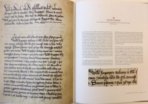
IMG_2440The Art and History of Calligraphy, published May 2017 by the British Library, does pretty much what it says on the tin! It covers writing from what is thought to be the earliest known writing by a woman in Britain in the first century, to the present day (as much as a book published in 2017 can do that!). Here is a sneaky peak inside the book.


FullSizeRender 8What I love about the design is that images of manuscripts are large and so it’s possible to get up close and personal to the letters. Here a page from the Luttrell Psalter has been spread over two pages at the beginning of the book. I chose this page for its wonderful trumpeter – his instrument long enough almost to extend right across the whole column of text!


FullSizeRender 7The first chapter is called, surprisingly enough, the Art and History of Calligraphy, and, after defining the way in which calligraphy is going to be regarded in the book, traces writing through the ages. A number of manuscripts will be familiar, but there are some new ones here, including this lettering by Bembo and a delight of chrysography on dyed black vellum.


FullSizeRender 6Then a chapter is devoted to how the manuscripts were actually made, including quills, vellum brushes, pigments and gold.


FullSizeRender 5This is followed by a section on Writing the Letters, based on Edward Johnston’s 7-point analysis.


FullSizeRender 4And then there are full page double spreads of over 70 manuscripts from the second century AD to right up to the present day. In many cases, as here, there is an enlargement of a couple of lines to show the lettering really closely. The Bosworth Psalter is on the right.


FullSizeRender 3Here is the Lacock Cartulary with wonderfully flourished letters.


FullSizeRender 2And this is one of the first times that Edward Johnston’s Scribe, given to Dorothy Mahoney, has been shown this size in full colour.


FullSizeRenderAnd the book is brought as far up to the present day as a publishing schedule will allow. A stunning piece by Stephen Raw of a poem by Carol Ann Duffy is shown on the right.


I really enjoyed writing the book, sharing information that I have learned from others and researching the manuscripts, and I do hope that others will enjoy reading it. It’s available from the British Library Bookshop, and I am also selling it through my website. If you order a copy from me here then I shall happily write a name in the book calligraphically to make it really special.


The Lindisfarne Gospels

6a00d8341c464853ef01a73dbed759970d-580wiThe Lindisfarne Gospels are, in the opinion of many (including me!) the greatest treasure we have. This manuscript had, of course, to be featured in my book The Art and History of Calligraphy, published by the British Library in May 2017. The Lindisfarne Gospels were written before 720 and the scribe and artist was Eadfrith, Bishop of Lindisfarne, according to Aldred who added a colophon (scribe’s note) at the back of the book in the tenth century. You can see Aldred’s dancing Insular Minuscule gloss between the lines on the right; he added this lettering during the 100 years or so when the monks were at Chester-le-Street. However, what is far more eye-catching are the wonderful colourful and decorated letters. The patterns range from interlace, to geometric red dots, to birds with necks and legs intertwined in the first and last strokes of the enlarged letter N at the start. And it is the invention of letter-forms and their placement that is so delighted. Look at the letter U sitting comfortably within what actually is a V but looks like a U on the top line – NOVUM. Note, too, the four birds’ heads hanging off the top serifs and springing up from the bottom ones on the squared-off letter O on the next line.

pod85Opposite this page is one of the famous cross-carpet pages, called this because they are densely decorated and patterned like a Persian carpet, but are also in the shape of a cross. On the right is the cross carpet page opposite the incipit, the beginning, of Mark.


Screen Shot 2017-03-14 at 12.39.56What is intriguing with this cross-carpet is the central part of the design in that the lines are not completely straight; so this circular design looks almost as if it is slightly raised in the centre, a bit like the ‘boss’ on a shield perhaps. Look at the red geometric patterns top and bottom and right and left; notice the way in which the black outlines aren’t exactly perpendicular emphasising this effect.


Screen Shot 2017-03-14 at 12.39.37Now these patterns didn’t come about by chance when Eadfrith was doodling away one wet afternoon. They were very carefully planned and constructed. This is the back of that page. These are the guidelines made by lead point, the earliest example of it according to the great Michelle Brown. However there are also pin prick marks where a set of dividers has been used to ensure that the distances between the lines on that central ‘boss’ shape are even. Michelle suggests that some sort of back lighting was likely so that Eadfrith could follow his planned design. Read more here about Michelle’s work on the Lindisfarne Gospels.

images-2The intricacy of Eadfrith’s designs are quite amazing when magnified. The is the chi-rho page – the first two letters of the name Christ in Greek (not x and p as some believe!).


imagesAnd this is a close up of part of that page. The swirls are very similar to patterns on jewellery and metalwork around this time.


Screen Shot 2017-03-14 at 21.29.18Red dots feature heavily in this manuscript, in patterns around and between the letters as here.


6a00d8341c464853ef01a73dbed769970d-580wiWhen the patterns are really enlarged the dots each have a dimple. This means that there would have been a dome. So, were these dots done with a pen/quill or a brush? I’ve experimented and am sure that they were done with a quill. There is a fascinating blogpost from the great British Library Typepad where they have enlarged various parts the page at the top of the blogpost, click here for more details.


images-3The lettering is in a particularly clear Half-Uncial, and even if you don’t read Latin, you will be able to make out the letters once you have realised that the letter A is a ‘two c’ letter and the rather strange squiggle is a letter G.


Screen Shot 2017-03-14 at 22.13.21This shows the clear letter-forms. Note the two c letter A at the end of the first line (TERRA), and the Half-Uncial letter G is the third letter from the end of the last line.


images-1There are also four author portraits of the Evangelists. This one shows St Matthew writing his Gospel in a book, with his symbol of a winged man blowing a trumpet behind him.


But you can see all this yourself as the Lindisfarne Gospels have been digitised by the British Library and you can look at page after page of wonderful lettering and glorious patterns, and enlarge them to your heart’s content! Click here for a couple of hours of pure joy!


Cotton to Gold Exhibition 31st January–19th April 2015

two-temple-placeTwo Temple Place is a fascinating building – it looks rather like a castle outside, built of Portland stone with a crenellated roof, stone carvings by Nathaniel Hitch, stone windows and a magnificent golden galleon weather vane of the Santa Maria, Christopher Columbus’ ship. The weathervane is significant in that it represents the route of William Waldorf Astor’s ancestor, John Jacob Astor and the links between Europe and the US. The house was built for William Waldorf Astor by John Loughborough Pearson in 1895, and was intended to be used as the Astor Estate Office, with an upper flat for Astor’s own use.

Two Temple PlaceInside there is a stunning Cosmati pavement and fantastic woodwork, as in this wonderful staircase on the right. When the Astor family sold the house it was owned by various businesses and damaged by a bomb in 1944.

The building is now owned by the Bulldog Trust, and in 2011 opened as the first London building specifically to show publicly owned art from the UK regional collections.


Icon of Eleousa, Blackburn Museum and Art GalleryThe exhibition Cotton to Gold, co-curated by Dr Cynthia Johnstone, IES, University of London, and Dr Jack Hartnell, Courtauld Institute, shows the extraordinary collections of the industrial magnates of the north-west of England, the home of cotton manufacture. During the 19th century wealthy cotton mill owners spent their huge wealth on a rather eclectic assortment of items including Roman coins, Tiffany glass, medæval manuscripts, Byzantine icons, ivories and even preserved beetles! Three publicly owned museums in the north-west – Blackburn Museum and Art Gallery, Haworth Art Gallery (Accrington) and Towneley Hall (Burnley) have joined together to present the best artefacts from these great collections.

BB mss - HART20918, Lombardy Missal, c.1400There will also be mediæval manuscripts on show, mainly Books of Hours. These were manuscript books for the lay person who could then follow the Offices of the Day in their own homes. In Psalms it says ‘seven times a day will I praise the Lord’, and indeed this is what happened in religious foundations, starting with lauds or matins at dawn, prime (6 o’clock), terce (9 o’clock), sext (noon), none (3 o’clock), vespers (sunset) and compline (9 o’clock) followed.


BB mss - HART20884, Book of Hours, Bruges, c.1490Many Books of Hours, as in the two shown here, were beautifully illuminated with rich jewel-like colours and lots of gold.

If you want to know more about how the manuscripts were made, then I am running a hands-on workshop and giving a talk. More details about these and the exhibition here.


Exhibition Opening Times: Monday, Thursday–Saturday: 10am–4:30pm Wednesday Late: 10am–9pm, Sunday: 11am–4:30pm, Closed on Tuesday. Admission Free 


Memento mori – remember (that you have to ) die

DSCN6043-300x214Children dressing up as skeletons, skulls made out of sweet jelly and white chocolate bones are all part of Hallowe’en, but, as with so many of our customs, these sorts of symbols are not new. It was thought that the veil between heaven and earth was particularly thin on the night before All Saints’ or All Hallows’ Day, and so it was then timely for us to remember our own mortality and to consider our life on earth. All Saints’ /Hallows’ Day is, of course, November 1st, and the evening before that All Hallows’ Evening, or Hallowe’en. Nowhere are we encouraged more to think about the afterlife than with memento mori – remember you have to die. And this is particularly true with some tombs such as that for Dean Fotherby at Canterbury Cathedral in Kent, erected in the seventeenth century (see right).

TombStJohnsChester_mOn Dean Fotherby’s tomb, the bones are in complete disarray, however on the tomb of Diana Warburton at St John the Baptist Church in Chester, erected also in the seventeenth century, her skeleton is modestly draped revealing only her upper chest and head and then her feet, (although her feet do seem rather large for her body and look a little as if they’re wrapped in bandages).


9900350Mediæval Books of Hours also included a memento mori, as they contained, usually towards the end of the book, the Office of the Dead. This Office was recited before the Requiem or funeral Mass, and is a rather long section. The illustration to this Office in a Book of Hours usually depicted death or burial, with a shrouded corpse, or, as here, a draped coffin. The fact that Books of Hours were for lay people ensured that the owners would be familiar with the words of the Office which encouraged a reflection on mortality.


allegory_of_the_vanitiesDeath was also featured in some paintings. Dutch artist Harmen Steenwyck painted An Allegory of the Vanties of Human LIfe in about 1640 (now in the National Gallery). It is a very symbolic painting with the shell representing wealth, the musical instruments indicating the pleasures of the senses, books denoting human knowledge, the chronometer and lamp (which has just gone out) showing the frailty of human life, and all being dominated by the large skull in the foreground – a symbol of death. These paintings are called vanitas, after Ecclesiastes (Old Testament) ‘Vanity of vanities … all is vanity’ (‘Vanitas vanitatum … et omnia vantias’).


Sand, sanders and writing

sanderWe’ve seen it so many times before. Someone in mediæval or slightly later costume picks up a full feather with a flourish, pretends to write on paper or skin, looks at what’s been written, then picks up something that looks like a salt pot, shakes a powder on the writing, looks at the writing again and then blows the powder away. The result? A wonderfully ‘blotted’ piece of writing.

Oh so wrong! First the idea that full feathers are used. If ever you have a chance, try to write well and quickly with something that is about 40 cm/18 inches long. It gets everywhere and is very difficult to control. Feathers are cut to pen length 22-3 cm/9 inches for ease of use. And the blotting of wet ink, by ‘sand’? The impression is that ‘sand’ is used because the shaker is called a ‘sander’ (see above). ‘Sand’ isn’t used, at least not the type that comes from the beach. Think of it. This sand is crystalline. If it could blot up ink then water from the sea would come on to the shore as a wave and then simply be soaked or blotted up, no water would return. Sand from the shore doesn’t blot.

Tetraclinis_articulataThe ‘sand’ that is used is gum sandarac. The crystals of gum sandarac are called ‘tears’ and they come from the tetraclinis articulata, which is a small tree (see right), similar to a cyprus, found in north-west Africa. The resin is either exuded naturally or, like rubber, is made by cutting the bark of the tree; it hardens on exposure to air.

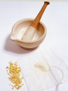
sandaracThe lumps, or tears, of gum sandarac, are ground to a pale yellow powder usually in a pestle and mortar. Once a powder, either it is used from a shaker (see above), or from a little bag (below) made from a piece of fine cotton usually tied up with string. Traditional shakers had a dished or concave top, so that excess sand could be shaken back into the container.


Using sandaracGum sandarac provides a very fine coating on paper or skin. This coating acts as a resist and so either the strokes of the letters are very fine, as on vellum, or it seals the surface of the sheet of paper. Hand-made paper in historical times was surface sized (nowadays paper is tub- or vat-sized – see the blog about paper). It was not always thoroughly done. If paper isn’t properly sized, ink will blot and strokes will have lots of little ‘bleeds’ like spiders’ legs. Gum sandarac prevented this and so it was and is always used before writing and not afterwards.

The last two photographs of gum sandarac and how to use it are from my new Illumination book. It looks like the log jam has at last been shifted and it may even go to the printers this year!

sandarac


Codex Amiatinus – a very English book with an Italian name


St Paul's, Jarrow
Abbott Ceofrid (pronounced Chalfrith) must have been a remarkable man. At the beginning of the eighth century, he was in charge of the twin foundations of St Peter’s at Monkwearmouth (now Sunderland) and also St Paul’s, Jarrow (right), both on or very close to the coast on the far north-east of England. The church buildings have evidence of Anglo-Saxon work, and although both have been much altered, it is still possible to get something of the feeling of what it must have been like at the time of Ceolfrid and Bede; Bede lived at Jarrow.

cod amIn 692, Ceolfrid commissioned three great pandects (all the books of the bible in one volume) to be created, one for Monkwearmouth, one for Jarrow and one to take with him when he went to see Pope Gregory II in Rome; this last book became the Codex Amiatinus. The date is fairly certain because it was in that year that the twin foundations were given a grant of extra land, needed to raise the cattle required for these books. (Map of Jerusalem on the right from the Codex Amiatinus)

Each of the three books had 1029 leaves from calfskin, which was of exceptionally fine quality. The books were large, one calfskin would have had the edges trimmed and then folded in two to make four pages. It’s been estimated that 2,000 cattle were needed for the project, and it should be pointed out that these would be calves, not fully grown mature cattle because their skin is too thick and unwieldy. The books weighed over 5 stone each (75 lbs, 35 kg), and would have required two strong people to move them once bound.

page from Cod AmiatinusThe writing in the Codex Amiatinus is a particularly fine uncial script (opening of St Mark on the right), and for many years was thought to be produced by scribes in or from Rome because of its quality. It must have taken years to produce three great books; seven scribes have been identified and there is evidence that the Venerable Bede was involved in the project. It was only at the beginning of the last century, and then only because of its similarity to other manuscripts known to have been produced at Monkwearmouth/Jarrow, that scholars agreed that the books would have been written by English scribes in England. There is no punctuation, but sections start with a large initial, and it is written as per cola et commata, which means that it is set out as clauses in a sentence, and indented as such. It is remarkably easy to navigate despite there being few illustrations or big headings.

Ezra page, Cod AmiatinusThe text is an almost pure form of the Latin Vulgate translation of St Jerome (the language used at the time, nothing to do with it being ‘vulgar’), and is thought to be have based on a book called the Codex Grandior, an Italian 6th century book, and again a pandect, but now lost. Benedict Biscop, who has recently been adopted as the patron saint of Sunderland, was the founder of the monasteries, as well as being Ceolfrid’s predecessor. He and Ceolfrid visited Rome in 678 and brought back books, including the Codex Grandior, bought from the library of the Vivarium, a monastery set up by Cassiodorus, on the site of modern Santa Maria de Vetere near Squillace, in Italy. (Right: The Ezra page from the Codex Amiatinus)

Two of the pandects stayed in England at Jarrow and Monkwearmouth, but, when he was 74 years of age, on 16th June in 716, Ceolfrid set out for Rome with the third book. It must have been a tearful departure as the monks knew they would not see their dear abbot again. Sadly, Ceolfrid didn’t get to Rome but died at Langres, Burgundy, in France on September 24th the same year.

Codex_Amiatinus_(dedication_page)By the 9th century, the pandect was at the monastery of Monte Amiata, near Siena, which gave the book its current name. It remained there until 1792 when the monastery closed and it was taken to the Laurentian Library in Florence, where it is to this day. In 1888 a scholar called Giovanni Battista de Rossi noted the similarity in text to the bibles mentioned by Bede, and also noted that the dedication of Petrus Langobardorum (Peter of Lombardy, see right, line 5) had been added over Ceolfridus Anglorum (Ceolfrid of England) which had been partially removed. This was one of the great Ceolfrid pandects.


Greenwell leafWhat happened to the two books that stayed? We have evidence that one was presented to King Offa when it was thought that it was a book from Rome, but that hasn’t survived, and nor has the other. However, individual leaves have. The most famous is the Greenwell leaf (right) discovered by the Reverend Greenwell in an old register that he said he bought in Newcastle. Other leaves have turned up including one from a book found at Kingston Lacy; mainly these are used as binding waste, which is why they are often discoloured and with pieces cut off.

So the Codex Amiatinus, one of the most famous books in the world because of its purity of text and script, is actually an English book produced by English scribes from Northumbria. Perhaps its name should be changed to Codex Northumbrianus (or whatever the Latin translation would be!).

St Albans’ Psalter

Christina of MarkyateChristina of Markyate (c1096–1155, and probably on the right, closest to Christ), first called Theodora and born in Huntingdon, was clearly a stunner, as it is recorded that various men were attracted to her. The story is that she fled from Burhred, her husband, on their wedding night, having, after a visit to St Albans in her teens, promised to remain a virgin and devote her life to God. It is unlikely, and records suggest, that Christina didn’t actually leave the night of her wedding, though. When she did finally go, she was sheltered by various hermits on the way until she reached Roger, who was a hermit at Markyate, which is close to St Albans. She stayed with Roger until he died, and then took over his cell. Christina attracted other women to her, including her sister Margaret, and eventually the land around Markyate was given to the foundation by Canterbury Cathedral, the previous owners.

St Alban's PsalterChristina was protected by and became friendly with Abbot Geoffrey (1119–1146) of St Albans, who was French and originally from the abbey at near Le Mans. Geoffrey made great changes at the abbey when he took office, commissioning various items for the church including jewelled copes, a silver candlestick, three ampullas, and he also had the shrine of St Albans rebuilt. In addition, Geoffrey commissioned a vita (life) of Christina which has now sadly been lost, but there is a fourteenth century version now in the British Library.

Annunc-CropThe relationship between Christina and Geoffery is an interesting one. Christina called Geoffery ‘my beloved’ and Geoffery called her ‘my girl and beloved maiden’. Christina had visions and she advised Geoffery as a result of these; it was said that she was ‘sensibly reproving him when his actions were not quite right’. However, Geoffrey’s regular visits to Christina did set the tongues of the gossips wagging and it was written ‘the abbot was slandered as a seducer and the maiden as a loose woman’. Perhaps her making him some underwear for his trip to Rome ‘not for pleasure but to mitigate the discomfort of the journey’ didn’t help either of their reputations!
_54632303_psalter-davidIt is likely that the St Alban’s Psalter was made especially for Christina at the instigation of Abbott Geoffrey. The illuminations are simply stunning, particularly those painted by the Alexis Master. The Psalter (Book of Psalms) was made at St Albans Abbey and no doubt kept at the priory at Markyate. Dates in the calendar relate to Christina with the dedication of her priory, and the deaths of her, and family members, are also recorded. In addition there are dates for female saints and virgins in the calendar which does suggest a female owner.


St Albans Psalter

The Psalter has been being re-bound at the Getty Museum, and there has also been an exhibition of all the unbound pages alongside beautiful stained glass from Canterbury Cathedral.


St Albans PsalterWhilst at the Getty, there have been major studies on the manuscript and, as part of this, they have been able to identify the face of the devil scratched out and tiny pin pricks in the eyes of demons. A knowledge of the mind-set of the mediaeval has explained these. People believed that to see, rays of light left the eyes, ‘saw’ and then returned. The pin pricks were only in the eyes of the demons. These then ‘prevented’ a potentially dangerous event of the demons’ eyes being able to ‘look’.

It is a wonderful manuscript, and ideal for copying to learn manuscript painting techniques.


demons_closeup

What’s on show at the British Library?

Lovell LectionaryI thought it would be helpful to have an easy link to the manuscripts on display at the British Library. Thanks to Dr Kathleen Doyle for supplying the list. I plan to update this when new manuscripts are added or are removed.

These are they:

Harley MS 4431, ff. 2v-3 Christine de Pizan
Add. MS 20698, ff. 69v-70 The City of Ladies
Harley 7026 ff. 4v – 5 The Lovell Lectionary, England, 1400 – 1410
Egerton 608 ff. 138v – 139 An Echternach Gospel-book, middle of the 11th Century
Harley 2804 ff. 216v – 217 The Worms Bible, central Germany, circa 1148
Add. MS 16977 ff. 186v – 187 Glossed Bible, Paris, Second-half of the 13th Century
Egerton 618 ff. 57v – 58 Early Wycliffite Bible, London circa 1400
Royal 1 C viii ff. 325v – 326 Later Wycliffite Bible. London (?), Early 15th Century
Add. MS 39625 ff. 71v – 72 The Vidin Gospels, Bulgaria, mid-14th Century.
Add MS 39626  ff 292-293 The Gospels of Jakov of Serres
Add. MS 39627 The Gospels of Ivan Alexander
Sloane 1975, ff.42v-43 Herbal
Add 41623, ff.35v-36 Herbal
Add 18850, ff.207v-208 Bedford Hours
Add 82945, ff.18v-19 Wardington Hours
Harley Roll Y.6, first 2 or 3 membranes Guthlac Roll
Add 5111, ff.10-11 Canon tables
Burney 19, ff.63v-64 Portrait of Mark

Gold on Parchment

Gold on ParQuills, vellum and parchment (they are different!), real gold, egg tempera paints, the development of scripts, how manuscripts were made, how quills are cut, the sequence of manuscript painting, scribes, all this and more will be covered in the ‘Gold on Parchment’ session that I’ll be giving at the State Library of New South Wales in Sydney on Monday 6th January from 5.30-7.30pm. Entrance is free. Do come along if you’re in the area (yes, I know it’s a long way, but you might enjoy it and could even be worth the airfare!!).