Tag Archives: vellum

For The King on the Occasion of the Coronation

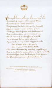
It’s not often that you’re asked to carry out a commission for The King to be presented to mark His Majesty’s Coronation, and it was such a privilege to be asked to do so. It was also a special privilege to be able to propose texts rather than this being prescribed. At the time of this request I was looking into suitable extracts for my latest book ‘The Art of the Scribe’ (published Spring 2025), and this quotation from Shakespeare – John of Gaunt’s speech from ‘Richard II’ seemed most apt. Starting with the phrase ‘This royal throne of kings …’ and with other appropriate regal references in the speech as well – it matched the occasion. (Admittedly, John of Gaunt is lamenting the decline of the realm under Richard II, but that section wasn’t included!)


Such a piece needed a lot of thought and preparation and I was keen to ensure that as many pertinent references were made. First, of course, it had to be on stretched vellum, and a beautiful skin was selected by William Cowley – the most perfect ivory-white. Then, without question, it had to be in gold – yellow shell gold – and with pure leaf gold on gesso as part of the composition. I tried it in my go-to Italic script and wrote out the whole passage as here.


This, though, was too ‘blocky’, and, on re-reading, it seemed that the speech was reaching a crescendo at ‘This blessed plot, this earth, this realm, this England’ (you can almost hear the actor’s voice rising in volume until the last two words are almost shouted). But writing each phrase on a separate line broke up the design too much.


In the end I decided to write the four phrases in two lines, with ‘this England’ in capital letters. This seemed to work better. However, for this piece italic just didn’t seem right, so I went back to a script developed during the reign of another King Charles, actually a Holy Roman Emperor, that of Caroline Minuscule used in many manuscripts during the time of Charlemagne in the ninth century. But how would it look written in gold? I tried out the first line on an offcut of the vellum being used and it seemed to be just right.
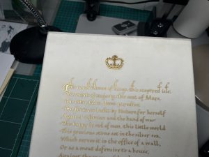
The gesso crown was rather tricky as it was so small (about 1·5 cm) and only a nodding representation could be made to the pearls atop the arches of the crown, and the fleur-de-lis and crosses patey which rise from the gold rim. The different shine on this part of the piece echoed but also contrasted that of the shell gold.


It was framed in Sandringham oak – wood saved from an ancient oak tree in the parkland which would have resonated with His Majesty for whom, we know, it is a very special place. The letter received back by Gallyon indicated that King ‘was touched to receive this beautiful piece of commemorative art’. And I felt that it was a real honour to have been asked complete it.

Glitterati of 2025

Another group of budding illuminators gathered in mid-May 2025 for this year’s Illumination course at Sevenoaks in Kent. In 2024 half were from overseas but this year they were all from the UK – it varies every year which makes it always very interesting. The day before everything was ready and the rooms set up; most of the tools needed were in the pink boxes – those who’ve been on my courses will be familiar with the wet and dry boxes – and the rest were carefully arranged around individual work stations! It takes quite a bit of time to prepare for the course, not just what is required for the course itself of course, but we also provide a light lunch of homemade soup, bread and dessert, as well as homemade biscuits and cake during each day – these being a very necessary sugar hit to keep us going!

It is a very full first day! Gesso is made, laid and gilded, quills are cut, vellum prepared for painting, and two miniatures prepared for gilding. Both images are transferred to vellum using home made Armenian bole paper – everyone gets to take home their own piece for future use.


The practice miniature is done first with a modern adhesive used to attach the gold.


Gesso is applied to the main miniature with a quill that each person on the course has cut themselves from a swan’s feather.


Then leaf gold is applied to the gesso and polished to a shine with a burnisher; after this the gold is cleaned up.


Finally the painting is done using the wonderful jewel colours as in the original being copied and applied with a very fine Kolinsky sable brush.

We learned many things on the course, not least that gesso needs to be thick enough to allow for scraping down to achieve a smooth surface, and that modern adhesive needs to be applied either quickly over the whole surface, or in tiny tiny strokes.

These are the results with comments by those on the course. The comments don’t necessarily match the miniatures.

I would do it again! Highly recommended course with an excellent tutor and lovely people.


Great explanations, very enjoyable and approachable for all questions. Great course! Perfect amount of time (longer would have been lovely too). Immersive and very educational!


Thank you for your clear explanations and demonstrations. The course is perfect for providing an introduction to illumination and painting. It has given me the motivation to continue with this.


I enjoyed the additional information as well as the essentials – all very well explained. It was wonderful; could have done five days.


Brilliant; thank you. I cannot believe how well my miniature turned out.


Excellent, clear description and explanation of materials, techniques and tools. Brilliant – pure and simple.


Such an interesting and engaging experience, thoroughly enjoyable and I felt I learned a great deal that will be put into practice at home. Patricia was unfailingly patient and good humoured, like being with a lovely family. Thank you!


Lovely, informative, very interesting and fun. Great!

‘The Art of the Scribe’

The Art of the Scribe cover‘The Art of the Scribe’ is the latest book published by the British Library in Spring 2025. It focuses on the scripts and the illumination and decoration used in the seven major periods of mediæval and Renaissance book production. Each of the seven chapters includes information about manuscripts of those times, what they were, who they were produced by – the scribes and illuminators – and the people associated with the books. There is also a detailed second section on tools, materials and techniques for calligraphy (including analysing texts, spacing of letters, words and lines, layouts, and serifs), illumination, painting, and simple book binding.

The Art of the Scribe, a pageFor each of the seven writing styles there are clear exemplar letters with guides for writing each one – here are Uncials as in the St Cuthbert Gospel in the British Library. Both the alphabet is shown as well as the letters arranged in families that have similar strokes – this makes learning and practising the letters much quicker.


The Art of the Scribe, a pageIllustrations are large, often taking up the whole page as here – a page from one of the huge bibles produced at the monastery of St Martin, Tours, in France. The script is Caroline Minuscule and is a lovely dancing script, very legible, and wonderful to write.


The Art of the Scribe, a pageAt the end of each of the seven chapters are three graded projects – foundation, intermediate and advanced. This is a favourite from Caroline Minuscule – a zig zag or concertina book using text from Dorothy Wordsworth’s ‘Grasmere Journal’ describing the walk when the ‘host of golden daffodils’ was seen. The illustration along the bottom matches the text, with a few daffodils to start with and then more and more.


The Art of the Scribe, a pageThe second section consists of a comprehensive consideration of materials, tools and techniques; for tools and materials – what is needed, how to use them and how to take care of them. The pages here are how to mix gouache for ink and paint and how to mix repeat colours.


The Art of the Scribe, a pageThis double spread is about vellum, how it’s made, types of skin – vellum and parchment – and the differences in thickness in the skin which affects the final result in use.


The Art of the Scribe, a pageIncluded in the section on tools is a section on quills, quill curing and quill cutting – all clearly illustrated with excellent photographs by the British Library photographer, Jonathan Vine, and with step-by-step instructions. Just visible on the left are the final steps for laying gesso, adding gold leaf (illumination) and painting a mediæval miniature.

Here is a sneaky peek inside the book showing the seven chapters – Uncial, Caroline Minuscule, English Caroline Minuscule, Gothic Textura (Black Letter), Bâtarde, Humanistic Minuscule and Italic – and also the second section of detailed information.

‘The Art of the Scribe’ is available from the British Library bookshop, and I have a limited number of copies for sale where I am happy to write in a name calligraphically; contact me through this website for this and for the cost of p+p (it is a heavy book, so that isn’t cheap!).


Calligraphy and Illumination Courses 2024

IMG_1953 2I am teaching two one-day courses at Sevenoaks in Kent (35 minutes by train from Charing Cross in London, and about 10 minutes from Junction 5 of the M25) in autumn 2024. The course on Saturday 21st September is ‘Quills and Calligraphy‘ and will be for both beginners – those just starting calligraphy – as well as improvers – those with some experience. The day will focus on Gothic Black Letter/Gothic Textura script. The course includes cutting a quill from a feather, and preparing a piece of vellum for writing and then writing a name on it with the quill.

DSCF0827Sets of 9–10 printed A3 sheets are provided for everyone on the ‘Quills and Calligraphy‘ course; these include the background and history of the script as well as principles of calligraphy, with exemplar letters and also ready ruled sheets showing the letters with individual strokes and direction arrows for construction, and then space to practise them (see image here). The handouts can be taken home as an aide memoir and also to continue practice.

IMG_1954The afternoon starts with cutting quills from feathers. This is carefully explained and demonstrated with everyone then cutting their own quill to use on the course and take home. A small piece of vellum will then be prepared for writing and a name written on it.

IMG_3425The ‘Illumination Masterclass‘ is on Saturday 5th October, and again is for complete beginners as well as those with some experience. Participants can choose from a limited selection of animals from bestiaries; this choice is restricted because the aim is to finish the painting in one day and that won’t be possible with complicated miniatures, however, there is some flexibility. Vellum is prepared for painting, and a tracing of the miniature transferred using traditional materials. A modern adhesive is used as there is not time on one day to use gesso; this is used on the three-day courses each May (see here). Real 23·5 carat gold leaf is applied to the adhesive to make it glisten.

IMG_4986Techniques of mediæval manuscript painting are explained carefully, and gouache paint with fine sable brushes are used to complete the image.

For both courses, demonstrations are live streamed to a large TV screen so everyone can see and there is no crowding round the demonstrations. Classes are limited to six participants allowing plenty of time for individual tuition.


IMG_4968Courses take place in a large bright room with plenty of light and individual adjustable table lamps for each person.

All refreshments throughout the day are provided including tea, coffee, home-made biscuits, and a light lunch.

The courses are held just outside Sevenoaks in Kent (UK). There is plenty of onsite parking, and for those travelling by train there are taxis at Sevenoaks station; we can pick up and take back four people.

To apply and details of cost etc please contact me through my website.

The Glitterati of 2024

IMG_4977What a lovely three days we had in May when eight keen illuminators-to-be got together and produced amazing results in just three days. The courses are held in mid-May each year and are limited to eight people. This year there were two participants from Canada, an American and one participant from Hong Kong, as well as four British. It made for a very jolly and very keen group.

IMG_4980The course focuses on the traditional materials, tools and techniques of mediæval manuscript illumination, including vellum preparation for painting, making, laying and using gesso, cutting quills from feathers, using 23·5 carat gold leaf, using burnishers, the processes of painting miniatures and much more.

IMG_4988It’s a huge amount to get through even with three days, but everyone set to with great enthusiasm. Despite all the best conditions, careful measuring and making, gesso can still be rather temperamental and so it proved on this course! Various approaches were tried, but it wasn’t possible even at the end of the course to burnish the gold to the shine that we all would have liked. The gesso needed to ‘settle’ for that; however, it was a very good experience for everyone on the course to have practical ideas to consider for what to do when it doesn’t work! So often it can be perfect on a course with the tutor there for quick answers, and then not so good at home when there’s no one at hand to advise.

Here are the results and the reason why the images are rather wonky is that I was trying to get the gold to glisten as best it could!

These are the comments from those on the course, but not necessarily next to their wonderful results:

IMG_5021Wonderful. I had an absolutely fabulous time and can’t wait to start working on projects at home. I’ll be telling my friends that if they ever get the chance to take this course they should absolutely do it.


IMG_5014Absolutely fabulous!! Well worth coming from Canada. I am so very glad to have made the journey and truly value the gift of the skills shared and encouraged. THANK YOU FROM MYSELF and all of our friends with whom we will share what we have learned (and will encourage to come). It was a privilege to learn from a master craftsperson such as you.

IMG_5015Absolutely fabulous – everything you could wish for on the subject. Great camaraderie, great facilities, lots of historical information. Loved every minute.


IMG_5024I truly enjoyed listening to your stories and demonstrations. I love how you’ve turned everything surrounded by mystery into something everyone can do. I loved it and wouldn’t change a thing.


IMG_5013Patricia really is the master of illumination. She is clear, knowledgable, even students without anything about illumination can get it done. Excellent and enjoyable. I would definitely recommend to anyone who is interested in illumination.


IMG_5017Very good combination and helpful to have an in-person teacher who could give comments and observe to fix mistakes and technique. Would recommend to any serious student of mediæval illuminated manuscripts.


IMG_5012Excellent! Everything is well explained.


IMG_5018I had a great time and learned a lot. Lovely setting and facilities.

The Benedictional of St Æthelwold

6a00d8341c464853ef01a3fcaecb6f970b-500wiA benedictional is a book of blessings given by a bishop; some manuscripts, such as the Benedictional of St Æthelwold (904/9–984), are richly decorated with gold and colour. Unusually we actually know who wrote this particular benedictional – the scribe Godeman as he included his name in a poem, probably in shell gold, placed at the beginning of the book. The poem includes the fact that the book should be richly decorated in gold and colour, as below, as instructions were given:


6a00d8341c464853ef01a3fcaecb8b970b-500wi-1‘A bishop, the great Æthelwold, whom the Lord had made patron of Winchester, ordered a certain monk subject to him to write the present book … He commanded also to be made in this book many frames well adorned and filled with various figures decorated with many beautiful colours and with gold … Let all who look upon this book pray always that after the term of the flesh I may abide in heaven – Godeman the scribe, as a suppliant, earnestly asks this.’


CIMG3078The manuscript, written in Winchester, which was where St Æthelwold was bishop, is decorated in the  ‘Winchester style’. This includes borders of acanthus leaves intertwining around circles and vertical and horizontal lines. There is much modelling and the appearance sometimes is almost 3-D. There is lavish use of gold and pages are most striking, although it could be said that the illumination on occasion almost overpowers the text. This style is seen clearly here, a copy of the beginning of the Eadui Psalter written a little later than as the Benedictional but decorated in a similar manner. This page was prepared for the Anglo-Saxon Kingdoms exhibition at the British Library, 2018–2019. There’s more about the creation of this page on my website here. And a blogpost with short films on how manuscripts were made here, including a film of gilding and painting this page.

6a00d8341c464853ef01a73d69da35970d-500wiThe potentially rather overwhelming aspect of the Winchester style is shown well on this folio. This full page miniature shows St Benedict and is placed in the book just before the benediction for his feast day. It is rather difficult to identify the central figure surrounded as it is by the gold and colour, with heavy and elaborate decoration at each corner, looking a little like shield bosses, and ones almost as elaborate halfway down the side. There are, though, as instructed by St Æthelwold, many arches in the book!


Screenshot 2024-05-14 at 17.43.51The lettering in the manuscript is very similar to, but not exactly the same as the Ramsey Psalter (shelfmark: BL, Harley 2904). The latter was written around the same time, and both in Winchester; the Psalter was the key manuscript used by Edward Johnston for his Foundational Hand. It is rather intriguing to think that both scribes may have been sitting next to one another in the scriptorium, and writing the letters slightly differently, perhaps even comparing notes!

There’s more information on a British Library blogpost here and it will certainly be worth looking at each page when the British Library website is up and running (this blogpost written May 2024).


Vespasiano da Bisticci – ‘cartolaio’ of Florence

Vespasiano_da_Bisticci_portraitIt must have been a very exciting time in Florence in the fifteenth century. The Humanists favoured Greek and Roman texts, rather than religious ones, and wanted them written out in luxury books. But who could procure the fine vellum needed, or the scribes to write the books in the new/old style of Humanistic Minuscule, artists to decorate them with white vine-scroll ornament, and skilled craftspeople to bind them in velvet or supple leather? Enter one Vespasiano da Bisticci (1421–1498) as shown here. He started working at a libreria along a street of similar shops when he was only 11 years of age but he learnt quickly and, when still a young man, became a member of the stationers’ guild and thus a fully fledged ‘cartolaio’.

Bartolomeo_Sanvito_-_Portrait_of_Petrarch_in_the_Incipit_Letter_“N”_-_Google_Art_ProjectThe Humanists wanted their ancient texts written in an ancient script. They thought Gothic scripts were too modern (though they look very old-fashioned to us!), and called them lettera/littera antica/antiqua. Looking back in history at various writing styles they were keen to get as close to the scripts of Rome and Greece, but they didn’t go back quite far enough. They settled instead on the clear and precise style developed during the reign of Charlemagne, another lover of all things classical. Charlemagne wanted a clear, easily readable script, that could be used throughout his empire, and this was it.


Screenshot 2023-12-13 at 17.00.31

The Humanists adapted it – they made the script more upright, they added feet to the  minims (sometimes emphasised too much!) and used classical Roman Capitals to complete the impressive look. The appearance on the page is almost of printed text when it is written as clearly and precisely as this. It is extremely difficult to justify text when it is hand-written – it is certainly not as simple and easy as highlighting a paragraph and clicking on a button to align left and right margins! Yet in this manuscript now in the British Library, written by Rodolpho Brancalupo, it is precisely what he has achieved.

Screenshot 2023-12-13 at 17.00.14Many of the pages of books at this time also reflected Classical influences. Those associated with the great Paduan scribe Bartolomeo San Vito and others often had decorations of swags and foliage, cherubs and acanthus leaves, vases and jewels, sea creatures and pearls – as can be seen in the manuscript page in the second paragraph. Others were decorated with bianchi girari (white twists), which worked well with the lighter and more delicate script. This is shown in this manuscript from the Fitzwilliam Museum which was supervised by Vespasiano da Bisticci and produced in about two months – an amazing feat!

IMG_3778Vespasiano’s shop can still be seen in Florence. It was on the corner of the Via del Proconsolo and Via de’ Pandolfini. Close by is another shop as here. This is a magnificent building with a most impressive doorway.


IMG_3780Above the rounded and decorated arch, between two horizontal swags of leaves and foliage, is a small carved open book. Those a little carried away by the romance of the bookshop of the famous bookseller thought that a book carved above the entrance indicated that this is the very shop.


IMG_3783This ‘book’ shop, though, is on the wrong corner, and in some ways sadly, although amazing that it’s still there, Vespasiano’s old shop is much more mundane now – at the time of writing it was a pizzeria. This is on here the correct corner and it was from where the bookseller traded.

There is much more about the Humanists, their manuscripts, and Vespasiano and his clients in ‘The Art of the Scribe’, published by the British Library, summer 2024.

‘A Word for Autumn’

Layout 1The changing of the seasons can be one of delight or one of apprehension. Winter to spring promises fewer cold days, the singing of birds and the appearance and flowering of bulbs. Spring to summer indicates the lengthening of days, increased warmth and new growth. Summer to autumn can be a change that heralds colder, wind, rain, and shorter, darker days. The ‘season of mists and mellow fruitfulness’ then quickly becomes a season of shivering, endless rain and drizzle, even snow and ice, and closing curtains in the late afternoon against the gloom as well as battening down the hatches. However, A. A. Milne had it correct in ‘A Word for Autumn’ – it can be a time to fear, or a time for looking forward with some pleasure.


IMG_4169I wanted to create an artwork that I could use for an A5 greetings card for winter and Christmas. I loved the words (taken from a longer extract), and at the time of producing it the leaves on the trees were changing to a riot of autumn colours. First I experimented writing the text with a warm brown that I thought would echo that of many of the leaves. It seemed a bit dull and ‘samey’, but this first effort confirmed the chosen nib size (a Mitchell 5), and the line spacing and layout. I was on my way!


IMG_4167One of my favourite interpretations of words is to use a limited range of colours fed into the nib whilst writing (see blogpost here for how to do this). To some extent it is random, but it is also very controlled, assessing each individual stroke as it is written and also looking at the line above as to whether a different colour needs to be fed in. It’s not exactly conducive to a good rhythm and flow, but the end result, in my view, can be very pleasing. The key is not to use one colour or one colour combination for more than two strokes and to wash the nib out frequently. At this stage it doesn’t matter if mistakes are made. The letters or words should simply be re-written as here. I had the idea of a landscape-shaped card and experimented with a rough indication with coloured pencils of what it would look like if a representation of autumn leaves was falling and gathering at the bottom of the text in a layer of leaves. This didn’t give the impression enough of the leaves falling, so I decided on a portrait-shape.


IMG_4170Next I experimented with painting the leaves on vellum (calfskin). In my opinion this really is the best surface for painting and writing. The darker colours in this photo are not at all representative of the actual painting! I used yellow, brown and green gouache, and painted leaves from different types of trees that I noted on walks in the countryside. I wanted to give the impression of the leaves falling from the trees and being tossed and turned in a slight breeze so they didn’t all fall in the same direction. These then collected in a bed of leaves on the ground.


IMG_4168I always photocopy the text and use this as a guide for writing the finished piece. This means that the rough is then available for reference and for future use. As there was no centring or design to consider – the lines were aligned left with some indented – there was no cutting lines in to strips and working out the best arrangement. To ensure that there were no mistakes on letters, words or spacing, I folded the photocopy horizontally into the separate lines and placed these on the vellum just above where I was going to write, attaching the paper with masking tape as I did so.

Layout 1The text was written in the same colour combination as the leaves creating a coherent whole, with the dropping leaves emphasising the left aligned text, and the bed of leaves at the base creating a firm ending for the piece.

The British Library One Day Illumination Masterclass Course

August 2023, finished animalsIt can be quite daunting signing up for a course which for many involves completely new techniques and tools. Most people haven’t picked up a paintbrush or dealt with paint since schooldays, and the thought of painting a mediæval miniature may be very tempting, but what if everyone else on the course is a trained artist? The British Library one-day Illumination Masterclass course is geared to allay all fears (at least most of them!). Much of painting in the style of mediæval miniatures is technique, and this is what I teach. These are the results of the course held in August 2023.

IMG_3380Everything is provided for each participant, no-one has to bring anything. It takes quite some time to prepare everything beforehand, and also a considerable time to set up for the course on the day. Here are the wet and dry boxes (those on my courses will know all about these!).


IMG_3381Each participant has their own work station set up on individual tables so that there is lots of space and everything they need is to hand. This is set up for a right-hander.


IMG_3382To allay any fears about not being creative, to avoid too complex an image for one day, and to use the time as effectively as possible, bestiary animals from manuscripts held at the British Library are chosen, and even these are selected to be ones that aren’t too complicated. Tracings are made which are transferred to treated vellum. The outlines are then reinforced with paint as here.

IMG_3383Instructions are given on dealing with gouache paint, using brushes, and how to paint using fine sable brushes. Here the pigment is being tested with a mixing brush to ensure that the very dilute consistency to paint the outline is correct, and also that the brush is held at the right angle to make the very fine strokes.

IMG_3385Then a modern adhesive is applied. There is not enough time in one day to use traditional gesso which raises the gold from the surface so that it shines brightly, and also creates a smooth surface to achieve a brilliant burnish. Anything other than gesso won’t have the effect of gold as in manuscripts, but it can still be stunning! Here the adhesive has been applied.

IMG_3386Next it’s GOLD. Despite not using gesso it’s always exciting to achieve that brilliance of metal with real gold leaf shining in the light. Areas not being worked on are masked as here.


IMG_3387Agate dog tooth burnishers are used to apply the gold.


IMG_3390And the effects are rather wonderful!


IMG_3392And again here:


IMG_3394Finally the paint is applied to create a wonderful mediæval miniature.


Comments from participants on this course:

Fantastic! Well structured and most enjoyable.

Such an enjoyable day, it’s amazing what can be done in a day due very much to the preparation and expertise Patricia brings.

Wonderful day and a very good and welcoming tutor.

Fascinating stuff!

Patricia is a great and supportive instructor. I look forward to taking more classes with her.

Humour, even steady pace, clear instruction, perfect level of detail, and fantastic tuition.

Most enjoyable and informative. Never thought I would produce such illumination in such a short time.

Very well pitched (in my view) to meet the requirements of novices and more experienced participants from a range of backgrounds. Loved the technical information.

Really enjoyed it! It was especially detailed with supplementary information which I liked.

It was very well planned and instruction and teaching were well summed up and delivered. I am going to return and learn more. Thank you Patricia.

It was very interesting and informative; I thoroughly enjoyed the day!

Well organised course. We didn’t bring anything to the course, which is great, everything is provided. Big thank you to Patricia.

(The only negative comments were to do with the arrangement of tables and movement round the room, which we realised as soon as the participants came in, and will be resolved for future courses, and the lighting in the room; it is suggested that if this is a potential problem, then participants may like to bring an illuminated magnifying glass with them.)

The Glitterati of 2023

Layout 1What a wonderful group of eight budding illuminators-to-be there was for this year’s intensive Tools, Techniques and Materials of Mediæval Manuscripts three-day course in May. It is always interesting to see how eight different people, complete strangers, from different parts of the UK and the world will react when spending three days together. I have been so lucky in that everyone who comes on my courses has been really nice – and so it proved to be this time!


IMG_2930It takes quite a long time to get the rooms ready. The furniture has to be arranged, and then all the tools and equipment set out for each individual – well over 30 individual pieces of equipment. No-one has to bring anything with them – it’s all provided. I do this for three main reasons. It is very expensive buying vellum, books of gold leaf, sets of paints, and fine kolinsky sable brushes. If someone is doing this only once, it is a lot of cost, which could be seriously off-putting! Then, for those coming long distances and even from overseas, buying all the correct stuff is not easy and carrying it long distances on public transport is also a challenge. Lastly, and this is from experience of many, many years, it is so important to have the right tools and materials – too low a gold level in leaf gold means that it will not stick to itself, a old burnisher that someone has found in a drawer may be scratched and ruin the gold, and new scissors bought cheaply will make the gold leaf tear. It really is a case of, quite rightly ,a workman blaming his tools when things don’t go well!

But the results were amazing as you can see. Gesso well laid, gold attached and burnished to a bright shine, and miniatures painted well.

IMG_2945Here are the results and comments from those on the course, although comments are not necessarily next to the image completed (by the way, the images may be a bit skewwhiff because I wanted to make sure the brilliance of the gold was captured).

Amazed at what I’d learnt on the first day. I thought we had a lot to do, and we did, but Patricia had timings meticulously planned, and we finished. it was extremely good value for such an in depth course (and most memorable).


IMG_2934Your help and advice at all stages have been very welcome; thank you for your encouraging words throughout the course. So glad to have attended. I have learned a great deal and particularly enjoyed using gesso. Absolutely fantastic. Thank you.


IMG_2935Superb! I’ve learned so much and will definitely experiment with techniques in the future, Unique and top quality training with plenty of inspiration for future explorations. Very clear, easy to follow and clearly based on practical experience. Brilliantly pitched.


IMG_2937I just want to say what a wonderful experience this has been – absolutely perfect for me! Thank you so much for your wonderful warmth and hospitality (well beyond what the course would require to be a success).


IMG_2936Perfectly paced and really fun, learned so much, quill making amazing. Patricia you are wonderfully encouraging and positive, Loved the gesso and gilding. Tremendous! Wish I could have stayed for a week.


IMG_2942I was so looking forward to it, but the course was so much more than I could have expected, The learning was wonderful, and I cannot thank you enough for all the effort you put in to make it an amazing experience. Excellent! Repeats, great demonstrations, you are a wonderful teacher! All my thanks.


IMG_2939This is famously the best course in the world, which is why we’re all here. No-one was disappointed.


IIMG_2940 loved the fact that you walked us through the details of all the supplies we used, where they came from and how they are made. It was an amazing experience, I have learned so much more than I had hoped to. Patricia, you are a very generous teacher and person. I am so glad I signed up for this workshop.


Courses are held in Kent, UK, about 35 minutes by train from London. They are run usually the third weekend (plus the Friday) in May, and details are sent out in my free online monthly newsletter. The courses fill up very quickly, so if you are interested, do book your place as soon as it’s advertised!